Formatting
 Click a button to jump to its description or just scroll the page.
Button: Handle


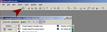
At the left end of a toolbar is an area called
the handle, which looks a bit different in different versions of MS
Access. Hover over this area and the mouse pointer changes to the
Move shape  .
Drag while in the Move shape and the toolbar will move. If you drag
perpendicular to the bar, it will undock and float. Drag to another edge
of the window and the toolbar will dock there.
.
Drag while in the Move shape and the toolbar will move. If you drag
perpendicular to the bar, it will undock and float. Drag to another edge
of the window and the toolbar will dock there.
Toolbar dragged to the right
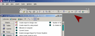
Toolbar floating
Toolbar docked at left
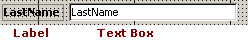
Button: Object Box
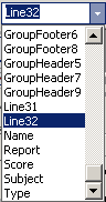 The
Object Box shows the name of the currently selected object, like a line,
header, footer, field, or the entire report. All formatting choices you
make will be applied to the selected object.
The
Object Box shows the name of the currently selected object, like a line,
header, footer, field, or the entire report. All formatting choices you
make will be applied to the selected object.
Button: Font
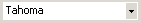
The Font button shows the name of the font used in the currently selected object. Clicking the arrow at the right of the name opens a list of the available fonts.
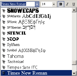
The font that you select is applied to the whole object. You cannot format just part of the text in a label or text box.
Button: Font Size

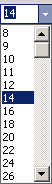 The
Font Size button displays the size of the text in the currently selected
object. It will be blank if the object cannot hold text.
The
Font Size button displays the size of the text in the currently selected
object. It will be blank if the object cannot hold text.
The arrow at the right opens a list of standard font sizes for you to
choose from. You can type in other sizes also.
Buttons: Bold Italics, Underline

These buttons format the selected text box or label. You cannot format just part of the text in a text box or label. It is all or nothing!
 Bold
Bold
 Italics
 Underline
Buttons: Alignment

The Alignment buttons give the choice of aligning text to the left, center, or right.
These buttons are grayed out when the selected object is not a label or text box.
Button: Fill/Back Color

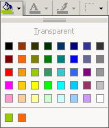 The
Fill/Back Color button shows the color of the last color that you
chose for a fill color or background color of an object.
The
Fill/Back Color button shows the color of the last color that you
chose for a fill color or background color of an object.
To choose a different color, click the arrow at the right of the icon. A palette of standard colors appears. Recently used colors show below the line.
You cannot choose a custom color from the palette, but you can set a
custom color in the object's Properties list.
Button: Font/Fore Color

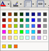 The
Font/Fore Color button shows the last color that you selected, not the
color used in the currently selected object. Click the button to apply
this color to the text in the selected object, or as the foreground
color.
The
Font/Fore Color button shows the last color that you selected, not the
color used in the currently selected object. Click the button to apply
this color to the text in the selected object, or as the foreground
color.
The arrow at the right opens a palette of standard colors. The most
recently used colors are at the bottom. To use a custom, you must go to
the Properties dialog for the object.
Button: Line Color

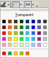 The
Line Color button shows the color that you applied last to a line or
border. The arrow at the right opens a palette of standard colors.
The
Line Color button shows the color that you applied last to a line or
border. The arrow at the right opens a palette of standard colors.
To apply a custom color, you must use to the Properties dialog.
Button: Line Width

 The
Line Width button shows the width that you applied last, not the current
line width for the currently selected object.
The
Line Width button shows the width that you applied last, not the current
line width for the currently selected object.
The arrow to the right opens a palette of standard widths, including Hairline and point sizes from 1 to 6 pts.
You cannot create a custom width at all.
Button: Special Effects

The Special Effects button shows the last effect that you applied, not the effect that is applied to the currently selected object.
The arrow opens a palette of special effects, including:
Flat
Raised 
Sunken 
Etched 
Drop Shadow 
Chiseled 
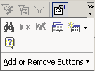
Button: Toolbar Options


The
down arrow at the far right of a toolbar opens a cascading menu: Add or
Remove Buttons. You can customize the toolbar by
adding or removing buttons.
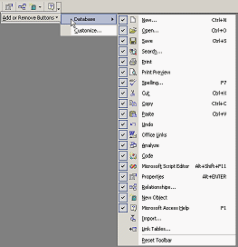
 A double arrow above the down arrow tells you that the window is too narrow to show
all of the buttons on the bar. Clicking the arrow in this case will open a palette of
the hidden buttons, in addition to the menu Add or Remove Buttons.
A double arrow above the down arrow tells you that the window is too narrow to show
all of the buttons on the bar. Clicking the arrow in this case will open a palette of
the hidden buttons, in addition to the menu Add or Remove Buttons.
All Office programs display the most recently used buttons when there
is not room for all of them.
As you continue to work in a small window, which buttons are showing will change.
This can be confusing!
|
Teachers: Request permission to use this site with your class Copyright © 1997-2012 Jan Smith <jegs1@jegsworks.com> All Rights Reserved |
~~ 1 Cor. 10:31 ...whatever you do, do it all for the glory of God. ~~