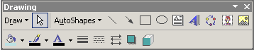
Drawing Toolbar
Menu: Draw

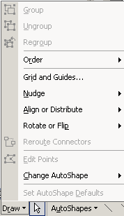 The
Draw menu has commands for managing
your objects. These commands can be used on Drawing objects, AutoShapes,
clip art, pictures, and placeholders. The
Draw menu has commands for managing
your objects. These commands can be used on Drawing objects, AutoShapes,
clip art, pictures, and placeholders.
 Change shape: You must
use the Change AutoShape command
to change the shape of an existing AutoShape, text
box, or placeholder. Not a obvious place to look for such a command! Change shape: You must
use the Change AutoShape command
to change the shape of an existing AutoShape, text
box, or placeholder. Not a obvious place to look for such a command!
|
Button: Select Object

The Select Object button
 changes the mouse
pointer to the Select shape. changes the mouse
pointer to the Select shape.
When the pointer has the Select Object shape, you can select objects on a
slide by clicking them. The pointer will drag a rectangle shape that will
select all of the objects that are totally inside the rectangle.
|
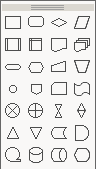
Buttons: Basic Shapes

The 4 most commonly used AutoShapes have their own buttons: Line,
Arrow, Rectangle, and Oval. Click the button for the shape you want and
then drag on the slide.
Helpful key combo:
- Square: hold the SHIFT key down while dragging a rectangle.
- Circle: hold the SHIFT key down while dragging an oval.
- Horizontal or vertical line or arrow: hold the SHIFT key down while
dragging.
|
Button: Text Box

The Text Box button lets you create a rectangle that is ready for
you to type in text. The borders will vanish when you exit the text box.
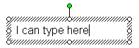
A text box is not a placeholder, so the text in a
text box does not show in the outline.
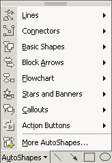
Add AutoShape to a text box: On the Drawing toolbar, choose |
and then pick a
shape from the palettes. The shape fits inside the existing
text box, but it will not show until you format the lines or fill.
Confusing!
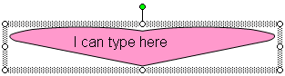
Text box after changing AutoShape to Heart
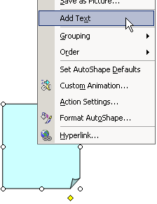 Add text to an existing AutoShape: Right click the AutoShape and
choose from the popup
menu. A text box surrounds the AutoShape and the cursor appears for you
to start typing. Add text to an existing AutoShape: Right click the AutoShape and
choose from the popup
menu. A text box surrounds the AutoShape and the cursor appears for you
to start typing.
|
Button: WordArt

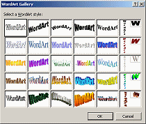 The
WordArt button opens the WordArt Gallery, which contains a number of a
pre-designed formats for your text. The
WordArt button opens the WordArt Gallery, which contains a number of a
pre-designed formats for your text.
Use a WordArt style as your
starting point for designing fancy titles and logos.
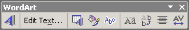
Afterwards you can modify the formatting with the WordArt toolbar.
|
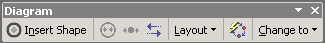
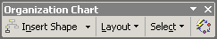
Button: Diagram

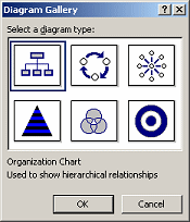 The
Diagram button opens the Diagram Gallery, which has several
standard diagrams and organizational charts. The
Diagram button opens the Diagram Gallery, which has several
standard diagrams and organizational charts.
Once you pick a diagram type, PowerPoint inserts the default version
on
the slide. Then you can modify it using the Diagram or Organization Chart
toolbar.
 In previous versions of Microsoft Office, this feature was a separate
program. In previous versions of Microsoft Office, this feature was a separate
program.
|
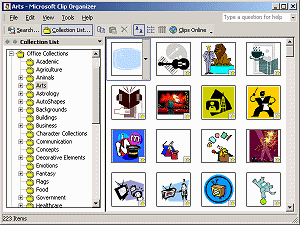
Button: Clip Art

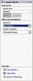 The Clip Art button opens the Insert
Clip Art task pane. You can search your clip art collections or
the Internet, based on the file name or on keywords associated with the
clip. The Clip Art button opens the Insert
Clip Art task pane. You can search your clip art collections or
the Internet, based on the file name or on keywords associated with the
clip.
Or you can open the Clip Organizer program with
a link at the bottom of the pane and browse though your clip art.
|
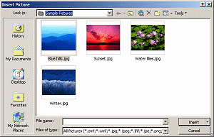
Button: Picture

The Picture button opens the Insert Picture
dialog so you can browse your drives to find the image that you want to
use.
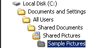
By default the dialog opens to the Sample Pictures folder
which shows thumbnails of the images.
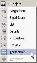  In
WinXP you
can make other folders show thumbnails of images also. On the toolbar for the
dialog or folder window, click the arrow beside the Folder Views
button In
WinXP you
can make other folders show thumbnails of images also. On the toolbar for the
dialog or folder window, click the arrow beside the Folder Views
button  and choose Thumbnails. TaDa! and choose Thumbnails. TaDa!
|
Buttons:
Colors- Fill, Line, Font
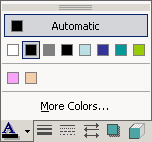 The
Colors buttons apply the color in the bar at the bottom of the button to
what you have selected. You can change the fill color, line color,
and font color. The
Colors buttons apply the color in the bar at the bottom of the button to
what you have selected. You can change the fill color, line color,
and font color.
Clicking the arrow at the right of a button opens a palette that shows
the colors
in the current Color Scheme. Below those colors are any colors you have selected yourself
previously. You can find more colors by clicking the
More Colors... link.
 The
palette will be grayed out if nothing is selected or if the selected item cannot be formatted with
the button you clicked. The
palette will be grayed out if nothing is selected or if the selected item cannot be formatted with
the button you clicked.
|
Button: Shadow

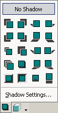 The
Shadow Style button opens a palette of choices for applying a drop shadow
to the selected object or text. It automatically picks a shadow color
that contrasts with the text. The
Shadow Style button opens a palette of choices for applying a drop shadow
to the selected object or text. It automatically picks a shadow color
that contrasts with the text.
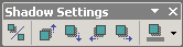
For even more choices, the Shadow Settings link opens a toolbar. You can
adjust the direction, distance, and color of the shadow.
Confusion - two Shadow buttons:
  The
Shadow button on the Formatting bar: The
Shadow button on the Formatting bar:
- Effects: Only 1 - a subtle shadow down and to the right
- Applied to: Selected text
The
Shadow Style button on the Drawing bar:
- Effects: Several to choose from
- Applied to: Objects, like placeholder, text box, AutoShape, or
image, and sometimes to all the text in an object
 If object
has fill: Shadow effect applies to whole object like the oval at the right. If object
has fill: Shadow effect applies to whole object like the oval at the right.
  If
object
does not have fill: Shadow effect applies to all the text in the
object, like two text examples at the
right, each with a different shadow effect If
object
does not have fill: Shadow effect applies to all the text in the
object, like two text examples at the
right, each with a different shadow effect
|
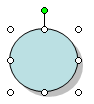
Button: 3-D Style

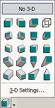 The 3-D
Style button opens a palette of choices for turning your object into a
3-dimensional shape. The 3-D
Style button opens a palette of choices for turning your object into a
3-dimensional shape.
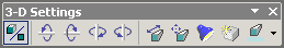
The 3-D Settings... link at the bottom of the palette opens a toolbar
that lets you control the tilt, depth, direction, lighting, surface type,
and 3-D color of your object.
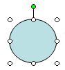

Initial oval and 3-D
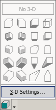
If the palette is grayed out, then the selected
object cannot be turned into a 3-D object.
|
Close this window
~~ 1 Cor. 10:31 ...whatever you do, do it all for the
glory of God. ~~
|
 T
T


 Line Style
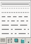
 Dash Style
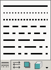
 Arrow Style
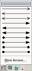