
 Previous
Jan's Working with the Web
About HTML
Why is HTML better than a word processing format for the Internet?
Advantages of HTML
-
Any browser can display any HTML document.
-
Text will wrap to fit the space available for display.
- Hyperlinks make it easy to view related materials.
- Accessibility: A user can adjust his browser to make the HTML page easier to read for his own needs and comfort levels.
Disadvantages of HTML
-
Actual appearance of the page on the viewer's monitor or when printed is not known by the author and cannot be completely controlled by the author. (This drives many authors crazy!)
-
Older browsers do not understand newer HTML codes.
- The tag markups make the raw source code harder to read and to edit than a word processing document.
HTML Standards
The rules for HTML grow and change constantly. Authors of browsers invent new features. The standards committees and the browser authors must both race to catch up with each other. The organization W3C (the World Wide Web Consortium) publishes recommendations (also called standards) for each version of HTML. The most current finished version is HTML 5., which was finalized in 2014. Most browsers supported many of the new features long before the standard is actually finalized.
New features are introduced with each new HTML Version. HTML 2.0 introduced forms and HTML 3.2 introduced tables.
With HTML 4.0 authors can take advantage of features like:
- Cascading Style Sheets (CSS) to control and format all the parts of the page.
- JavaScript lets you write tiny computer programs that actually createor change parts of the page.
- Dynamic HTML (DHTML), combining CSS and JavaScript lets you write interactive pages that change based on what the user does. (The term DHTML has fallen out of use as it tends to refer to methods that do not work with current browsers.)
In HTML5 has some new tags:
- Media elements: audio, video, source, embed, track
Once browsers all support these tags, we won't need add-ins like Flash and Shockwave. This is particular important for mobile devices like tablets and smartphones. Many of those cannot handle the media add-ins. - The canvas tag lets a script draw something new on the
page.
This should make for exciting new ways to interact with a web page.
These advanced features are worth textbooks of their own. Cascading Style Sheets have become standard for handling the formatting of a web page, so the basics of CSS will be included in these lessons, but we will not be dealing with scripts at all. If you already have some knowledge of HTML, you might want to take a peek at my Cascading Style Sheets Demo (updated 2016) and my Web Scripting Demo (updated 2016).
As new tags and methods are added, older features are eventually phased out and deprecated. This awkward word means that future HTML standards will not include the deprecated tag at all. Eventually browsers may not even recognize it. Thus, an HTML author has a problem with no perfect solution. Old code tags may eventually not work in newer browsers while older browsers do not understand the cool new features.
Can you predict what browser and which version of it will be used to view your web pages? If so, your authoring life will be easier! Most web authors, however, must try to write pages that will display at least fairly well in any browser at all.
Page Appearance
Working with web pages is different from working with printed documents. The author of an ordinary document on paper knows the size and color of the paper. He can make specific choices about the color and size of the text, width of the margins, where a page breaks, etc. He can know what the results will be. An HTML author cannot know exactly how the document will be displayed on the viewer's monitor. There are many factors involved.
The table below shows some of the things that will be different for different people who are viewing the same HTML page. These characteristics often make a difference in how an HTML document displays on a monitor.
| Feature | Some Possibilities |
|---|---|
| Computer type | PC, Mac, main frame, tablet, smart phone… |
| Operating system | Windows (many different versions), System 7, Unix, Linux, OS X, Droid… |
| Monitor size | Desktop, lap-top, tablet, hand-held device... |
| Color depth | Gray scale, 16 colors, 256 colors, 16 million colors… |
| Screen resolution | 640 x 480, 800 x 600, 1024 x 768, 640 x 332… |
| Window size | Full screen or any size smaller than that |
| Display hardware | Screen, speaker, Braille pad |
| Navigation hardware | Keyboard, mouse, voice, stylus, touch screen |
| Browser | Internet Explorer, Chrome, Firefox, Opera, Safari…(a variety of versions for each) |
| Customized browser settings | Custom choices for the default fonts, font size, text color, background color, link colors, images shown or not, personal style sheet |
| Scripting and plug-ins | The browser allows or does not allow JavaScript, Active X, Java applets, Flash plug-in… |
| Fonts | Browser default font will be used if the font you use in the HTML code is not on the computer. Mac and PC computers usually have different fonts! Smart phones and tablets have different fonts than the ones available on PCs and Macs. |
In theory, any browser can display any HTML document in a
way that makes sense, though it may not be pretty.
This will work if:
- Author of the page followed HTML standards
- Authors of the browser followed the same HTML standards
When these conditions are met, the different parts of the document are shown in a way that is suitable for the particular equipment and the viewer's personal needs. The page author does not have to worry about what equipment is used to view the page or what customized settings the browser has. Super!!
In reality, there are problems.
- Non-standard code: HTML authors may use code that does
something cool (or used to), but that is not in the HTML standard. Only certain
browsers understand it. Sounds and video often require additional
programs that may not have been installed.
- Non-standard practice: HTML authors don't follow HTML standards
well. They often try to achieve a certain look for the page by
using HTML code for purposes besides what it was designed for. This
can result in problems for some viewers, sometimes minor and sometimes
severe.
Common problems:
- Using tables for placement on the page >> Text reading software may get confused
- Setting text size small >>Text may be too small to read on some systems especially Macs.
- Setting text color but not background color >> Text may blend into the viewer's customized default background.
- Setting page or table or DIV width >> In a small window the page may run out of sight to the right.
- Using images for text or including information only in an image >>
Information is not available to a text reader program or a text-only browser like those used by
blind people or if the browser has images turned off.
- Non-compliant browser: No browser is 100% compliant with HTML
standards. They either leave out parts or add in new cool features of
their own.
- Non-standard features:
- Example: The LAYER tag was created by Netscape, but IE was never updated to do anything at all with it. The HTML standard used the DIV tag to create a similar effect. Each method had its own advantages and disadvantages.
- Example: Inline frames were created for IE and other browsers did not display them at first. But they were such a good idea that a later HTML standard included inline frames.
- Interpreting differently:
Every browser has some part of the HTML standard that it does not handle or handle well or 'correctly'.- Example: Internet Explorer is well known for doing its own thing at times with spacing especially with margins around block tags like DIV.
- Example: Netscape was quite infamous for choking on nested tables (tables inside of tables) that other browsers had no trouble with.
- Non-standard features:
- Customization: Some people change the way their browser displays pages. They might like to see their own favorite font instead of what the page's author chose. They may set a particular background color or image. People with vision difficulties may need a really large font size or specific colors for text and background.
Creative minds have expanded what HTML can do, what browsers can do, and what computers can do. It is hard to keep things simple any more. So be forewarned - the HTML pages that you write may not work well for everyone. Keep it as simple as you can to let the most people use your page.
Default Font
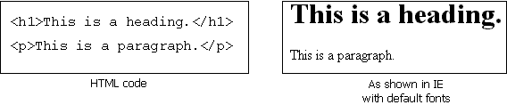
In most browsers for Windows, the default serif font is Times New Roman and the default non-serif font is Arial. Non-Windows computers may not have these fonts. The browser will substitute its own default fonts.
For example, Android comes with only three fonts: Droid Sans, Droid Serif, and Droid Sans Mono.
The iPhone comes with several fonts, including: American Typewriter, American
Typewriter Condensed, Arial, Arial Rounded MT Bold, Courier New, Georgia,
Helvetica, Marker Felt, Times New Roman, Trebuchet MS, Verdana, Zapfino.
PDF of
how these iPhone fonts look The page shows all Mac fonts and labels the one for iPhones with a white F in a green square.
|
|
| © 1997-2017 Jan Smith All Rights Reserved |
Site Map What's New |
Privacy Policy Terms of Service Copyright Acknowledgements |
~~ 1 Cor. 10:31 ...whatever you do, do it all for the glory of God. ~~
Last updated: March 27, 2017