
Jan's Working with Words
Formatting
Now you can actually get to work! You will create an advertising flyer for a travel agency. You will cleverly use a large number of Word's commands to create an attractive document. The process is broken down into a number of steps, which also will introduce you to various methods of formatting your document. Follow all of the directions carefully. Save your document often!!
![]()
![]() Key combo CTRL + S is the fastest way to save your changes.
Key combo CTRL + S is the fastest way to save your changes.
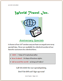
What you will create
Formatting
The term formatting includes all of the ways that you can change the appearance of the text and of the page. You will learn how to change the font, the font size, the font style (bold, italic, underlined), the indentions for paragraphs, the page margins, the color of text and of background, and the borders.
Design Thoughts
You will be writing an announcement flyer. What is its purpose? It is very important to know the final goal. That's how you will know if you were successful!
Your goals:
- Capture the reader's attention.
- Reader actually reads the whole thing.
- Reader signs up for a trip with the travel agency or at least contacts them about booking a trip.
Now you know what 'success' would look like for this flyer.
How to accomplish the goals:
- Include the basic who, what, where, when, and why.
- Make it attractive and colorful but not overwhelming to the eye.
- Emphasize visually the special trips that the agency is advertising in this flyer.
While this flyer is not a great piece of literature, it does illustrate several design considerations and uses only basic formatting choices. Of course, a professional design company would do something much more complex and more expensive to produce, and more beautiful, too!
Design Tips for Documents
- Number of fonts
Be careful not to use too many fonts. Normally two or three fonts for body text and headings are plenty, especially if they are quite different from each other. Headings can be larger, bolder versions of the body text fonts. An additional fancier font can be used also as part of a logo or letterhead without creating much of a problem. Too many fonts actually make the document harder to read. The eye and the brain are lazy about lots of changes!
- Title fonts / Body fonts
Some fonts work well as titles but are disastrous as text. Don't get too fancy when you have lots of words to read. For something with a lot of text, like a report, you may want yo use a font like Cambria or Times New Roman which have thin lines and serifs on the letters. Those extra marks at the top and bottom of letters (the serifs) actually draw the eye along, making it easier to read than the plainer letters on paper. Rather amazing, but true. What works best on a screen is another story entirely!
Article on best fonts for print and for screen

Article on best fonts for email (Nice example of a scientific approach for a specific audience) - Upper case
Don't use all upper case (capital) letters for anything but a TITLE or SUBTITLE or an acronym (like NASA and UN). Text in all caps is very much harder to read. It feels like shouting when used in body text.
- Paper color / Ink color
The color of the paper makes a major difference in the look of a document, even when all the ink is black. When colored inks are used also, there can be an even larger difference in the overall effect. When you complete this project, you might try printing on different colors of paper to see for yourself.
- Graphics
The right graphics can add a lot to your document. Too many graphics in too many different styles can clutter up the page and distract the reader. Be sure each graphic is adding something. Being pretty counts as 'something' but only if the graphic is not just getting in the reader's way.
- White space
The blank areas of your document have an important function. They are not wasted space. They function to set important information off from the details. Don't crowd everything together. Let your spaces help the reader see what you are trying to say.
|
|
| © 1997-2017 Jan Smith All Rights Reserved |
Site Map What's New |
Privacy Policy Terms of Service Copyright Acknowledgements |
~~ 1 Cor. 10:31 ...whatever you do, do it all for the glory of God. ~~
Last updated: March 27, 2017