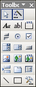
Toolbox
 Click a button to jump to its description or just scroll the page.
Button: Handle


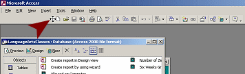
At the left end of a toolbar is an area called
the handle, which looks a bit different in different versions of MS
Access. Hover over this area and the mouse pointer changes to the
Move shape  .
Drag while in the Move shape and the toolbar will move. If you drag
perpendicular to the bar, it will undock and float. Drag to another edge
of the window and the toolbar will dock there.
.
Drag while in the Move shape and the toolbar will move. If you drag
perpendicular to the bar, it will undock and float. Drag to another edge
of the window and the toolbar will dock there.
Toolbar dragged to the right
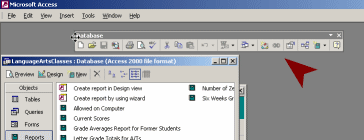
Toolbar floating
Toolbar docked at left
Button: Select

 When Select Button on the Toolbox bar is
active, it has a border and a contrasting
background and the mouse pointer has the Select arrow shape
When Select Button on the Toolbox bar is
active, it has a border and a contrasting
background and the mouse pointer has the Select arrow shape
 .
When it is inactive
.
When it is inactive
 , there is no border.
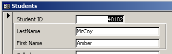
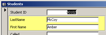
To select an object on a form or report (in Design view), the mouse
pointer must have the Select shape. Once the object has been selected,
then you can move, resize, format, change the properties, or delete the
object.
Button: Control Wizard

When the Control Wizard is
active (blue border and darker gray background) and you insert a
control onto a form or report, a wizard dialog will appear to help you.
When the Control Wizard is inactive
 (no border), no wizard will appear.
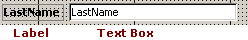
Button: Label

You use a label on a form or report to add items like report titles and to label the content of text boxes or option groups. The button shows an upper case A and a lower case a.
Labels are static, that is, their text does not change. Text boxes, on the other hand, show data from a field or a calculation. So text boxes normally change from record to record.
Button: Text Box

A text box shows the values from a field or from a calculation in a form or report. Note that the Text Box button shows the lower case letters ab with a cursor bar at the right.
Buttons: Option Controls

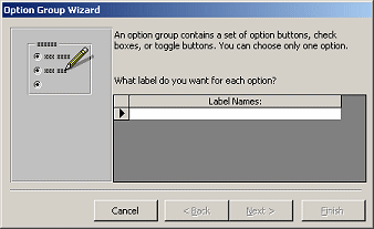
Use an option group
 when your users need to
choose one option from a limited number of options. You can use option
buttons
when your users need to
choose one option from a limited number of options. You can use option
buttons
 (also called radio buttons), checkboxes
 , or toggle buttons
 .
.
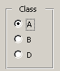
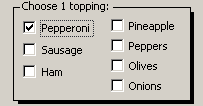
Option Groups using option buttons, checkboxes, toggle buttons
Access allows only 1 choice in an option group, no matter what type of controls you use. This is different from web pages and Windows dialogs, which normally use checkboxes when multiple items can be selected from the group and use toggle buttons only for simple OK, Yes/No or On/Off choices.
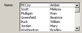
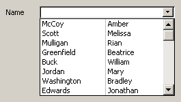
Buttons: Lists
Combo Box
 and List Box

When you want the user to select from a pre-defined list, you can use either a combo box or a list box.
A
list box show all or at least several of the list items.
You cannot type in a value that is not in the list already. You can type
the first letter of an item to move quickly to that part of the list.
This works better if the items are in alphabetical order.
A
combo box is a drop-list, so it takes up
less room on your form than a list box. You can type the first several
characters, instead of just the first one, to move to that part of the list.
You can configure the list to accept or to not accept new values.
Combo box
closed:
Combo box
open:
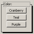
Button: Command Button

A command button performs an action, like opening a form or report, closing a window, or doing a calculation after the user entered numbers.
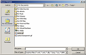
Button: Image

 The Image button opens the Insert Picture
dialog. The dialog opens at My Documents. You can then navigate to the image that
you want to put in your form or report. Once you click on OK, the pointer
changes to the Image shape
The Image button opens the Insert Picture
dialog. The dialog opens at My Documents. You can then navigate to the image that
you want to put in your form or report. Once you click on OK, the pointer
changes to the Image shape
 and you
can click on the form or report to insert a full size image. You can also drag on your form or report to
set the size of the image.
and you
can click on the form or report to insert a full size image. You can also drag on your form or report to
set the size of the image.
Alternate method: Use the menu command, Insert | Picture...
 Problem: Only part of image shows
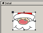
The default setting for images is to
Clip them to fit the size of the rectangle that
you drew with the pointer. You can change that in the object's Properties
dialog to Zoom. Then the image is resized to
fit the area.
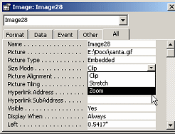
Clip and Zoom
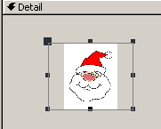
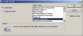
 Where is Clip Art? MS
Access does not make it easy to use clip art like the other Office
programs. You can get to clip art with the command Insert | Object... |
choose Create from File and then choose Microsoft Gallery in the list of Object
Types.
Where is Clip Art? MS
Access does not make it easy to use clip art like the other Office
programs. You can get to clip art with the command Insert | Object... |
choose Create from File and then choose Microsoft Gallery in the list of Object
Types.
Buttons: Object Frame -

unbound
& bound
You can insert an outside object like a spreadsheet or a document or an image using an object frame.
 Use
Unbound Object
Frame when the object remains the same for every record.
Use
Unbound Object
Frame when the object remains the same for every record.
 Use Bound
Object Frame
when the object changes with each record
Use Bound
Object Frame
when the object changes with each record
Button: Page Break

The Page Break button inserts a page break
indicator  onto your form or report. This only affects the printed version, not the
onscreen version.
onto your form or report. This only affects the printed version, not the
onscreen version.
Button: Tabs

When you have a large number of data fields, you can group the fields onto two or more tabs. This keeps your interface cleaner and easier to work with... IF you have divided the data logically!
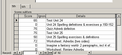
A subform with two tabbed
pages -
5th grading period and 6th grading period
Button: Subform/Subreport

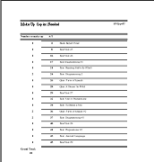
A subform or subreport shows data from another table or query that is related to the current records. The source for the main form must be joined to the source for the subform in a unique way.
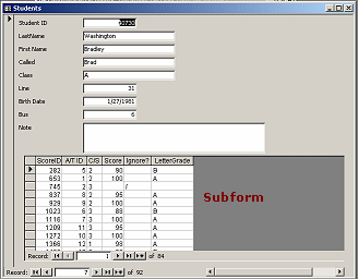
Students info form with
subform
showing assignment scores
Button: Line

Lines can help separate parts of your form or report, making the data easier to read and understand. Decorative lines can add interest to a plain report.
After you click the Line button, the mouse pointer changes to the Line
shape . Click on your form or
report or data access page to see a default-sized line there. Click and
drag to create a line of a different length.
. Click on your form or
report or data access page to see a default-sized line there. Click and
drag to create a line of a different length.
Lines divide the subtotals and the grand total.
Decorative lines in the Title area
Button: Rectangle

Clicking the Rectangle button changes the mouse pointer to the
Rectangle shape .
Click in the form, report, or data access page to create a default
rectangle. Click and drag to create a rectangle of the size and
proportions that you want.
.
Click in the form, report, or data access page to create a default
rectangle. Click and drag to create a rectangle of the size and
proportions that you want.
Such rectangles can be sent Back underneath other objects to visually separate them on the form, report, or data access page. (Format | Send to Back)
You can format the borders of your rectangle as to their thickness, color, style (like solid or dashed or dotted) and special effects (like Etched or Shadow). You can also change the fill color.
A transparent rectangle and a colored rectangle
Button: More Tools

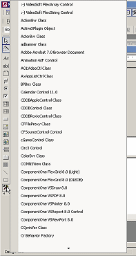 There are
many more tools that you can use, if you know what they do! The More
Tools button opens a very long list of objects that can be added to
forms, reports, and data access pages. On my computer this list has 7
screens of 30 items each!
There are
many more tools that you can use, if you know what they do! The More
Tools button opens a very long list of objects that can be added to
forms, reports, and data access pages. On my computer this list has 7
screens of 30 items each!
Most of the items in the More Tools list are specialized for particular programs. But MS Access will let you use them, including many from Microsoft which insert objects from other Microsoft programs.
If you select one of the object types in the list, the mouse pointer
changes to the Tool shape
 . You
can either click to place a default-sized object, or drag to size it
yourself.
. You
can either click to place a default-sized object, or drag to size it
yourself.
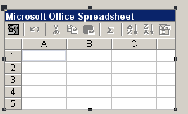
An Office 9.0 spreadsheet inserted using the More Tools list.
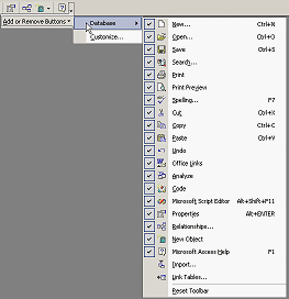
Button: Toolbar Options


The
down arrow at the far right of a toolbar opens a cascading menu: Add or
Remove Buttons. You can customize the toolbar by
adding or removing buttons.
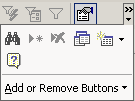 A double arrow above the down arrow tells you that the window is too narrow to show
all of the buttons on the bar. Clicking the arrow in this case will open a palette of
the hidden buttons, in addition to the menu Add or Remove Buttons.
A double arrow above the down arrow tells you that the window is too narrow to show
all of the buttons on the bar. Clicking the arrow in this case will open a palette of
the hidden buttons, in addition to the menu Add or Remove Buttons.
All Office programs display the most recently used buttons when there
is not room for all of them.
As you continue to work in a small window, which buttons are showing will change.
This can be confusing!
|
Teachers: Request permission to use this site with your class Copyright © 1997-2012 Jan Smith <jegs1@jegsworks.com> All Rights Reserved |
~~ 1 Cor. 10:31 ...whatever you do, do it all for the glory of God. ~~