
Jan's Working with the Web
Formatting: Format Text
Browsers come with default settings for normal text and for headings. But you will certainly want to use something different on your pages from time to time.
Unfortunately, with old HTML methods you must make the changes to each spot yourself. But with CSS you can use styles to change all tags of a particular type to a different font and style at once. Plus you can create special styles to use in special places. That's why CSS is worth using!
Examples of Text Formatting with CSS:
font-family, font-size (xx-large), color, text-shadow (a CSS3 feature)
font-family, color, font-variant (small caps), width, background-color, text-align (center in width)
font-family, font-size (x-small), color, font-weight (bolder), font-style (italic), text-align (center)
font-family (downloaded Tangerine), font-size (x-large),color, text-align (right)
Downloadable Fonts: The fourth example above downloads a
free font (IF you are online!) that probably is not on your computer. It's from Google Fonts![]() . (See
the screenshots below for how different browsers display this.) Google does
part of the coding for you. Complete directions
for Google Fonts
. (See
the screenshots below for how different browsers display this.) Google does
part of the coding for you. Complete directions
for Google Fonts![]() You just have to add one LINK line and
then create a style that uses the font. Google does the heavy lifting. It
detects which browser you are using and sends the font in a file format that
your browser can use. This process uses the @font-face feature
of CSS to tell the browser where to go online to find the font.
You just have to add one LINK line and
then create a style that uses the font. Google does the heavy lifting. It
detects which browser you are using and sends the font in a file format that
your browser can use. This process uses the @font-face feature
of CSS to tell the browser where to go online to find the font.
Unfortunately, some browsers/versions do not understand @font-face. Some will only accept certain font file formats, which makes it harder to use the @font-face method on your own. There are many ways for things to go wrong! That's why you should include several fonts in a font-family and not just one font, even when you are providing the font!
Browsers Display Differently!
You really, truly don't know what your viewer will see.
Here are screenshots of how the three major browsers showed the four examples of formatted text above on the same computer. (You can open it separately.) The page does not look quite the same in all browsers. Glitches occurred which I cannot explain.
The windows were sized to be the same width for the screen shots below. The first three formatting examples use fonts that should be on a recent Windows PC - Arial Black, Arial, and Verdana. The fourth example uses Tangerine, a Google Web Font that should download automatically.
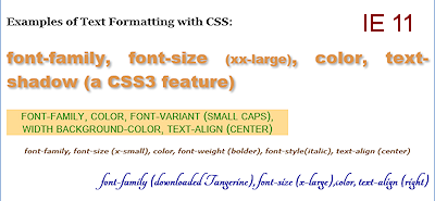
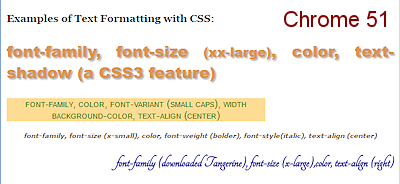
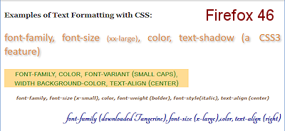
What differences do you see? Note that IE 9 and earlier will not render the text-shadow.
-
Browser Glitch
In Example 1: Firefox did not use the first font in the font-family list, Arial Black, but used the next one Calibri. This is a glitch. Arial Black was on the computer because the other two browsers used it! On another computer, Firefox correctly used Arial Black. Firefox seems to ignore fonts that have names with more than one word, even when the names are correctly typed between quote marks. There are more ways for things to go wrong than my poor brain can hold! -
Different fonts cause other differences
In Example 2: The colored background is a slightly different height in each browser. This is related to the difference in font height and line spacing. Each browser apparently handles 'small caps' a little differently. - Font Sizes
All four examples: The font sizes are rendered slightly different between browsers. This is a regular design issue. At times there is enough difference to make the text wrap differently.
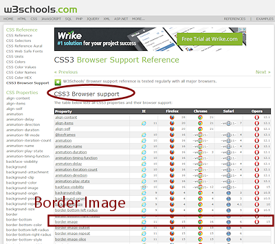
Which Browsers Support Which CSS Features?
There is a LONG list of CSS properties and CSS3 has a lot of new features. But many of those features are not yet supported by any browsers. Some features have an equivalent feature that is specific to that browser. So you can use those features only if you include the special codes for each browser. Oh, for an agreement among the browsers!
Example of special property codes: BORDER-IMAGE property
Creating a border using an image is defined in CSS3 but it took a while for the major browsers to accept the CSS3 coding. IE did not support the border-image property at all until IE11. Chrome, Firefox, Safari, and Opera supported it with their own interpretations at first but now support the CSS3 coding. Wonder why they found that easier than doing it the CSS3 way to start with?
Example of coding for individual browsers:
{
-moz-border-image:url(border.png) 30 30 round; /* Firefox */
-webkit-border-image:url(border.png) 30 30 round; /* Safari and Chrome */
-o-border-image:url(border.png) 30 30 round; /* Opera */
border-image:url(border.png) 30 30 round;
}
Interactive example![]() at
W3Schools.com
at
W3Schools.com
 New
CSS3 Properties: Visit W3Schools for a complete
list
New
CSS3 Properties: Visit W3Schools for a complete
list![]() of
which browsers support which features. The version number listed is the first one that supports the property.
of
which browsers support which features. The version number listed is the first one that supports the property.
At the left on that page is a
complete list of CSS properties. Some items expand to show variations. The
pages on the W3Schools.com site are a great reference source about HTML, HTML5,
and CSS.
External Style Sheet
When you want to use your styles on more than one sheet, you can put them all in an external style sheet. Hector's site does not need such an external style sheet yet. It only has one page! But we need to plan for the future.
Remember that a CSS file does not need the code that an HTML page needs. No DOCTYPE or HTML or HEAD or BODY tags. Just a simple statement of the various styles.
| |
Step-by-Step: Format Text |
|
| What you will learn: | to center an image on the page to create an external style sheet to style H2 - font-family, color, text-align to style H3 - font-family, color to style H4, P, and create a class to make text bold and italic to use a downloadable font |
Start with: ![]() , hector 19-Lastname-Firstname.htm, resource files
, hector 19-Lastname-Firstname.htm, resource files
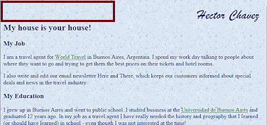
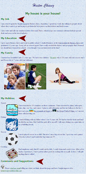
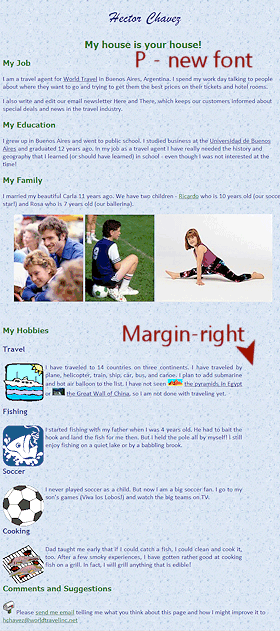
You will be making some changes to make Hector's page more appealing and colorful. By changing the title to use just the text graphic of Hector's signature, the top of the page will look cleaner. Then you will change the font, size, and color of the headings.
-
If necessary, open hector19-Lastname-Firstname.htm in your text editor.
-
 Save
as hector20-Lastname-Firstname.htm.
Save
as hector20-Lastname-Firstname.htm. - Remove heading:
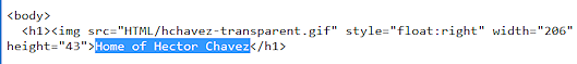
Select the heading text in the H1 tag, Home of Hector Chavez.
Be careful not to include the anchor and the image of Hector's signature.
-
 Delete.
 - Save.
[hector20-Lastname-Firstname.htm]
-
Switch to your browser and view the page.
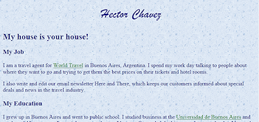
The signature image is still there, floating at the right, but the H1 text is gone.
Center Image on Page
To center an image, you need to center its container, often a P or DIV tag. But first you need to remove some styling you added earlier.
If you wanted all H1 headings to be centered, you would create a declaration in an external style sheet for that.
- Edit the IMG tag for the signature to remove the
STYLE attribute which is making it float.
- Add a STYLE attribute to the H1 tag to center its
contents:
<h1 style="text-align:center;"><img src="HTML/hchavez-transparent.gif" height="43" width="206"></h1>
 About
the cascade: The style that floats the image would override any
alignment from any other styles. So the floating has tobe removed so that
the paragraph alignment will center the image.
About
the cascade: The style that floats the image would override any
alignment from any other styles. So the floating has tobe removed so that
the paragraph alignment will center the image.
-
 Save.
Save.
[hector20-Lastname-Firstname.htm]
- Switch to your browser and view the page.
The signature image is centered.
Create External Style Sheet
You are going to move the current internal styles to a separate external style sheet.
-
 In the source code for hector20-Lastname-Firstname.htm, copy the
lines between the opening and closing STYLE tags.
In the source code for hector20-Lastname-Firstname.htm, copy the
lines between the opening and closing STYLE tags. - Open a new copy of Notepad.
A new blank document is showing. This will become your external style sheet. - With the cursor at the top of the blank page, Paste.
-
Save
as hchavez-Lastname-Firstname.css to the same folder on your Class disk as the various versions of
Hector's page. Change the Lastname-Firstname part to your own name, of course.
An external style sheet does NOT have a BODY tag or an HTML tag or a HEAD section. Adding extra parts will usually keep the style sheet from being used.
External Style Sheet: H2 - font-family, color, text-align
 It
is a common design practice to use a sans-serif font for headings and a
serif font for text, or the other way around. You will find different
recommendations about which type is best for body text and for headings.
The current recommendations lean toward using sans-serif fonts for
quantities of text on screen but to use serif fonts for printed material.
Your browser defaults probably do not follow this recommendation!
It
is a common design practice to use a sans-serif font for headings and a
serif font for text, or the other way around. You will find different
recommendations about which type is best for body text and for headings.
The current recommendations lean toward using sans-serif fonts for
quantities of text on screen but to use serif fonts for printed material.
Your browser defaults probably do not follow this recommendation!
Arial and Calibri are sans-serif fonts. The letters in these fonts do not have the little extra pieces like Times New Roman and Georgia use, which are serif fonts.
The browser default style for an H2 heading is usually larger and bolder than regular text. You will add some formatting to that using an external style sheet.
- Edit the external style sheet that you just saved to add a style
for H2 elements below the existing style. The style has the following features:
- centered
- text color is green
- font is Tahoma, Trebuchet MS, Arial, or sans-serif
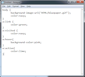
h2 {
text-align:center;
color:green;
font-family:Tahoma,'Trebuchet MS', Arial, sans-serif;
} -
Save.
[hchavez-Lastname-Firstname.css]
-
Switch to your browser and view hector20-Lastname-Firstname.htm
Nothing has changed! Whoops. You have to add a LINK to the HEAD of the page. -
Switch to the editor window that shows hector20-Lastname-Firstname.htm.
- Edit the HEAD section to include the following:
(Be sure to use your own name!)<link rel="stylesheet" href="hchavez-Lastname-Firstname.css" type="text/css">
-
 Delete the STYLE section since you moved it to the external style sheet.
 -
Save.
[hector20-Lastname-Firstname.htm] - Switch to your browser and view hector20-Lastname-Firstname.htm
The H2 heading updated to use the new style. Nothing else changed because you copied the original styles to the external style sheet.
 Problem: Part or all of the
styles are not used
Problem: Part or all of the
styles are not used
Possible causes:
- Failed to LINK an external style sheet
- Mistyped the LINK code.
- External style sheet was moved or renamed.
- Same errors as were mentioned about internal style sheets
- Punctuation of styles - colons, semicolons, quotes, parentheses, and brackets.
- Spelling of the name of attributes and values, especially font and color.
- Spelling and punctuation of class in the tag where you wanted to apply it.
- Did you actually create the style named in the tag?
- Did you apply the correct class to the tag?
External Style Sheet: H3 - font-family, color
Browsers have default settings for the headings - H1, H2, H3, H4, H5, H6. They are sized relative to the default browser text size. When you format the headings, these default sizes still apply unless you apply a particular font size.
-
 Switch to the Notepad window
showing the CSS file, your external style sheet.
Switch to the Notepad window
showing the CSS file, your external style sheet.
-
Add a style for H3 with the same color and font-family that you used for H2.
Do not center this element.h3 {
color:green;
font-family:Tahoma,'Trebuchet MS', Arial, sans-serif;
} -
Save.
[hchavez-Lastname-Firstname.css] -
Switch to your browser and Refresh.
- Scroll to see all of hector20-Lastname-Firstname.htm
All the H3 headings updated to use the new style. That was easier than formatting them each separately, for sure!
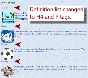
External Style Sheet: H4, P, Class hobby
The subheadings under My Hobbies are in term/description form. That's not what those tags are really for. We used them just to illustrate one of the types of list. What we really need is a couple of styles that will create a new look.
-
 Switch to your text editor to edit hector20-Lastname-Firstname.htm.
 -
Edit the list under My Hobbies so that the subtitles, like Travel and Fishing are H4 tags.
-
Remove the <dl> and </dl> tags.
-
Change the DT tags to H4.
Don't forget to edit both the opening and the closing tags! <dt> becomes <h4> and </dt> becomes </h4>. -
Similarly, change the DD tags to P.
-
Save.
[hector20-Lastname-Firstname.htm] -
Switch to your browser and Refresh.
The subtitles are shown as bold, using the default font. - Switch to your text editor to edit the external style
sheet, hchavez-Lastname-Firstname.css.
-
Add a new style for H4 tags that sets the font-family to 'Trebuchet MS', Arial, sans-serif and the font size to large.
h4 {
font-family:'Trebuchet MS', Arial, sans-serif;
font-size: large;
}  Add a new style for P tags that sets the
font-family to Calibri, Arial, sans-serif.
p {
Add a new style for P tags that sets the
font-family to Calibri, Arial, sans-serif.
p {
font-family:Calibri, Arial, sans-serif;
}-
Add a new class named hobby which sets the right margin at 100px and justifies the text.
.hobby {
margin-right:100px;
text-align:justify;
} -
Save.
[hchavez-Lastname-Firstname.css] -
Switch to your text editor to edit hector20-Lastname-Firstname.htm.
-
Edit the P tags in the Hobbies list to use the new class, hobby.
<p class="hobby"> -
Save.
[hector20-Lastname-Firstname.htm] -
Switch to your browser and Refresh.
You may need to make the window narrower to see the effect of using the class 'hobby'. - Scroll to see all of hector20-Lastname-Firstname.htm.
All of the paragraphs updated to use the new font! The Hobbies list is indented from the right. Sweet!!
Bold and Italic
Most browsers will render the logical tags <strong> and <em> the same as the tags <b> and <i>,
bold and italic. But text readers use vocal emphasis for STRONG and EM but
may not for B and I tagged text.
[Remember that your code may wrap differently in your editor and your page may wrap differently in your browser.]
-
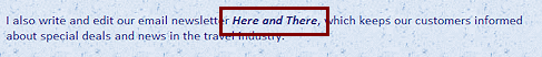
In the section My Job, find the name of the newsletter, Here and There.
- Wrap the name with both STRONG and EM tags.
Be sure to get the closing tags in the correct order.
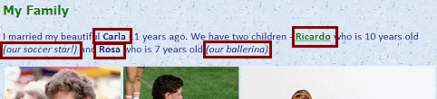
<strong><em>Here and There</em></strong> - In the My Family section, surround the name Carla with B tags.
- Repeat for the names Ricardo and Rosa.
- Select the phrase in parentheses (our
soccer star!) and surround it with I tags
- Repeat for the phrase (our ballerina)
<h3>My Family</h3>
<p>I married my beautiful <b>Carla</b> 11 years ago. We have two children - <a
href="family/ricardo/index.html"><b>Ricardo</b></a> who is 10 years old <i>(our soccer star!)</i> and <b>Rosa</b> who is 7 years old <i>(our ballerina)</i>.</p>
<p style="text-align:center"><img src="HTML/carla2.jpg" width="170" height="212" alt="Photo: Carla and Hector Chavez" title="Our anniversary trip to the World Cup! Such fun!!"> <img src="HTML/ricardo2.jpg" width="170" height="212" alt="Photo: Ricardo at soccer" title="Ricardo waiting to get into the game... at last"> <img src="HTML/rosa2.jpg" width="284" height="213" alt="Photo: Rosa at ballet" title="Rosa worked so hard to get flexible!"></p> -
 Save.
Save.
[hector20-Lastname-Firstname.htm] - Switch back to your browser and look for the
changes.
Downloadable Font
CSS3 has a new feature, @font-face, which allows the browser to download a font to use on the page. BUT, you must have permission from the copyright holder of the font to share the font in this way. Most of the fonts on your computer came with programs that you or your school or company paid for. That gave you the right to use those fonts in those programs. It did not give you the right to give those fonts away over the Internet.
Google Web Fonts and several other sites offer free fonts. You could use a free font for special effects on your web pages but to make sure your viewers see that special font, you must upload it to your web space and then use the @font-face feature to send out the font from your web server.
Instead, for this topic, you will use Google Web Fonts. That way we won't have to worry about whether you have a place to upload a font!
Be careful to include back-up fonts in your font-family in case something goes wrong and the viewer's browser does not get to use your special font. Glitches in the process seem to be common!
-
 Click this link Google
Web Fonts
Click this link Google
Web Fonts  to open the site in your browser.
 -
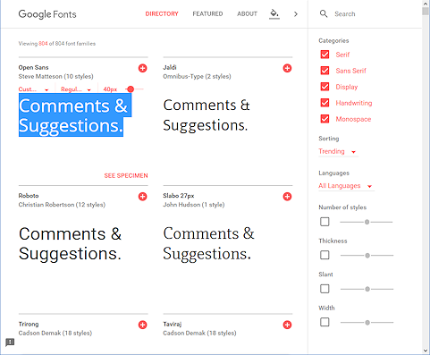
Type Comments & Suggestions in place of whatever text shows in the first example.
This is the text that you will format with a font from this site. The default text may not show the ampersand, which is important in this heading.
-
Click the button Apply to All.
-
Scroll through several fonts and see the inventiveness of font designers.
How many different shapes for an ampersand did you see?
Do you find it hard to pick out favorites?Suggestion: Use your mouse scroll wheel, if you have one, to scroll the previews.
It can take a LONG time to view all of the fonts. There were 804 when I took the screen shot.[June 2016]
Tips: You can search for a name, if you already know one. Or, choose a category or another feature to shorten the list.
Now you will use one of these lovely fonts! It takes two steps. You will have to add a LINK tag to the HEAD and then create a style that uses the font.
-
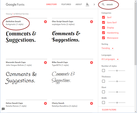 In the Search box, type swash.
The previews automatically change to show only fonts with 'Swash' in the name.
Berkshire Swash has a nice look with a fancy ampersand, &.
Problem:
No Berkshire Swash found
Solution: Are the filters off? If not, Clear Filters.
If they are, use another font with an interesting look. Your instructor may have a preference. 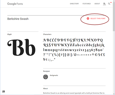
In the preview for Berkshire Swash, click on Bershire Swash.
A page opens that displays all of the characters.
The directions for using this font appear.-
Click on SELECT THIS FONT.
A popup at the bottom of the window shows that one font has been selected.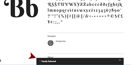
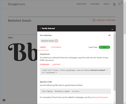 Click on 1 Family Selected.
A popup shows on top of the page with code and directions on how to use the code.- Select the code for the LINK and copy.
-
Switch to your text editor to the source code for Hector's page.
-
LINK code: In the HEAD section paste the code you just copied.
This code tells the browser where to go to find the font named Berkshire Swash.
Notice that there is a + where there would usually be a space in the font name. This is important!
The same code will work for any of Google's fonts if you change the font name.
-
Edit the H3 tag that contains the text "Comments and Suggestions" to include an ampersand & instead of the word 'and'.
If you just type &, your browser might figure out what you meant or it might get very confused. It is not worth the risk! Always use HTML code for characters that are used in scripting!
- Add the class to the H3 tag at the bottom of Hector's page:
<h3 class="comment">Comments & Suggestions</h3>
-
Save.
[hector20-Lastname-Firstname.htm] - Switch to view the external style sheet in your text editor.
- New Class for H3 only: Add to the external style sheet a class that applies only to H3 elements and uses the new font. You must also include other fonts
in the font-family in case something goes wrong with your code or the font's web
server.
h3.comment {font-family:'Berkshire Swash','Britannic Bold', cursive;}
The single quotes around the font names with spaces are very important, too!
Usually you want to choose similar fonts to list in the font-family. Britannic Bold is not much like Berkshire Swash. This time we want to be able to tell easily if the download process worked.
-
Switch to the browser and Refresh.
What do you see? Different browsers/versions may show different results!Examples:
 IE: Used the downloaded the font at normal font weight instead of the Bold style that is part of the default H3 definition. Versions of Internet Explorer before IE11 fail to download the font.

 Chrome: Used the downloaded font at normal font weight

 Firefox: Using downloaded font at Bold font weight from H3 default style.

Perhaps we should have included a font-weight property to override the default H3 styling. <sigh>
|
|
| © 1997-2017 Jan Smith All Rights Reserved |
Site Map What's New |
Privacy Policy Terms of Service Copyright Acknowledgements |
~~ 1 Cor. 10:31 ...whatever you do, do it all for the glory of God. ~~
Last updated: March 22, 2017