
Jan's Working with the Web
Formatting: Horizontal Rule
The tag <hr> is interpreted by a browser as a line across the web page, called a horizontal rule. Such a line is not supposed to be decorative, but is supposed to show the logical divisions in your page. For example, rules are often used to separate the title and the footer from the rest of the text.
Scroll the current page and find the purple horizontal rules. For example: A rule separates the bread crumbs from the lesson content. A rule separates the beginning information from the step-by-step section. A rule separates topics in the step-by-step directions.
The base style used for HR in Working with the Web:
hr {
background-color : #652284;
color : #652284;
clear:both;
margin-top:10px;
border:thin #652284 solid;
}
In HTML5 the HR tag is no longer described by how it looks (presentational terms) but only in terms of what it means (semantic terms). The whole approach with HTML5 is to define parts by what they mean. The same code can be used to show the content visually, or by sound, or with Braille, or with whatever method you need to use to understand the content. So the old HTML method of adding attributes to the tag are out and CSS methods for formatting the rule are in.
A horizontal rule is actually a very narrow box with a 3D border by default. The default size is a length of 100%, a height of 2 px, and a 3D style border. Most people agree that it is quite boring! Sometimes you have to do some tinkering with your styles to get a horizontal rule in just the right place.
Examples of Horizontal Rules:
Set length: Red background and border, 5 px height, 300px width, solid border
Percentage length: Green background and border, 'thin' height, 80% width, solid border
Dashed border: White background, 8 px height, 100% width, blue border, dashed border
Centered image: Image background - one copy of the image, no-repeat
Image repeats across: Image background, repeated
Minimum Height for HR: You don't want to set a height for an HR that is less than 3 px. It won't render in some browsers. You need 1 px for the 'content' of the rule and 2 px for the top and bottom borders of the rule. That adds up to 3 px.
Height for Image Rule: You must set the height of the rule large enough to hold the whole image. For the diamond shapes used above, the rule height was set to 30 px.
| |
Step-by-Step: Horizontal Rule |
|
| What you will learn: | to add a horizontal rule to format a horizontal rule in external style sheet to format IMG and class in external style sheet |
Start with: ![]() , hector 20-Lastname-Firstname.htm, resource files
, hector 20-Lastname-Firstname.htm, resource files
Add Horizontal Rule
-
If necessary, open hector20-Lastname-Firstname.htm in your text editor to see the source code.
-
 Save
as hector21-Lastname-Firstname.htm to the web project2 folder on your Class disk.
Save
as hector21-Lastname-Firstname.htm to the web project2 folder on your Class disk. - Move your cursor to the right of the closing H2 tag, </h2>, of the second line of text on the page and press ENTER.
This creates a blank line below.
- Type <hr>.
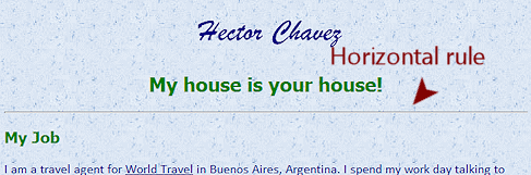
<h2 style="clear:both">My house is your house!</h2>
<hr>
<h3>My Job</h3> -
Save.
[hector21-Lastname-Firstname.htm] -
 Switch to your browser and edit the address to show the hector21 version.
 - Refresh.
A thin line shows across the page below the subtitle.
External Style Sheet: Horizontal Rule
You can use CSS to choose the length, the height (that is, the thickness), and the color of the horizontal rule. Some browsers do not render these features quite as expected.
The method below creates a flat, solid color line in all three browsers, IE, Chrome, Firefox. You will set both the border and the background-color to get the same results in all three browsers.
-
Switch to the text editor and show the external style sheet, hchavez-Lastname-Firstname.css.
- Add a style for all the HR tags.
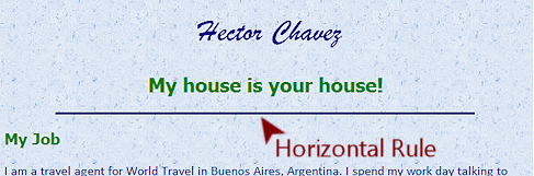
hr {
background-color:navy;
height:1px;
width:80%;
border:1px solid navy;
}This code creates a flat, solid line with total height 3 pixels and color navy. The line's height comes from 1 pixel from HEIGHT plus the top and bottom border, 1 pixel each. Total height is 3 px. The border and background must be the same color to get a flat line.
 Compact declaration: The code
above for border is an example of a compact declaration: width (of the
border), line type, color. Many compact declarations must be in a specific order! Of course, you can also set
these separately as border-width, border-style, border-color. If
you do not set both the border and background-color for HR, you may not see any changes to the
default look.
Compact declaration: The code
above for border is an example of a compact declaration: width (of the
border), line type, color. Many compact declarations must be in a specific order! Of course, you can also set
these separately as border-width, border-style, border-color. If
you do not set both the border and background-color for HR, you may not see any changes to the
default look. -
Save as hchavez21-Lastname-Firstname.css to the web project2 folder on your Class disk.
 We have been saving Hector's page with a different name in each lesson to make it easier to go back to an earlier stage. Now that there is an external style sheet, we will save that sheet with a matching number. You will have to edit the LINK so that the version of Hector's page pulls the correct external style sheet.
 - Switch to your text editor window that shows the source code for Hector's page.
- Edit the LINK in the HEAD section to read:
<link rel="stylesheet" href="hchavez21-Jan-Smith.css" type="text/css">
-
Save.
[hector21-Lastname-Firstname.htm] - Switch to your browser and Refresh.
Is the horizontal rule different now? -
 Switch back the text
editor and add a horizontal rule between each section by adding <hr> before the H3 or
H4 tag
for the next section, (except Travel) like:so I am not done with traveling yet.</p>
Switch back the text
editor and add a horizontal rule between each section by adding <hr> before the H3 or
H4 tag
for the next section, (except Travel) like:so I am not done with traveling yet.</p>
<hr>
<h4 style="clear:both">Fishing</h4> -
Save.
[hchavez21-Lastname-Firstname.css] - Switch to the browser and Refresh.
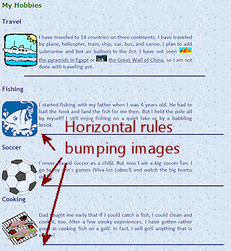
Hmmm. Some of the new horizontal rules are bumping into the floating images on the left instead of being centered in the available space. Did you expect that?
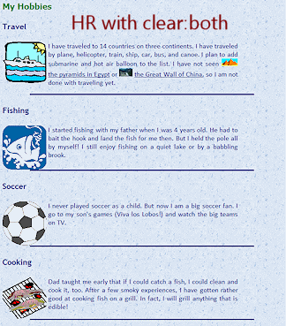
You need to make the HR drop down clear of the images. It is easy to add another declaration to the HR style in the external style sheet.
-
 Switch back to your text
editor and the CSS file.
Switch back to your text
editor and the CSS file. - Edit the HR style to include clear:both;.
hr {
background-color:navy;
height:1px;
width:80%;
border:1px solid navy;
clear:both;
} -
Save.
[hchavez-Lastname-Firstname.css] - Switch to the browser and Refresh.
Better.
External Style Sheet: Format IMG and Class
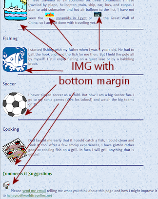
Those horizontal rules are really close to the bottom of the floating images. It would be better if there was a bit of space.
You have a couple of options. You could add some vertical space below each image with an inline style or a class. Or you could add some vertical space to the HR styling. Let's do a style for the IMG tags that adds clear space at the bottom.
You will create styling in an external style sheet for IMG tags and then create a class to apply to some IMG tags.
-
 Switch back to your text
editor and the CSS file.
Switch back to your text
editor and the CSS file. -
Add a declaration for images:
img {margin-bottom:10px;} -
Save.
[hchavez-Lastname-Firstname.css] -
Switch to the browser and Refresh.
Those images on the left look better! The only problem with this method is that you might not want ALL images to have space at the bottom. -
Look at the two inline images in the Travel paragraph and the mail box at the bottom of the page.
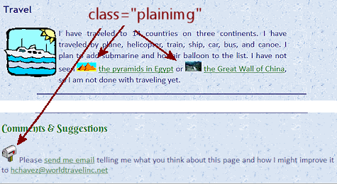
They also got the bottom margin. Not a happy effect in those cases! In that case, you need to create a class and apply it to selected images. -
Switch back to your text editor and the CSS file.
-
Add a new class named .plainimg with margin set to zero pixels all around.
.plainimg {margin:0px;} -
Save.
[hchavez21-Lastname-Firstname.css] - Swtich back to the text editor with Hector's page
- Edit the IMG tags for the pyramids, China, and
the mail box to include the attribute class="plainimg".
Partial code:
<img class="plainimg" src="HTML/pyramids2.gif"
<img class="plainimg" src="HTML/china2.jpg"
<img class="plainimg" src="HTML/Mail.gif" -
 Save.
Save.
[hector21-Lastname-Firstname.htm] -
Switch to the browser and Refresh.
Ah. Much better! The three inline images sit on the same line as the text.
-
 Experiment: Window
size effect on page layout
Experiment: Window
size effect on page layout
Horizontal rules are normally 100% the width of the container, whether its the whole page or a DIV or inside a table. What happens when the window size changes and the rule was not 100% width? What else changes as the window width changes?- Drag your window edge to make the window much narrower.
- Scroll the page.
 What was affected? Any problems that need fixing?
 - Maximize your window.
- Scroll the page.
What was affected? Any problems that need fixing?
If your source code matches the lesson directions, everything should wrap nicely, even at very large or very small window sizes. If you spot a glitch, just dig around in the source code to find the error.
Your recent work clearly illustrate that the web author does NOT have complete control over what the viewer of the web page sees. There are many factors involved. Keep this in mind... always!!
|
|
| © 1997-2017 Jan Smith All Rights Reserved |
Site Map What's New |
Privacy Policy Terms of Service Copyright Acknowledgements |
~~ 1 Cor. 10:31 ...whatever you do, do it all for the glory of God. ~~
Last updated: March 22, 2017