
 Previous
Jan's Working with the Web
Format for Print: @media, @page
Solutions to screen display issues may cause problems in the print-out of the page. Or perhaps you need to rearrange parts of the page for it to print neatly. CSS lets you create different styles that apply only when printing. You can use two special style sections, @media print and @page.
@media print
Styles that you want to apply only when printing go into a @media print section of your internal or external style sheet. You can pick fonts and font sizes that work better when printing than they do on screen. Or, perhaps you need to rearrange parts of the page to fit better on paper. Or, maybe you need to hide parts of the page that are not useful in print, like menus or ads. There are several other @media types , including @media screen.
How it works: In your style sheet (internal or external), add a section at the end to hold styles that need to be different for print, @media print { }. Put all such styles between the braces. Be careful not to type a space after the @!
Example:
Changes the font-family for headings and paragraphs. Sets a font-size in points for paragraphs. Drops the positioning for an element with class 'positioned'. Hides an element with ID 'menu'.
@media print {
h1 {font-family: "Britannic Bold", Broadway, Calibri, sans-serif;
}
p {font-size:10pt;
font-family:Cambria, "Times New Roman", serif;
}
.positioned {position:static;}
#menu {display:none;}
}
Matching braces: Be careful to have matching sets of braces, { } .
The @media print section has its own braces plus each style inside the section has a pair of braces. That last closing brace is easy to omit.
Apply classes: Of course, you have to apply any classes you created in this @media print section.
Measurements: You can use point sizes for your fonts since this style is for printing. Do not use point sizes to set sizes for screen display. They often create text that is too small to read on screen.
 Inline Styles: Any inline styles will
override the @media print styles since inline styles come last in
the cascade of styles. This is another reason to avoid
inline styles!
Inline Styles: Any inline styles will
override the @media print styles since inline styles come last in
the cascade of styles. This is another reason to avoid
inline styles!
@page
An @page section, @page { } , in your internal or external style sheet holds styles that affect the layout on the printed page. You can set the page's margins, page orientation, page breaks, and some other features. If you put other styles in this section, they will be ignored.
The SIZE property can have values of AUTO, PORTRAIT, LANDSCAPE, or a specific width and height, like size: 8.5in 11in;. AUTO is the default.
Example:
/*To set a 2 cm margin on the page in landscape orientation*/
@page {
margin: 2cm;
size: landscape;
}
Measurements: You can use physical measurements like centimeters and inches when setting the page margins or size but not pixels or points. Percentages will be calculated against the size of the page box (usually the size of the page).
Page Breaks
It only makes sense to include a page break property in the @media print section. The property will be ignored in the @page section.
Page breaks can be required to occur before or after certain styles or elements with certain IDs. For example:
h1 {page-break-before: always;
} would start a new page before any H1 heading. That's good if you are using H1 for a chapter or section title that should start a new page.
If you want to forbid a page break occurring at a certain spot, you are out of luck. The best you can do is ask the browser to avoid breaks there if it can.
table {page-break-inside: avoid; } would keep a table from starting on one page and finishing on another, but only if the table will actually fit on one sheet of paper.
 |
Step-by-Step: @media print and @page |
|
| What you will learn: | to view your web page in Print Preview and evaluate
layout for print to use @media print in external style sheet to control print-out to add a page break in internal style sheet to use @page to control print margins to use TRANSFORM to scale DIV |
Start with:  , hector26-Lastname-Firstname.htm
Print Preview and Evaluate
Controlling what shows on the screen does not always result in a nice print-out from the browser. The paper has a fixed width. What size paper will your viewers use? Letter size (8.5" x 11") is standard in the USA but other parts of the world primarily use A4 paper (10 x 297 mm) which is about 8.27" × 11.69". So A4 is narrower and taller than Letter size.
Page Setup is controlled by the viewer, not by you. So, once again, you cannot control the whole process yourself. Different browsers handle some issues automatically, but differently. Shrink to Fit helps a little bit but does not handle all issues.
- If necessary , open the current version of Hector's page in your browser.
[hector26-Lastname-Firstname.htm] - View the print preview of Hector's page.
 IE: Right click on the page > Print preview...
 Chrome: Right click on the page > Print...
 Firefox:
  > Print
 It takes 3 pages of paper to print Hector's web page. (See illustrations below.)
Each browser handles the layout on the page a bit differently. Each browser has different default page margins. That makes the text and images wrap differently, of course, which can even change the number of pages.
Example screen shots:
 Margins for Page Setup in your browser may be different from the
illustrations. Shrink to Fit was turned on for all three browsers.
That feature would change the font size and image sizes to make the contents'
width fit between the margins. So your print preview may look different. IE:
Margins for Page Setup in your browser may be different from the
illustrations. Shrink to Fit was turned on for all three browsers.
That feature would change the font size and image sizes to make the contents'
width fit between the margins. So your print preview may look different. IE: 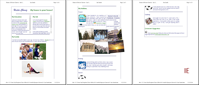 Chrome:
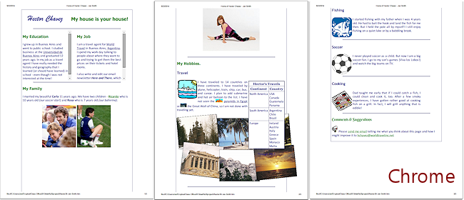 Firefox:
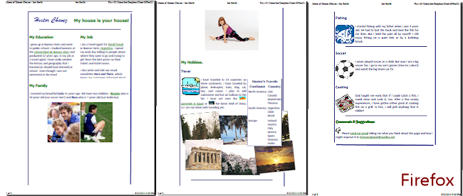
What issues do you see in your browser? There may be several!
With the default margins:
- All cut off the text in the My Job section. IE and Chrome even print the scroll bar, which is useless on paper. All it does is give you a hint that there was text that does not show in print. It would be better to see that text!
- All show the photos sticking out past the navy border of the page contents.
- All have a lot of white space down the sides. Remember that the #pagecontents style has a width of 80% as part of centering the contents in the browser window. That 80% width is applied to the area within the existing margins for the paper page. It adds up to lots of wasted space!
- IE does not show a background for the table so it is very hard to read on top of the photos.
- Any or all may print part of an image on one page and the rest on the next page. In the illustrations above, IE split the soccer ball image between pages.
- All printed the table's caption directly over the photos, where it is very hard to read.
The only issue that really requires fixing is what happened to My Job. You really, really, really don't want part of your text to be hidden in a print-out even if it does not show in the browser window. Happily, since there is only a small amount to text to rescue, you can adjust the margins. You need to do that anyway to fix the wasted space down the sides.
- Close the Print Preview.
- If necessary, open hector26-Lastname-Firstname.htm in Notepad.
- Save As hector27-Lastname-Firstname.htm to the web project2 folder on your Class disk.
- Switch to your browser and edit the address bar to show the new file. Refresh.
External Style Sheet: @media print
Hiding or resizing sections of a page is a common task for an @media print style section. A print-out usually looks better without a border. You can even remove backgrounds so that they can't print even if the browser is configured to print backgrounds.
Keep in mind that whatever changes you make with an @media print or @page style, an inline style will override those. You may have to move some inline styles to your internal style sheet. Yes, I could have avoided this minor aggravation but you need to experience why inline styles can be a bad idea.
- Switch to your text editor and open, if necessary, the current external style sheet, hchavez24-Lastname-Firstname.css.
- Save As hchavez27-Lastname-Firstname.css to the web project2 folder on your Class disk.
- If necessary, open in your text editor hector27-Lastname-Firstname.htm.
- Edit the LINK tag in the HEAD section to point to the new version of the style sheet:
<link rel="stylesheet" href="hchavez27-Jan-Smith.css" type="text/css">
- Switch back to view the external style sheet in your text editor.
 Use the key combo CTRL + END to move the cursor to the
end of the document.
Use the key combo CTRL + END to move the cursor to the
end of the document.
-
Create a section at the bottom of the CSS page for @media print with a new version of the style #pagecontents that will reduce the wasted space and will remove the border around the page contents.
Be sure to have the correct number of curly braces! The @media print item has { and } that surround the styles you want used when the page is printed. Each style has its own set of curly braces, { }.@media print {
#pagecontents {
width:100%;
border:0px;
}
}
-
Save.
[hchavez27-Lastname-Firstname.css] - Switch to your browser and Refresh and then open Print Preview again.
 The page contents can spread out over more of the paper now because of the style you created for #pagecontents in the @media print section.
The My Job section shows up in full in IE and Chrome, with their default Page Setup settings. Firefox cuts the last line in half horizontally, but there is enough to read.
What's fixed and what needs adjustment? Changing the margins can create brand new errors!
- Table of Hector's Travels is split between two pages.
- Sections Fishing, Soccer, and Cooking waste space being so wide.
IE: 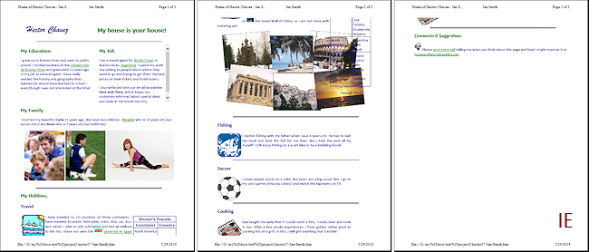 Chrome:
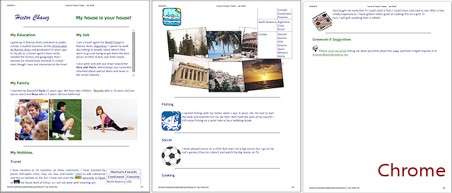 Firefox: The print preview had trouble with one of the images' position, for no obvious reason! As I scrolled the window, Mt. Rushmore kept sliding down the page. Happily the print-out was fine!
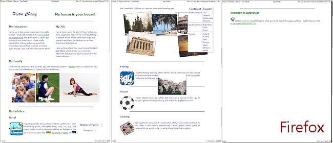 Small windows and Print Preview: In any browser, if the preview is small (from a small window or zoomed), the horizontal rules and borders may not show in the preview and text may not look like the actual font. Change
Page Margins: You can manually change the
margins for the print-out for all four margins in the Page Setup
dialog. Just remember that this setting will stick for the next time
you print from the browser. That's one reason your print preview may look different from the illustrations.
Small windows and Print Preview: In any browser, if the preview is small (from a small window or zoomed), the horizontal rules and borders may not show in the preview and text may not look like the actual font. Change
Page Margins: You can manually change the
margins for the print-out for all four margins in the Page Setup
dialog. Just remember that this setting will stick for the next time
you print from the browser. That's one reason your print preview may look different from the illustrations.
Add Page Break
Looking at Print Preview shows that the travel photos and the table can get split between two sheets of paper. This is especially bad for a table.
You can fix that by using one of the CSS Page Break properties to force a page break using page-break-before or page-break-after. These can have the values always or auto. Other values exist but are not supported by most browsers yet.
These properties can be applied as inline styles or in a style sheet without worrying about @media because they only affect the layout in print, never on the screen.
Comments on Page
Break Properties:
page-break-before and page-break-after:
- Use as few of these as possible.
- Will not affect an element with absolute position.
- Don't apply to floating elements, elements with borders, or inside a table.
page-break-inside property:
- Intended to be used with the value avoid
What's the plan? You will add a page-break-before:always style to the My Hobbies heading. That will force the whole Travel section to a new page. Then you will check the print preview to see if you need other page breaks because of this change.
-
Switch to your text editor that shows the source code, hector27-Lastname-Firstname.htm.
-
Edit the heading My Hobbies:
<h3 id="myhobbies">My Hobbies</h3> - Add to the internal style sheet:
#hobbies {page-break-before:always;} -
Save.
[hector27-Lastname-Firstname.htm] -
Switch to your browser and Refresh and open Print Preview.
Is this better?There is now a large empty space at the bottom of the first page (not so good), but the travel photos and the table are in one piece (very good). One of the hobby icons gets split between two pages for IE and Firefox (not good).IE still does not show the table well since the background color does not show. <sigh>
IE: 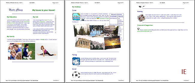 Chrome:
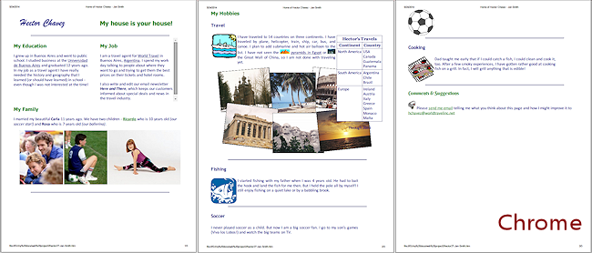 Firefox:
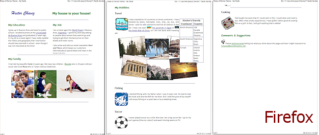
With some scripting you could create a set of styles that kept the right parts together, but it would be very complicated. Perhaps there is another plan!
Internal Style Sheet: @page
You probably should have set the paper margins early. It is easy to get involved with fixing issues and forget to set the basics first! With fixed paper margins, we don't have to worry about different browsers having different default margins. IE's default margins are all 0.75". Chrome's are 0.4". Firefox's are 0.5".
Adjusting margins on the printed page is what an @page section of styles is usually used for. A narrower margin leaves more room for the page contents.
-
Switch to your text editor that shows the source code, hector27-Lastname-Firstname.htm.
- In the internal style sheet, just above the </style> tag, add a @page section with a setting for the paper page's margins:
@page
{margin:0.5in;
} - Switch back to the browser and Refresh.
-
Open Print Preview.
There is a half inch margin on all sides of the page. There may not be much change if your browser was already using 0.4" or 0.5" margins.I compared all three browsers to the state they were in the last illustrations above. In IE the soccer ball was no longer split between two pages. What changes you see will depend on what margins your browser was using before.
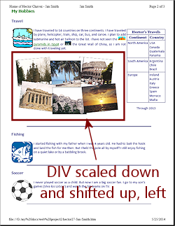
Scale DIV Photos for Print with TRANSFORM
It would be better for the travel photos to print in full without running under the table. What can you do to fix this? There is not enough room on the paper to move the photos to the left without chopping off part of the photos on the left.
What if the photos were smaller? There is a cool feature in CSS3 that will let you scale the DIV that contains the photos, id="photos", along with its contents. Then you can turn change the margin property that centered the DIV and pick new margins that keep the photos from flowing under the table. Since we know how wide the paper is (Letter size in these lessons), we can experiment until it is pixel-perfect! I did that part for you. (You are welcome!)
There is one complication to be aware of. The styling that centered the DIV photos is in an internal style sheet. So you cannot use an external style sheet to adjust that style for printing. Internal styles win over external styles in the cascade. You must put at this @media print section in the internal style sheet.
-
Switch to your text editor to the page hector27-Lastname-Firstname.htm.
-
Add to the internal style sheet a style in the @media print section for #photos that scales the whole DIV smaller and uses negative margins to shift the DIV up and left on the page.
@media print {
#photos {margin:-40px 0px 0px -40px;
transform:scale(.8,.8);
-ms-transform:scale(.8,.8); /* IE 9 */
-webkit-transform:scale(.8,.8);/* Opera, Chrome, and Safari */
}
}Compact MARGIN Property: The four margins are listed starting from the top on moving clockwise, margin: top right bottom left. So the values you used set negative margins to the top and left sides. That moves the DIV up and left from its normal location.
Once again we have a property that must be coded multiple times to convince all of the fairly recent major browsers to apply the property. The current [2016] versions understand the original CSS3 code for TRANSFORM.
Multiple TRANSFORM Properties: If you want to apply more than one TRANSFORM property, for example you want to scale (enlarge or reduce size), rotate (turn), and translate (move left/right or up/down), you must write them together in one property with a space between each type, like:
.mytransform {transform: rotate(8deg) scale(.7,.7) translate(6px,8px);}If you write separate TRANSFORM properties, only the last one in the cascade of styles will actually be applied. For example, in Hector's page, four of the photos are rotated. If we add a class in the @media print to scale the photo for print instead of scaling the whole DIV, the new TRANSFORM property overwrites the previous one. To keep the rotation, you have to repeat it in the new class, too, as part of a single property.
-
 Save.
Save.
[hector27-Lastname-Firstname.htm] -
Switch to your browser, Refresh, and view Print Preview.
(The illustration is from IE.)The table is now off of the photos. The photos are smaller. Compromise is part of the game of web page design!
This is a good example of the kind of tweaking professional web authors have to think about.
 Print from your browser.
What other design changes can you think of that could handle this issue?
Alternate Method: Reduce the number of photos
You can hide some of the photos for printing instead of transforming the DIV container. You could hide the two on the right by add the following classes to the @media print section of the internal style sheet:
.topright {display:none;}
.bottomright {display:none;}
@media, @page
|
|
| © 1997-2017 Jan Smith All Rights Reserved |
Site Map What's New |
Privacy Policy Terms of Service Copyright Acknowledgements |
~~ 1 Cor. 10:31 ...whatever you do, do it all for the glory of God. ~~
Last updated: March 22, 2017