
 Previous
Jan's Working with the Web
Format for Print
When you try to print a lovely web page, you may find some unhappy surprises. What looks great on the screen may not print well at all. There are a number of features that can cause problems on the printed page. Some solutions are available to you as a browser user but others require the web page's author to use CSS styles to set up the printed page.
Which Print command to use? (User)
Example: Web page with videos, photos, ads, sidebars
-
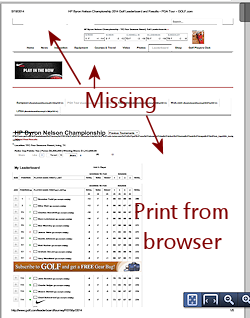
Browser's Print command > Leaves empty spaces for videos and includes ads, menus, and sidebars. Printing at 100% will cut off parts at the right if the web page is wider than the paper. Using Shrink to Fit to get it all within the page width reduces the font size, but is it still readable?
-
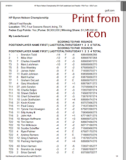
Print button on web page (if it was well planned!) > Prints only the article, not the other objects on the page like ads and menus. But some web pages include a Print button that simply runs the browser's own Print command. What's the point of that?
Example:
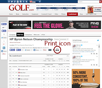
Web page in browser
Credit: golf.com
Printing Issues
Wrapping
The printed version of a web page will wrap quite differently than it did in the browser window, depending on the width of the paper. Letter size paper (8.5" x 11") is standard in the USA, but other parts of the world primarily use narrower and taller A4 paper (10 mm x 297 mm, 8.27" × 11.69" ). What will your viewers use?
Backgrounds
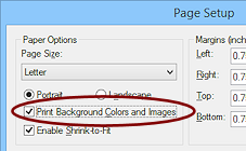
Backgrounds do not print, by default, in current browsers. That's usually a good thing! Most browsers will let you choose to print the backgrounds. It's all or none. You cannot make the browser print only certain backgrounds and not others.
 Page
Backgrounds: Do not choose to print page backgrounds without
careful thought. It adds a lot of time to the print job and will probably
make the page hard to read. Plus, it can use a lot of ink. Ink jet printers
can make a page very wet if the background is dark.
Page
Backgrounds: Do not choose to print page backgrounds without
careful thought. It adds a lot of time to the print job and will probably
make the page hard to read. Plus, it can use a lot of ink. Ink jet printers
can make a page very wet if the background is dark.
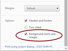
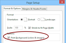
How to Print Backgrounds (User):
|
Right click on page > Print... > Background colors and images
|
|
 >
> 
 >
> 
Images
 Split
image
Split
image
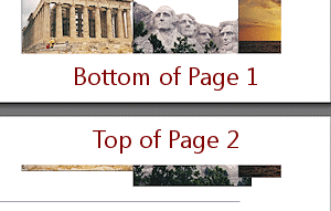
The top of an image can sometimes print on
one sheet with the bottom of the image on the next sheet!
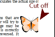
Image Cut Off
Browsers may cut off an
image that is too wide for the page and will not even print the rest of it on
a different sheet of paper!
The Shrink to Fit feature, if the user turns it on,
can help prevent cropping off down the right side but does not help with splitting
an image at the bottom of the page.
 Image Background
Some images have
a background color that matches the page background. This background
is part of the image itself and will
print, even though the page background does not. The illustration
shows the navigation links from the old version of this site. Not very attractive in print!
Page Breaks (Web Author)
Most web pages will not fit on a single sheet of paper. HTML code cannot control where the page will break for printing. CSS can give some control over this with the properties page-break-after, page-break-before, and page-break-inside. These properties apply to any element on the page except an empty DIV or an element with absolute positioning. They are especially useful for headings and tables. In practice, the properties seem to apply to block elements in current browsers.
Values for the three page-break properties:
auto allows a page break IF it is
needed. This is the default value.
always requires a page
break at this point.
avoid asks the browser not to break if possible. A large table may not fit on one page, for example.
These values are understood by current browsers. There are other values defined in the CSS standard that are not yet understood by browsers.
Web authors use these properties most often to keep a table from splitting between two pages or to start a new chapter/section on a new page.
Header/Footer (User)
Some browsers allow you more control for what information prints in the header and footer than others. This was covered previously in the lesson Browser Basics: Printing.
Solutions for Printing Issues
CSS lets you create sections in a style sheet for styles to use for specific media - screen, print, braille, aural (spoken aloud), handheld, and more. These sections are called @media screen, @media print, @media handheld, etc. CSS also allows an @page section of style with which you can control the margins and orientation of the printed page. Using @page is the only way a web author can manage those features of a print-out.
Example: Applying different styles for printing
Example page and its external style sheet
Using the code below in an internal or external style sheet, creates four styles and then changes some properties for printing using @media print and @page.
- Find the font and font size for P elements on the web page and for printing.
- Find the property that hides the element with ID menu for printing.
- Find the property that changes the class with positioning.
- Find the property that sets orientation to Landscape and the margins of the paper to 1 inch.
- Find the property that creates a page break. What will show up on page 2?
Styles for web page
h1 {color: darkorange;
font-size: medium;
font-family: 'Arial Black', sans-serif;
}
p {
font-size: medium;
font-family: Calibri, Helvetica, sans-serif;
}
.positioned {
position: relative;
left: 100px;
top: 0px;
}
#menu {
width: 325px;
color: white;
background-color: wheat;
display: block;
}
Styles for print
@media print {h1 {
font-family: "Britannic Bold", Broadway, Calibri, sans-serif;
}
p {
font-size: 10pt;
font-family: Cambria, "Times New Roman", serif;
}
.positioned {
position: static;
}
#menu {
display: none;
}
#lion2 {
page-break-before: always;
}
}
Styles for the paper page
@page {size:landscape;
margin:1in;
}
 WARNING: Copy and paste from a web page
or other document to a CSS file is a VERY bad idea. Hidden
characters that tag along can keep part of your style from being
used! These character do not show, even in Notepad! (This happened to me while working on this example. It took days to figure it out!)
WARNING: Copy and paste from a web page
or other document to a CSS file is a VERY bad idea. Hidden
characters that tag along can keep part of your style from being
used! These character do not show, even in Notepad! (This happened to me while working on this example. It took days to figure it out!)
 In Browser: The example page when displayed in the browser does not use styles from the @media print section.
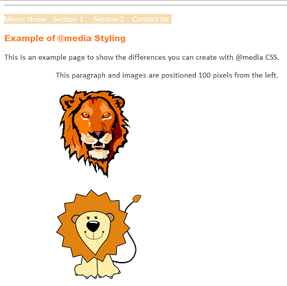
There is a menu line just below the horizontal rule. The heading is in Arial Black at Medium font size. The paragraph font is Calibri at Medium size. The last three paragraphs are indented 100 pixels.
What changed in Print Preview: The styles in the @media print and @page sections are being applied except for size:landscape in IE and Firefox.
- Font and font size are different.
- Menu is hidden.
- Indented paragraph and images are back at the left.
- Page margins are 1" on each side, which is not the default.
- A page break puts the second lion image on a new page.
Examples:
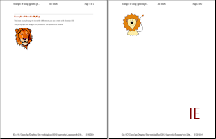
 IE: Color for H1 is darker than before and is darker than other browsers'
print-outs. Did not accept the Landscape orientation from the @page section.
IE: Color for H1 is darker than before and is darker than other browsers'
print-outs. Did not accept the Landscape orientation from the @page section. 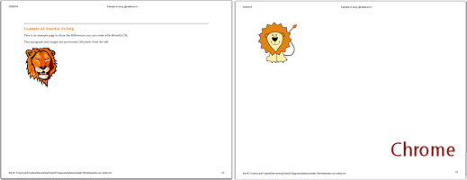
 Chrome: Accepts the Landscape orientation from the @page section.
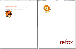
 Firefox: Does not use a font with a space, Britannic Bold, for the H1 text, just like it failed to do in the browser. Instead Firefox used the second font, Broadway. Did not accept the Landscape orientation from the @page section.
 |
|
| © 1997-2017 Jan Smith All Rights Reserved |
Site Map What's New |
Privacy Policy Terms of Service Copyright Acknowledgements |
~~ 1 Cor. 10:31 ...whatever you do, do it all for the glory of God. ~~
Last updated: March 22, 2017