
 Previous
Jan's Working with the Web
Positioning: Overlapping
There is a lot of thinking and calculating and experimenting involved to get the elements positioned so that they can't overlap or to make sure that they do overlap in exactly the right way.
Examples of Overlapping Elements:
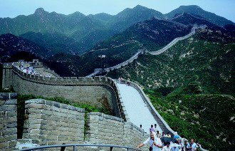
Great Wall of China
Magnifying Glass
The text 'Great Wall of China' is on top of the photo, not part of the image.
The label text 'Magnifying Glass' overlaps the magnifying glass image.
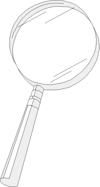
The magnifying glass is on top of this text and the horizontal rule below.
 |
Step-by-Step: Position Overlapping |
|
| What you will learn: | to add set of images to position and stack images to overlap to control overlapping of content below to control overlapping of floating table with Z-INDEX to rotate an image with the TRANSFORM property |
Start with:  , hector25-Lastname-Firstname.htm, resource files
The Travel section has a lot of empty space because the floating table is so tall. This would be a good spot for some of Hector's travel photos! The images are in your HTML folder on your Class disk, or you can download them from the resource files and put them in that folder. This one will stretch your skills!
Add Travel Images
First you will add some images. Shortly you will position each image.
-
Switch to your text editor, showing Hector's web page.
- Save As hector26-Lastname-Firstname.htm
Your HTML folder on your Class disk contains several resized photos that you can use here.
- Add the code
below after the Travel paragraph.
Do you remember the attributes that you need? Path to the source file, the width and height of the image, ALT text (for screen readers), TITLE text (for screen tip). Also remember that copying from here and pasting into Notepad can sometimes bring hidden characters that create problems. It's not worth the risk!
<p>
<img alt="Coliseum-Rome, Italy" title="Roman Coliseum" height="157" src="HTML/rome.gif" width="202">
<img alt="Beach - Hawaii, USA" title="Hawaii" height="158" src="HTML/hawaii.gif" width="202">
<img alt="Wooden Russian Orthodox church, Arkhangelsk, Russia" title="Russia" height="158" src="HTML/russia.gif" width="202">
<img alt="Parthenon - Athens, Greece" title="Parthenon, Greece" height="159" src="HTML/parthenon-greece.gif" width="202">
<img alt="Mt. Rushmore - USA" title="Mt. Rushmore" height="158" src="HTML/mtrushmore-usa.gif" width="202">
<img alt="Sunset over ocean" title="sunset over ocean" height="158" src="HTML/sunset.gif" width="202">
</p>
The new photos show on the page in the order that they appear in the source code. They are all in the same paragraph with no line breaks. They wrap automatically like text when there is not enough room left.
-
Save.
[hector26-Lastname-Firstname.htm] -
Switch to your browser and edit the address to show the new version and press ENTER.
-
 Experiment:
Window size and wrapping
Experiment:
Window size and wrapping
Resize your browser window narrower and then wider.
What happens to the images?
At some wide widths the first row of images gets hung up beside the Travel icon. Did you expect that?
These images are taking up a lot of space, even at this small size.
You have design choices:
-
Reduce the number of pictures, or eliminate them all
-
Resize the pictures. (Use a graphics program.)
-
Overlap the pictures with positioning to save space.
Can you guess which choice you are going to do for this lesson?
-
Position and Stack Images
We need a plan that will make the images overlap to save space and will control the wrapping. The stacking order of the images and other page parts determines which parts are on top of other parts.
To accomplish these tasks will add quite a bit of styling. Each image has different position values. You could use inline styles since the position is going to be different for each image. But, the STYLE is going to be quite long, which will make your code hard to read. These styles won't be useful on another page. It's probably easier to create a class for each image and put the classes in the internal style sheet.
You need:
- DIV to be a container for the images.
- The container DIV needs the property clear:left; to put it below the Travel icon.
(Do NOT use clear:both which would move the DIV below the table of Hector's continents. That would recreate that empty space that you are trying to fill. - A class for each image to assign absolute position and values for LEFT and TOP within the container DIV.
Figuring out the LEFT and TOP values for the positions usually requires some experimenting or a WYSIWYG drag-and-drop editor. To simplify things, I will provide you the values. (You are welcome!)
-
Switch to your text editor, showing Hector's web page.
-
Create DIV container: Add a DIV surrounding the code for the photos that will be the container for the positioned images.
Notice there is an ID attribute. It is a good idea to give an ID to all of your DIVs. It helps to keep things straight in your head when you have several of these on a page. For this lesson you will be creating styles for those IDs.
<div id="photos">
...code for images goes here...
</div> - In the internal style sheet at the top of the source code, add an ID class for this DIV:
#photos {
clear:left;
position:relative;
left:0px;
top:0px;
width:100%;
} -
Save.
[hector26-Lastname-Firstname.htm] 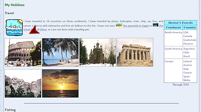 Switch to your
browser and Refresh.
Switch to your
browser and Refresh.
Nothing changes in the browser at small window widths. At large widths, the photos slide down the page below the Travel icon.
-
Switch to your text editor, showing the source code for Hector's web page.
You need to add a class for each image. Each one needs absolute position but the LEFT and TOP values will be different for each image. -
Add to the internal style sheet a set of classes for the positions to put the six images into two overlapping rows:
.topleft {position:absolute;left:3px; top:5px;}
.topmiddle {position:absolute;left:180px; top:16px;}
.topright {position:absolute;left:365px; top:3px;}
.bottomleft {position:absolute;left:24px; top:148px;}
.bottommiddle {position:absolute;left:213px; top:175px;}
.bottomright {position:absolute;left:392px; top:160px;}
- Scroll down to the IMG tags for the travel photos.
- Add the class attribute as follows:
To Roman Coliseum: class="topright"
To beach: class="topmiddle"
To wooden church: class="topleft"
To Parthenon: class="bottomleft"
To Mt. Rushmore: class="bottommiddle"
To sunset: class="bottomright"
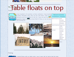
Note that the order the images come in the source code is NOT the order that they will appear after positioning.Without looking in your browser yet, which picture will show at the top left on the screen? Which will be bottom right? Which photo will be on top of the others?
-
Save.
[hector26-Lastname-Firstname.htm] -
Switch to your browser, inspect the current order of the images and then Refresh.
The images overlap each other as planned and are not in the same left-to-right order as before.
The stacking order still follows the order that the tags appear in the source code. So the first photo in the source code (Roman Coliseum) is on bottom still even though it is now the third photo on the first row.
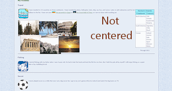
Problem: In a narrow window the photos overlap the table at the right and the text in the Fishing section below.
Problem: In a wide window the photos hug the left edge, which looks odd. The set of photos would look better centered.These are fixable!
Control Overlapping of Content Below
We want the photos to stay off of the table and off the next section, too. Happily that is not too hard to manage!
Solutions:
- The DIV named photos needs a HEIGHT to stop it from overlapping the rest of the page.
- The DIV named photos needs to have its contents move in from the left or, even better, be centered.
- The table of Hector's continents needs its own POSITION property so that you can set a Z-INDEX higher that is higher than all of the
photos. That is the way to make sure the table is always on top.
In a narrow window, part of the photos will still slide underneath the table. That is better than hiding part of the table.
-
Switch to your text editor, showing Hector's web page.
-
Control Overlap of Text Below: Set DIV height
Find the class named #photos in the internal style sheet and add the property height:350px;
This ID class applies only to the container DIV for the photos. How to guess well for HEIGHT: Double
the tallest photo height (159px). Then add the largest TOP value for
the first row (16px) - which pushes a photo down on the page. Round
up to a handy value to add a bit of clear space. 159 + 159 + 16 =
334 >> 350px. Adjust the number if there is too much or too little
space when you look at the page. Be sure to check with the browser at several window
widths.
How to guess well for HEIGHT: Double
the tallest photo height (159px). Then add the largest TOP value for
the first row (16px) - which pushes a photo down on the page. Round
up to a handy value to add a bit of clear space. 159 + 159 + 16 =
334 >> 350px. Adjust the number if there is too much or too little
space when you look at the page. Be sure to check with the browser at several window
widths. -
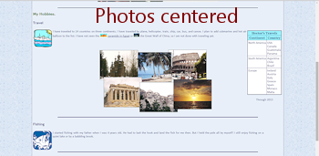
Center Photos: You need to set a width for the container DIV and set the margin property.
Revise the style #photos to read:#photos {
clear:left;
position:relative;
width:620px;}
height:350px;
margin:0 auto;This will center the set of photos on the page. The width was calculated by adding up the widths of three images across (606px) and adding a bit since each row sticks out past the other on one side.
-
 Save.
Save.
[hector26-Lastname-Firstname.htm] -
Switch to your browser and Refresh.
-
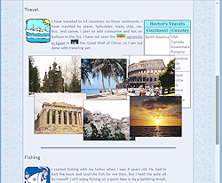
Resize the window width and evaluate.
The photos no longer hide the Fishing text below. But, the table is still getting hidden in narrow windows.
Control Overlapping of Table with Z-Index
You are going to switch from using inline styling for the table of Hector's travels to using an ID selector in the internal style sheet. You must edit the TABLE tag to remove the inline styles and add an ID.
-
Switch to your text editor, showing Hector's web page.
- ID Attribute for table: Find the table of Hector's travels. Make a note of the properties in the inline style applied to the table of Hector's travels. Edit the tag to remove the whole inline style and the border="1". Add instead an ID attribute:
<table id="tabletravels"> -
ID Selector (internal style sheet): Add to the internal style sheet an ID selector named #tabletravels that duplicates the previous inline styling plus two new properties: position:relative; and z-index:20;
#tabletravels {
border-collapse:collapse;
border:thin solid navy;
background-color:white;
float:right;
margin:5px;
position:relative;
z-index:20;">
}The border styles for the outside border of the table were combined in to the short form. But this does not define the cell borders. You need to tell the table to draw the lines between cells. Since the table has header cells, you need a declaration for TD and for TH. These can be combined.
The DIV should now be higher in the stacking order than anything else. The default z-index is zero. You just need to be sure that the 'tabletravels' DIV has a higher z-index than anything that it might slide under.
Positioning required: Assigning a z-index to the table itself
without the POSITION:RELATIVE property will have no effect. Stacking works only with positioned objects. -
Combinator Selector: Add to the internal style sheet the following:
#tabletravels th {
border: thin solid navy;
}
#tabletravels td {
border: thin solid navy;
}These two combinator selectors combine two selectors in a parent-child relationship. The first selector is the 'parent' of the second. The parent's code on the web page surrounds the code for the 'child'. So a DIV can be the parent of a P. An H1 can be the parent of a SPAN. A TABLE is the parent of a TD.
So the first selector you wrote says "Any TH element that is part of an element with id="tabletravels" displays a thin, solid, navy border." By writing a combinator selector, you can format parts of a specific table on the page without affecting any other tables on that page, like the positioning table at the top of Hector's page. Sweet!
-
Save.
[hector26-Lastname-Firstname.htm] -
Switch to your browser and Refresh.
-
Resize the window to check how the stacking order is working now.
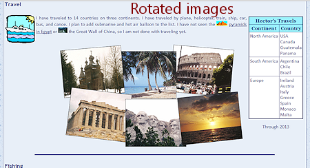
Rotate Image with TRANSFORM
Your staggered photos don't look too bad, but perhaps a bit of rotation would look even better.
CSS3 adds a new property, TRANSFORM, which allows you to rotate, scale, move, skew, etc., elements. Old browsers do not understand this property. As long as you are sure that your users will use recent browsers, IE10+, Chrome 36+, Firefox 16+, Safari 9+, you can use the TRANSFORM properties happily. If you need to handle those earlier browser versions, there is some code to put in front of the TRANSFORM styles. For Chrome, Safari, and Opera, put -webkit- in front of the property. For Firefox, put -moz-. For IE, put -ms-. For complete coverage, you would have to write 4 copies of the same properties.
- Switch to your text editor and view the source code for Hector's page, hector26-Lastname-Firstname.htm.
- In the internal style sheet in the HEAD of the source code, find the classes that position the photos.
-
Add a TRANSFORM property to the class TOPLEFT, like:
.topleft {position:absolute;left:3px; top:5px;
transform:rotate(-5deg);
-ms-transform:rotate(-5deg); /* IE 9 */
-webkit-transform:rotate(-5deg); /* Opera, Chrome, and Safari */
-moz-transform:rotate(-5deg); /*Firefox*/
}If you expect your users to be current on their browser versions, you only need the plain transform statement. Trust issues are common in coding web pages!
Even if a browser fails to rotate the photos, nothing is lost but a bit of artistry. That's called 'graceful fallback' - Nothing bad happens if the cool, new effect fails.
-
Similarly, add code to other classes that will rotate:
- top right by 5 degrees
- bottom left by 7 degrees
- bottom right photo by -6 degrees.
Suggestion: In your text editor, copy (carefully!) the three TRANSFORM properties you just created for the TOPLEFT class and paste (very carefully!) at the end of the existing properties for the other three classes. Then edit the number of degrees.
 Warning: Double-check that your semicolons are still correct and that all braces still match up in opening/closing pairs. Missing or duplicated punctuation can keep your edited style from working and also can keep the next style(s) from being applied.
 -
Save.
[hector26-Lastname-Firstname.htm] -
Switch to your browser and Refresh.
This topic illustrates well the control issues with HTML and CSS. You
can try to lock everything down in place with a position table or
with absolute positioning. But with narrow or wide windows, parts may still
overlap or else fall off the screen at the side. You can use more
properties to cover more situations. Try for a balance
between flexibility for the browser and control by the author.
Compromise!
|
|
| © 1997-2017 Jan Smith All Rights Reserved |
Site Map What's New |
Privacy Policy Terms of Service Copyright Acknowledgements |
~~ 1 Cor. 10:31 ...whatever you do, do it all for the glory of God. ~~
Last updated: March 22, 2017