
 Previous
Jan's Working with the Web
Positioning
One of the tricky parts of HTML is getting things into the right positions beside each other. Floating left or right is great for single items. But sometimes there are more parts to position or the exact position is really important or you want to overlap objects, which cannot be done with a table.
Problem: How to put things side by side on the page (and make sure they stay there)?
Solution 1- Old HTML Method: Put them in a table.
Unlike a data table, the parts of a positioning table do not have any logical relationship to each other. It's just a trick (a hack) to keep things in position on the page. You still have the issue with table cells resizing. These are reasons why this method is no longer recommended. (But it is still widely used!)
Solution 2 - New CSS Method: Position parts with CSS positioning, combining DIV and floating and relative or absolute positioning.
You actually have a lot more control over the position of an object on your web page with CSS. It just takes a bit of practice. There are a few situations where a table is still a good choice. But, all major web sites currently use CSS positioning for arranging the parts of their web pages.
Positioning Table
Using a table to get parts of the page side by side was the only reasonable method to use, back in the olden days, before CSS was widely understood by browsers.
This is an example of a hack, an awkward but effective work-around to accomplish a task. Web authors may resort to a hack to make a page display correctly in a particular browser version. They sometimes take advantage of the way the old browser is broken to make it do what they want. It might be a cool trick, but you need to avoid doing this whenever possible. When the browser is updated, the hack might not work as expected any more!
Example of Positioning Table:
| This is a long paragraph that has an image at the right. We want the image to have a caption below it and to have this text wrap on the left of the image and the caption. A table is an easy way to do this. |  Win 7 monitor |
If you put the text in the cell on the left and the caption below the image in the cell on the right, then it will look like the text wraps around them both.
This example table has the border turned on so you can see where it is. You would usually want the border off for a positioning table on an actual page.
Code for the example:
<tr>
<td>This is a long paragraph that has an image at the right. We
want the image to have a caption below it and have this text wrap on
the left of the image <strong>and</strong> the caption. A table is an easy way to do this.</td>
<td style="text-align:center;"> <img alt="Icon: Monitor showing Win7 desktop"
height="33" src="../icon-monitor-desktop-win7.gif" width="49"><br>
Win 7 monitor</td>
</tr>
</table>
CSS Positioning
There are a couple of ways to use CSS to position something on your web page. DIV tags can be used to group one or more other elements together for positioning.
-
Position with FLOAT:
The FLOAT property works for any element, not just images. You can float left or right to make text wrap around whatever you floated. The element must have a width set!
Example of CSS Float DIV: Image plus caption
The example below uses two DIV tags. One DIV tag contains the image and its caption. It has a lavender background and is floated right.
The outside DIV tag (which has a border) holds the paragraph and the floating DIV with the image and caption. Again, the border and background color are there only to help you see where each DIV area is.
Win 7 monitorThis is a long paragraph that has an image at the right. We want the image to have a caption below it and have this text wrap on the left of the image and the caption.
Code for example:
<div style="border: 1px solid #000000; width:500px; margin-left: 40px;">
<div style="width:75px;float:right;background-color:#CCCCFF;text-align:center;">
<img alt="Icon: Monitor showing Win7 desktop"
height="33" src="../icon-monitor-desktop-win7.gif" width="49"><br>
Win 7 monitor </div>
<p>This is a long paragraph that has an image at the right. We
want the image to have a caption below it and have this text wrap on
the left of the image <strong>and</strong> the caption.</p>
</div> -
Position with CSS Positioning:
This method is more complex but offers more precise control and more options for effects than FLOAT does. Web authors can wander far, far away from the flexibility of HTML by using CSS to create exact placements. They may not consider the effect on various size screens. CSS positioned objects may not wrap as the window size changes.
Using CSS positioning requires that you set the type of position and one or two of the properties LEFT, RIGHT, BOTTOM, TOP. LEFT and TOP are the most common choices. If you pick a position type but do not set a position, you may not see any change at all. Widths and heights for the container and the elements being positioned are usually needed, too.
Distances are most commonly given in pixels or percentages, though there are some other choices. Negative numbers are allowed! This is useful when you want parts to overlap.
- POSITION types
- static - Default -The position of objects on the page follows the order that they appear in the source code.
- absolute - Position is changed with
respect to whatever previously positioned element contains what you
want to position. If there is not a positioned container element, then
the position is compared to the page as a whole.
- left or right - horizontal distance from where it would have been inside the container element
- top or bottom - vertical distance from where it would have been inside the container element
- relative - Position is changed with
respect to the normal position for the object.
- left or right - horizontal distance from where it would have been normally
- top or bottom - vertical distance from where it would have been normally
- fixed -Position is changed with respect to
the window. When you scroll the page in the window, the fixed
object does not move.
- left or right - horizontal distance from edge of the window
- top or bottom - vertical distance from the top of the window
- inherit - The value is inherited from the parent element, the tag that contains the one you are positioning. Many properties can inherit values.
- WIDTH of all objects being positioned
- HEIGHT of all objects of all objects being positioned
- OVERFLOW - what the browser will do with
content that does not fit in the space you have allowed
- visible (default value) - Allows contents to overlap whatever follows.
- scroll - Adds a scroll bar, whether or not one is needed.
- auto - Adds a scroll bar IF it is needed. Be sure to allow space for it in the width.
- hidden - Cuts off whatever won't fit (usually a bad idea).
- inherit - Uses the same value for the property as its parent/container element
Example of CSS Relative Positioning: Image plus caption
Win 7 monitorThis is a long paragraph that has an image at the right and we want the image to have a caption below it and have this text wrap on the left of the image plus the caption.
Code for example:
The border and background color are set so you can see where each DIV lies on the page. The margin-left property scoots the DIV over a bit on this lesson page.
<div style="border: 1px solid #000000; margin-left: 40px; width:500px; height: 87px;">
<div style="width:75px;position:relative; left: 422px; top: 5px;background-color:#CCCCFF;"text-align:center;>
<img alt="Icon: Monitor showing Win7 desktop"
height="33" src="../icon-monitor-desktop-win7.gif" width="49"><br>Win 7 monitor
</div>
<p style="position:relative;left:2px; top:-86px; width: 426px;">This is a long paragraph that has an image at the right and we want the image to have a caption below it and have this text wrap on the left of the image plus the caption.</p> </div>
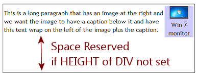
 DIV Height: The outside DIV needed a HEIGHT as well as a WIDTH. Otherwise, there will be empty
space below the contents, where the parts would have been if we had not positioned them. Not good!
DIV Height: The outside DIV needed a HEIGHT as well as a WIDTH. Otherwise, there will be empty
space below the contents, where the parts would have been if we had not positioned them. Not good!More examples of various CSS POSITION values
(Opens in a new window/tab. The window may need to be resized to see text covered by the rectangle for absolute positioning.) - POSITION types
|
|
| © 1997-2017 Jan Smith All Rights Reserved |
Site Map What's New |
Privacy Policy Terms of Service Copyright Acknowledgements |
~~ 1 Cor. 10:31 ...whatever you do, do it all for the glory of God. ~~
Last updated: March 22, 2017
Disclaimer: The old version of these lessons uses tables for positioning, which is no longer recommended. When I started writing, CSS positioning was not handled the same way in different browsers. In particular, Netscape was quite popular then and used an entirely different method than other browsers used. So I opted to use the method that worked in all browsers - positioning tables. My new layout for these lessons is based mostly on CSS.
This is another case of Do as I say (and do now), not as I did!