
 Previous
Jan's Working with the Web
Positioning: Side by Side DIV
You can place objects side by side on a web page using a set of DIV tags. This is more complex than using tables but allows you to change the positioning for print or with scripting.
Positioning:
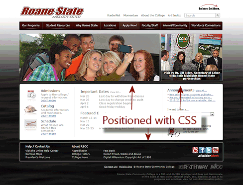
Credit: Roane State Community College
In the illustration the middle white section and the menu near the top use tables to get the parts in position. The whole page is in a DIV that is centered on the page using CSS, as you used in the previous lesson. The footer and the photos are positioned with CSS using Method 2 below. The smaller photo on the right uses scripting to rotate among several images and captions. That would be harder to do in a table. Use the right tool for the task!
Interactive Scripting:
 Click image to open interactive page
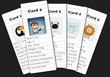
CSS and JavaScript can work together to format a page and create an interactive experience. A screen shot of an example is at the right.
Interactive: The card the mouse pointer is over comes to the top of the stack, enlarges, and the portrait of the animal changes to one with a background color. When the mouse pointer moves away, the card returns to its original size, location, and portrait.
Formatting: The rotation of each card, shadows, and rounded corners are created with CSS3 properties. They are not part of an image.
Some browsers do not understand the CSS3 features.
As simple as the page looks, if you check the source code, you will see that underneath is a lot of styling and some simple inline scripting to change the portraits.
Position Object on Page:
Method 1: Use FLOAT to wrap parts around images, tables, or DIV sections.
Method 2: Use the POSITION property and its helper properties, LEFT and TOP:
-
Set position within the current container (BODY or DIV usually)
-
position: Either relative, absolute, fixed, or static (the default - all elements display in the order they appears in the source code).
-
left: Horizontal distance from normal position.
-
top: Vertical distance from normal position.
-
- width: Usually needed.
- height: Sometimes needed.
The LEFT, TOP, WIDTH, and HEIGHT are usually in pixels or percentages. Be careful that the numbers add up to fit the space! You must also be careful that your positioned objects won't overlap other objects, unless that is what you want.
Negative numbers are allowed for left and top to move the object up or left from the normal position.
With these properties and some scripting, a web author can create some cool interactive features on a web page. Scripting is not part of this course.
Examples: If you did not look at the page of examples yet, look at
it now: Examples
of CSS POSITION values
(Opens in a new window/tab. You may need
to resize the window to get parts of the text clear of the absolute positioned
rectangles.)
Position Side by Side DIVs
What you need:
 Outside DIV containing all parts to be positioned. Has RELATIVE
position to keep in the flow of the page.
Outside DIV containing all parts to be positioned. Has RELATIVE
position to keep in the flow of the page. - Inside DIV for each section to be positioned. All have ABSOLUTE position within the container DIV.
- Set WIDTH (and probably HEIGHT) for all three DIVs.
- Set POSITION, LEFT, TOP, WIDTH for each inside DIV
- You may need OVERFLOW on a DIV if the contents won't fit in the height set for it.
Tips for Trouble Shooting
As you edit your source code and check what the browser shows, you will often get unexpected results. With experience you will learn to make good guesses as to what went wrong.
Important! Review the article Trouble Shooting Page Display, in the Appendix. It has many suggestions about what might have gone wrong. The most common issues involve bad typing, bad spelling, bad punctuation, and just not writing both what goes in the style sheet and what belongs in the HTML code.
 |
Step-by-Step: Side by Side with DIV |
|
| What you will learn: | to add DIVs for the container and two DIVs to add ID to each DIV to create internal style for each #ID to add HEIGHT to each #ID style to handle overflow when contents won't fit in the space |
Start with:  , hector24-Lastname-Firstname.htm
Add DIVs for Container and Two DIVs
Hector's page still has parts with one or two long lines in wide window. Not a good look and hard to read, too! You will now use CSS positioning to put some of these paragraphs side-by-side. They will be easier to read and will reduce the amount of scrolling to read the whole page. All advantages!
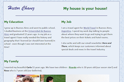
My Job and My Education Sections
You will position the My Job and My Education sections side-by-side, with My Job on the right, even though My Job comes first in the source code!
There are some tricky choices to make these sections sit next to each other on the page and yet still behave well when the window is resized.
-
 Switch to your text editor,
which is showing the source code for hector24-Lastname-Firstname.htm.
Switch to your text editor,
which is showing the source code for hector24-Lastname-Firstname.htm.
Your window may wrap differently! -
Save As hector25-Lastname-Firstname.htm to the web project2 folder on your Class disk.
-
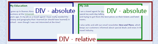
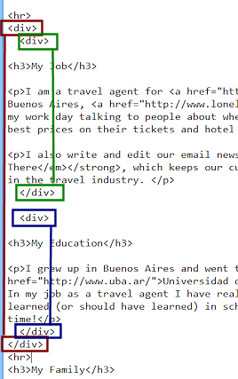
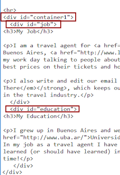
Add to the source code an opening DIV before My Job and a matching closing tag after the My Education paragraph.
This is your container DIV for the parts you will position.
(Marked in dark red in the illustration.) -
Add an opening DIV before My Job and a matching closing tag after the My Job paragraphs.
(Marked in green in the illustration.) -
Delete the HR tag before the My Education paragraph
-
Add an opening DIV before My Education and a matching closing tag after the My Education paragraph.
(Marked in dark blue in the illustration.) - Save.
[hector25-Lastname-Firstname.htm]
Add ID to Each DIV
You will name the DIVs so that you can create styles for them in the internal style sheet.
 Add to the outside DIV, id="container1".
- Add to the DIV for My Job, id="job".
- Add to the DIV for My Education, id="education".
- Save.
[hector25-Lastname-Firstname.htm]
Create Internal Style for each #ID
Next you will add some styles to the internal style sheet for the named DIVs.
The white space in your code is ignored by the brwoser except between numbers and units of measure.
 Relative Position for container:
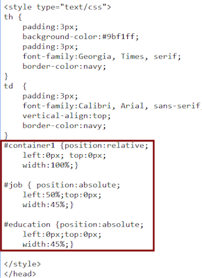
Add to the internal style sheet at the top of the source code:
#container1 {position:relative;
left:0px; top:0px;
width:100%;}
This style creates a container for the two DIVs that you will position inside it.
-
Absolute Position for My Job:
To position My Job as a second column on the page, add a style to the internal style sheet.#job { position:absolute;
left:50%;top:0px;
width:45%;}This style lets My Job take up 45% of the available space but starting at the 50% mark. This will leave 5% of the 'container1' DIV empty to the right of the 'job' DIV.
-
Absolute Position for My Education:
To position the My Education section at the left, add a style to the internal style sheet:#education {position:absolute;
left:0px;top:0px;
width:45%;}This style puts My Education at the left of the page, taking up 45% of the available width. That leaves 5% to its right before the My Jobs section starts. 45% + 5% + 45% + 5% = 100%
 Arithmetic
matters: When choosing percentages or pixels, the total must
add up to the space available or less. When the total is larger than
the window's width, parts will hang out past the window's edge. A
horizontal scroll bar appears, but it is a pain to read a page where
you have to scroll sideways. Sometimes you will just have to guess
how small the smallest window is likely to be. Be aware!
Arithmetic
matters: When choosing percentages or pixels, the total must
add up to the space available or less. When the total is larger than
the window's width, parts will hang out past the window's edge. A
horizontal scroll bar appears, but it is a pain to read a page where
you have to scroll sideways. Sometimes you will just have to guess
how small the smallest window is likely to be. Be aware! -
 Save.
Save.
[hector25-Lastname-Firstname.htm] -
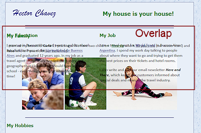
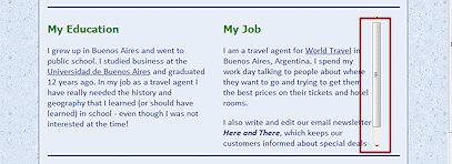
Switch to your browser and edit to show the hector25 page.
Whoops! The material is positioned as two columns but overlaps the rest of the page. Not at all what we want!The problem is that we did not set any HEIGHT properties for the three DIVs.
Add HEIGHT for DIVs
- Switch back to your text editor.
-
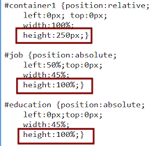 Add HEIGHT properties to the three DIVs - 250px
for the outside one and 100% for the two inside.
Add HEIGHT properties to the three DIVs - 250px
for the outside one and 100% for the two inside.
How the sizes were picked:
The 250px height for the containing DIV was chosen after some experimentation. It is tall enough to hold all of the text at a smallish window size. Yet with the browser maximized, the blank area did not shout, "Wasted space!"The section DIVs were allowed to take up all of the available height inside the containing DIV, 100%. This is better than setting the heights to 250px also. If you need to adjust the height later, you would have to change three places instead of just one. Think ahead. You will make adjustments many, many times in web authoring!
 Save.
Save.
[hector25-Lastname-Firstname.htm]-
Switch to your browser and Refresh.
Much better, at least at the window width shown in the illustration. - Resize your window narrower and then wider.
What happens to your positioned sections?If narrow enough, the text starts overlapping the next part of the page again. <sigh>
At wider sizes a blank area appears below the positioned sections.
Picking a pixel number for the container1 height turns out to not be a perfect solution after all.
Handling Overflow
CSS offers a way to handle the overlapping text issue automatically with the OVERFLOW property.
OVERFLOW property values:
- VISIBLE (default value) - Allows contents to overlap whatever follows.
- SCROLL - Adds a scroll bar, whether or not one is needed.
- AUTO - Adds a scroll bar IF it is needed.
- HIDDEN - Cuts off whatever won't fit (usually a bad idea).
- INHERIT - Uses the same value for the property as its parent/container element
-
Switch back to your text editor.
Edit the two styles for the two inside DIVs (job and education) to add the property overflow:auto; to the style.
-
Save.
[hector25-Lastname-Firstname.htm] -
Switch to your browser and Refresh.
-
Resize the window narrow enough for the scroll bar to show.
The OVERFLOW property is a good way to make sure that the viewer can always read everything, even if they are crazy enough to make the window very, very narrow.
Down-side: When printing from the browser, only the parts that are actually showing on the screen will print... unless the author took advantage of @media print to include styles that will ensure that all of the text will print. (This is covered in the next lesson.)
Mysterious
unnecessary(?) scroll bar: There is a window width where all of the text shows on the screen in the DIV, but, when you add overflow:auto to the style,
a scroll bar appears. Why? There are two possible reasons.- Blank lines or margins count. Browsers add a bit of margin below a paragraph by default. Your text might have a blank line at the end. The browser treats the space created as important as text.
- Include space for scroll bar: With overflow:auto, the browser includes the space for a scroll bar and the space needed for the text in its calcuations. If the space was barely large enough before, it is too small now.
Hector's page still needs some work with the Hobbies section to save space. There is an exercise at the end of the project for that. Something to look forward to! 
|
|
| © 1997-2017 Jan Smith All Rights Reserved |
Site Map What's New |
Privacy Policy Terms of Service Copyright Acknowledgements |
~~ 1 Cor. 10:31 ...whatever you do, do it all for the glory of God. ~~
Last updated: March 22, 2017