
Jan's Working with Databases
Forms & Reports: Special Types:
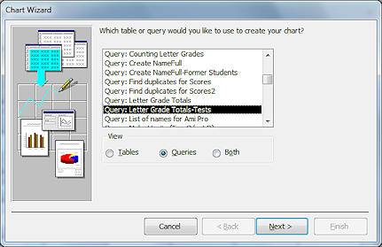
Chart Wizard
 A picture is worth a thousand or
so datasheet cells. Many kinds of data are more easily understood as a
chart. Microsoft Access has a Chart Wizard to help you.
A picture is worth a thousand or
so datasheet cells. Many kinds of data are more easily understood as a
chart. Microsoft Access has a Chart Wizard to help you.
Access can chart a whole table (in the report or form header or footer) or an individual record (in the Detail section).
![]() Using an Excel Chart: Access is not the most
user-friendly program for creating charts, especially complex charts! Excel has much better tools. You can export your data to Excel and create an Excel
chart. Then copy and paste the chart to the report header or footer.
This process works out well if the data is not going to change.
Using an Excel Chart: Access is not the most
user-friendly program for creating charts, especially complex charts! Excel has much better tools. You can export your data to Excel and create an Excel
chart. Then copy and paste the chart to the report header or footer.
This process works out well if the data is not going to change.
Chart Wizard
The Chart Wizard walks you through the choices to create a chart from data in a single table or query. After the wizard is done, you can edit the source using the Query Builder to include other tables or queries. If you want to use a Value List instead of an existing table or query, you should insert a default chart and then modify the Row Source property of the chart.
You can add a chart to a form or to a report.
Steps in the Chart Wizard:
![]() Click each step below to see the wizard's page at the right.
Click each step below to see the wizard's page at the right.
- Step 1: Source for the data - one table or query
- Step 2: Pick fields for chart
- Step 3: Pick type of chart
- Step 4: Assign fields to chart
- Step 5: Name chart
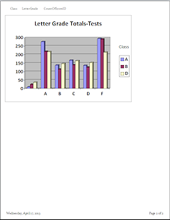
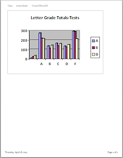 The resulting chart shows sample data while the report is in Design View. Switch to Print Preview to see the actual data in the chart.
![]() A suitable table or query
must already exist to start you out! Later you can edit the source for the chart to include other tables or queries.
A suitable table or query
must already exist to start you out! Later you can edit the source for the chart to include other tables or queries.
Editing a Chart
 Once
the wizard has finished, you cannot get back to the wizard pages. You
must either recreate the chart with the wizard or edit it from Report
Design View.
Once
the wizard has finished, you cannot get back to the wizard pages. You
must either recreate the chart with the wizard or edit it from Report
Design View.
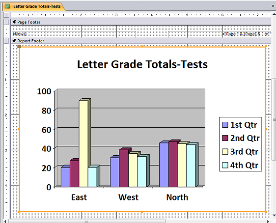
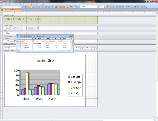
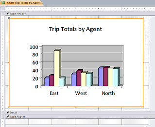
In Report Design View, you will see the default chart data about East, West, and North and the four quarters of the year instead of your actual data. Only the chart's Title is correct. So confusing!
You can resize the chart by selecting it and dragging its handles. You can drag it to a new position on the page.
To change the source for the data for the chart, go to the Property Sheet for the chart control and in the Source property, open the Query Builder and edit the query as much as you wish. Remember, however, that if you used an existing query, that query will be updated with your changes.
![]() Tip: If you want to show a static
chart that is not based on Access data, create it in Excel and paste it
to your report.
Tip: If you want to show a static
chart that is not based on Access data, create it in Excel and paste it
to your report.
![]() Default Data
in Report Design View: In Report Design View, the chart normally shows the default data from Microsoft Graph. Access cannot figure out the
actual data until it formats the chart for Print Preview. Any changes to the datasheet values in the chart's
datasheet while in Microsoft Graph will show in Report Design View but will NOT show on the actual chart
in Print Preview. Crazy, isn't it?! The datasheet values are replaced when Access
formats the report. This can be quite confusing!
Default Data
in Report Design View: In Report Design View, the chart normally shows the default data from Microsoft Graph. Access cannot figure out the
actual data until it formats the chart for Print Preview. Any changes to the datasheet values in the chart's
datasheet while in Microsoft Graph will show in Report Design View but will NOT show on the actual chart
in Print Preview. Crazy, isn't it?! The datasheet values are replaced when Access
formats the report. This can be quite confusing!
To make it even more confusing, while working on this example, the Design View did start showing the actual chart instead of the sample data. But I have not been able to reproduce the effect.
 Format
chart features with Microsoft Graph: Double-click the chart and
chart's border changes and the ribbon also changes, showing that the chart is now in Microsoft Graph.
A datasheet window opens also, but it and the
chart show only the default sample data, not the actual data. You can edit the
chart's title and format chart parts like the axes and legend from this
window. You can change the fonts, font sizes, and alignment of axes
labels. You can change the colors of the series bars and hide or show the
legend.
Format
chart features with Microsoft Graph: Double-click the chart and
chart's border changes and the ribbon also changes, showing that the chart is now in Microsoft Graph.
A datasheet window opens also, but it and the
chart show only the default sample data, not the actual data. You can edit the
chart's title and format chart parts like the axes and legend from this
window. You can change the fonts, font sizes, and alignment of axes
labels. You can change the colors of the series bars and hide or show the
legend.
When you are finished formatting the chart, just click out of the chart to return to Report Design View.
![]() Check changes in Print
Preview: When you make formatting changes in Report Design view, you
will not see what will print. You must check the print preview carefully
to see the effect of your changes. You may need a different font size or
alignment for the actual text to fit well.
Check changes in Print
Preview: When you make formatting changes in Report Design view, you
will not see what will print. You must check the print preview carefully
to see the effect of your changes. You may need a different font size or
alignment for the actual text to fit well.
Step-by-Step: Chart Wizard |
|
| What you will learn: | to create a query from one embedded in a report to edit query to use the Chart Wizard to center chart on page to format chart in Microsoft Graph |
Start with: ![]() , resource files, worldtravel-Lastname-Firstname.accdb from folder databases project4 as updated in the previous lesson
, resource files, worldtravel-Lastname-Firstname.accdb from folder databases project4 as updated in the previous lesson
You are going to create a report containing a chart of the total price of trips sold for each agent. The Chart Wizard does not allow you to use more than one table, so you will have to use a query to get an understandable chart.
Create Query from One Embedded in Report
- Open the report Trips by Agents in Design view.
The source for this report is a query that is saved with the report. You need this query for the chart. - In the Property Sheet for the report, click the ellipsis button for the Record Source property.
The query design view opens for the embedded query. - Click the Save As button
 on the Query Tools: Design ribbon tab
The Save As dialog opens. - Type the name QTripsbyAgents and click on OK.
A message asks if you want to save changes and update the report. - Click on No.
The query is saved but the Record Source still uses the embedded query. Now you can safely edit the new query without risking damage to the report. - Close the report without saving changes.
Edit Query
What we want to see in the chart is the total of all Final Prices for each agent. So you will need to add a field to calculate the Final Price and to calculate the full name of the agent.
- Open the query QTripsbyAgents in Design view.
You only need the fields to create a full name and to calculate the Final Price. - Delete the Clients table from the Query Design.
The columns from that table vanish, too. - In the blank column after Price, add a new field:
Final Price: [Price]*(100-[Discount %])/100. - In the next blank column, add a new field:
AgentName:[LastName]&", "&[FirstName]
This simple expression will work fine for the names we have for agents currently. It would not work well with there are agents with name suffixes or who have the same first and last names. - Close and Save the query.
Use Chart Wizard
 From
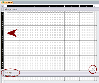
the ribbon open a blank report in Design View.
From
the ribbon open a blank report in Design View.- Enlarge the Page Header area to about 4" tall.
- Drag the bottom of the Detail section up to meet the top.
- Select the Chart tool
 on the Controls palette.
The mouse pointer changes to the Chart shape .
. - Drag across the report in the Page Header to make a rectangle about 6" x 4".
The Chart Wizard opens.
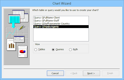 Choose the query QTripsbyAgents.
 - Click the Next > button.
-
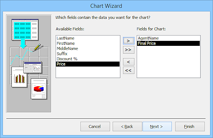 Click on LastName and Price and then on the > button to move them to the right column, Fields
for Chart.
Click on LastName and Price and then on the > button to move them to the right column, Fields
for Chart.
- Click on Next >.
The wizard opens the page for chart type.
-
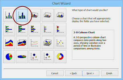 Click on the 3-D column chart, in the top row.
-
Click on Next >.
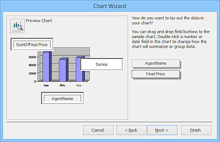 The Chart Wizard makes a guess as to how you want the data displayed,
AgentName across the bottom and a total of prices for that AgentName in the
column. That's right!
The Chart Wizard makes a guess as to how you want the data displayed,
AgentName across the bottom and a total of prices for that AgentName in the
column. That's right!The Series box is used when you have a set of values to compare, like totals for different years. That would result in several columns grouped together.
 Click on Next >.
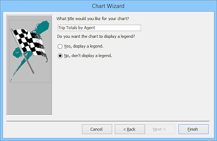
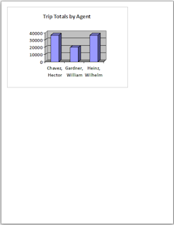
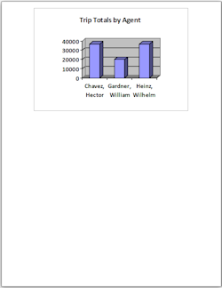
The Chart Wizard wants a title for the chart.- Type Trip Totals by Agent as the title.
- Click on the option button 'No, don't display a legend.'
 Click on Finish.
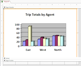
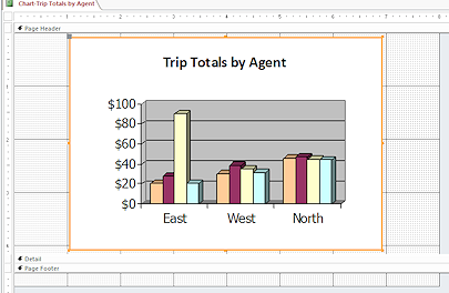
The report opens with a chart showing the sample data. Is that a surprise? Access cannot populate the chart with the actual data in Design View.
 Switch to Print Preview.
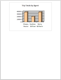
The chart is plenty large enough to read but the numbers on the vertical axis should be currency. The chart is not centered on the page. You can fix all of these issues.
 Save the report as Chart-Trip Totals by Agent
Center Chart on Page
A chart looks different in Design View since it shows the default sample data. There are some tricks to formatting the chart, too. To edit the chart's features, you must open the chart in Microsoft Graph.
-
 Switch to Design View.
Remember, the chart will use the default sample data while you are in Design View. - Make the report 8" wide.
- If necessary, click on the chart to select it.
You should see an orange outline and handles at the corners and center of each side.
- Move your mouse over the chart.
The pointer turns to the Hand shape .
. - Press the left mouse button down.
The pointer changes to the Move shape .
.
- Drag the chart to the right to put its right edge at about the 7" mark on the ruler and drop.
- Check that the center handle is on the 4" mark on the ruler.
If not, move the chart again.
-
 Switch to Print Preview.
Is your chart centered horizontally on the page?
If not, try again.
-
Switch to Design View.
The remaining changes are to the chart itself. Those must be made in Microsoft Graph.
Working in Microsoft Graph
Microsoft Graph is a program that comes with Microsoft Office. It opens only when called upon by an Office program. You will change some formatting of the chart.
-
Double-click the chart.
The border of the chart changes to diagonals.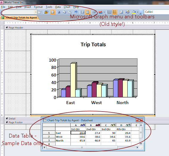
The toolbar and menu change to those of Microsoft Graph - still in the old menu and toolbar style.
You may see a datasheet below the chart.
The chart and data table still show only the sample data.
All these changes are quite surprising when you don't expect them.
-
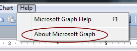 Click on the Help menu.
Surprise!
The last item is "About Microsoft Graph". This tells you what program you are in.You can now make some changes to the chart.
Change Column Color
-
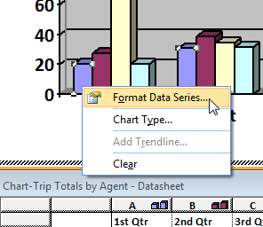 Right
click on the first column at the left of the chart.
Right
click on the first column at the left of the chart.
Your chart only has one series of data so this column controls the appearance of your data series.
- From the context menu, select Format
Data Series...
The Format Data Series dialog appears. - On
the Patterns tab, click on the light orange square in the fifth row from
the top.
-
Click on OK.
In the chart, the whole series of columns changes color.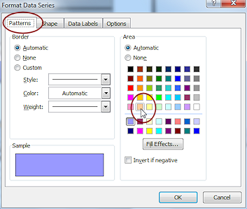
-
 Click off the chart to get out of Microsoft Graph and back to Report
Design View.
Click off the chart to get out of Microsoft Graph and back to Report
Design View.
The menu and toolbar change back to Access.
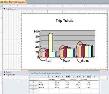
- Switch to Print Preview.
How do your changes look with the actual data?
The columns are in light orange, like the first series in the sample data. Success!
Format Chart Axes
You can format all of the font characteristics for all parts of the chart. You can add and remove parts like the title and legend. You have a lot of control but it is tricky to guess how your changes will affect your actual data. The sample data can be deceiving.
You will change the font, font size, font style, and number format.
-
 Close Print Preview to get back to Design View.
 - Double-click the chart to get back into Microsoft Graph.
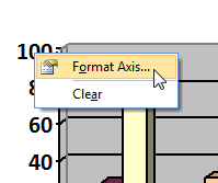
- Right click on the vertical axis and from the context menu select .
The Format Axis dialog appears.
-
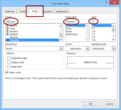 On
the Font tab, change:
On
the Font tab, change:
Font = Tahoma
Font Style = Regular
Font Size = 8With the Auto scale box checked, you won't likely get 8 pt characters!
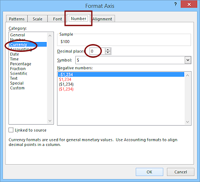 Click on the Number tab.
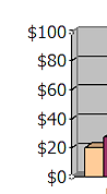
Since the values on the vertical axis are total prices, it makes sense to format the labels as money.- Change the Category to Currency.
- Reduce the Decimal places to 0 .
 Click on OK.
You are back in Microsoft Graph with a new look for the vertical axis labels, which still show sample data.
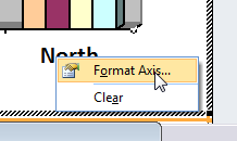 Right
click on the horizontal axis labels and from the context menu select .
Right
click on the horizontal axis labels and from the context menu select .
The same dialog appears as before.
- On the Fonts tab, change to match the vertical axis:
Font = Tahoma
Font Style = Regular
Font Size = 8
 Click off the chart to get out of Microsoft Graph and back to Report
Design View.
Click off the chart to get out of Microsoft Graph and back to Report
Design View.
The menu and toolbar change back to Access.
-
 Switch to Print Preview.
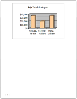
How do your changes look with the actual data?
Not too bad. But the page does not look quite like what you saw in Microsoft Graph. - Switch to Design view.
- Add in the Page Footer a label with your name.
- Save.
[Chart-Trip Totals by Agent] -
 Print. (1 page)
|
|
| © 1997-2017 Jan Smith All Rights Reserved |
Site Map What's New |
Privacy Policy Terms of Service Copyright Acknowledgements |
~~ 1 Cor. 10:31 ...whatever you do, do it all for the glory of God. ~~
Last updated: March 22, 2017