
Jan's Working with Numbers
Formulas: Subtotals: Format Groups
Data is often sorted into data groups, like the subtotal groups you created in the previous lesson. How can you make this kind of data easier to read? Those subtotals can get lost in the mass of rows.
- Separate groups with color or borders or white space.
- Format summary data (like subtotals and averages) different from groups.
- Do not use too many different formats.
Too many different formats can make a sheet harder to read instead of easier. But a careful choice of background, border, alignment, spacing, font style and size, and font color can help the eye follow the flow of data.
![]() Colors: Background colors may all look the same when you print in black and white
instead of color. The darker colors may all look black.
The lighter colors may be the same shade of gray.
Colors: Background colors may all look the same when you print in black and white
instead of color. The darker colors may all look black.
The lighter colors may be the same shade of gray.
![]() Alternate
light/dark: Follow a light background group with a darker background group. If you use a dark fill, change the font color
to a light color or your text may vanish into the darkness.
Alternate
light/dark: Follow a light background group with a darker background group. If you use a dark fill, change the font color
to a light color or your text may vanish into the darkness.
| |
Step-by-Step: Format Data Groups |
|
| What you will learn: | to format data group - background, border, merge duplicates to move a table to print in black and white to check formatting to revise colors based on how they print |
Start with: ![]() trips22-Lastname-Firstname.xlsx - Specials sheets (saved in previous lesson)
trips22-Lastname-Firstname.xlsx - Specials sheets (saved in previous lesson)
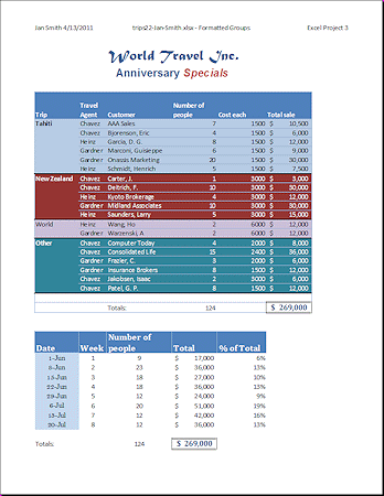
You will format the data to emphasize the sorting categories you created on the Specials sheet and to spotlight the grand totals. You may need the original data later, with no formatting or cute layout tricks. You will work with a copy of the sheet. This data does not have the Subtotals. That's on a different sheet.
To visually separate the groups of trips, you will apply a fill color to the whole group, and a border below the last row in the group. Since the name of the trip is repeated for each record, you can merge those cells and show the trip name just once for the whole group. To make the grand totals more visible, you will move the second table to the left and down.
Disadvantages to merging duplicate cells:
- Creating charts is more difficult.
- To sort again you must split the merged cells and replace the data in the new cells.
Copy Sheet
-
 Open trips22-Lastname-Firstname.xlsx to
the Agent Totals sheet.
Open trips22-Lastname-Firstname.xlsx to
the Agent Totals sheet.
- Save
As trips23-Lastname-Firstname.xlsx in the excel project4 folder of your Class
disk.
- Right click on the sheet tab for Specials and select Move or Copy...
- In the Move or Copy dialog, check the box to Create a copy.
-
In the first text box select trips23-Lastname-Firstname.xlsx (with your own first name and last name, of course) and in the second select from the drop list Tahiti-linked. Click OK.
A new sheet named Specials (2) appears at the between Agent Totals and Tahiti.
- Rename this sheet Formatted Groups .
Having your data in its original state can save a lot of time and aggravation if you decide that your groupings were not such a good idea. It's another safety net.
- Save.
[trips23-Lastname-Firstname.xlsx]
Format Group: Fill, Border, Merge Duplicates
You will format the new sheet and leave the original data in place.
- On the sheet
Formatted Groups, select cells A5:A10, all of which contain the word Tahiti.
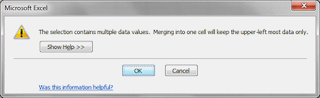
- On the Home tab click on the button Merge & Center.
- Click on OK on the message about losing cell contents when merging.
- Click alignment buttons Top Align and Align Text Left.

- Make Tahiti Bold .
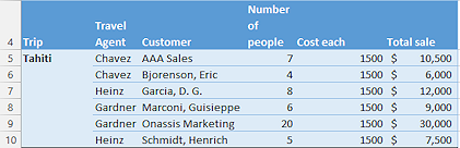 Select cells A5:F10, which are the records about
Tahiti trips.
Select cells A5:F10, which are the records about
Tahiti trips. - Apply a
fill Accent 1, Lighter 60% or 80%.
- Apply a thick bottom border with the Border button on the Formatting bar.

-
 Repeat the procedure for the New Zealand trips, using a different color at the same Lighter %.
The theme colors are somewhat different in Excel 2013 and 2016
Your color choices may be different.
[Select cells A11:F15. Apply a fill color and the same bottom border. Select cells A11:A15 and merge. Set alignment to Left with Vertical alignment as Top. Make 'New Zealand' Bold. If necessary, widen column A to show all of the "New Zealand". Bold text takes more space! ]
- Repeat the procedure for the World trips, using another color at the same Lighter %.
- Repeat the procedure for Other trips, using yet another color at the same Lighter %.
- Save.
[trips23-Lastname-Firstname.xlsx]
Format Sheet: Move Table
-
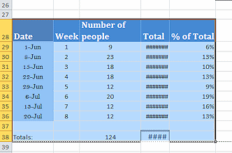 Select the second table, in the range C28:G38.
 - Drag the selection left to A28.
The column width is too narrow for the values in the Total column. - AutoFit column D.
- Save.
[trips23-Lastname-Firstname.xlsx]
Preview and Print
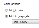
Printing in gray scale costs less than printing in color. What will
your pretty colors look like in shades of gray?
![]() Design
Tip: Think about how colors print in gray scale when picking
out your colors!
Design
Tip: Think about how colors print in gray scale when picking
out your colors!
- Check Print Preview.
Now the grand totals on row 25 are more noticeable and both tables still fit on one page. -
 If
you have a color printer, open Printer Properties from the Print dialog or the Print pane and change the color options
to print in
Gray Scale.
If
you have a color printer, open Printer Properties from the Print dialog or the Print pane and change the color options
to print in
Gray Scale.
(Exactly how to do this varies because the dialog vary depending on the exact model of printer.)
The preview does not change to show what your document will look like without colors. -
 Print in gray scale, if it is available, or black and white.
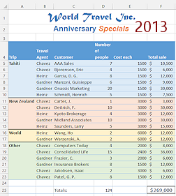
In this formatting plan the groups had different colors but the same Lighter %. Did the groups stand out from each other? Apparently using the same percentage for all of the groups was not a good plan!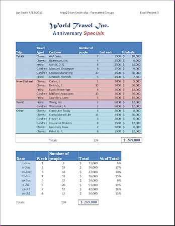
Formatting for all groups used 60% lighter fill with dark text
Most groupings look the same in gray scale. - Close Print Preview.
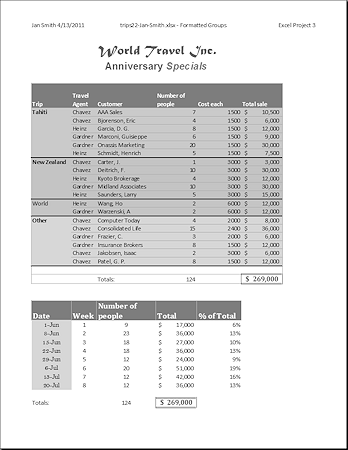
Use Alternating Formatting
By alternating the formatting between groups, you can guarantee that printing in gray scale will still show the groupings clearly.
![]() Design
Tip: For best results in gray scale printing, use a lighter
color fill with a dark font color alternating with a darker color fill
with a light font color.
Design
Tip: For best results in gray scale printing, use a lighter
color fill with a dark font color alternating with a darker color fill
with a light font color.
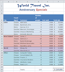
- Change the fill color for the New Zealand group of cells to use Darker 25% and change the font color to White.
- Change the Other group of cells similarly.
- Save.
[trips23-Lastname-Firstname.xlsx]
- Preview.
The groupings are much more noticeable in gray scale. - Print.
- Open Printer Properties again and change back to Color, if you wish.
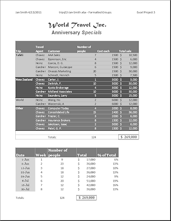
Formatting for groups alternates between light fill/dark text and dark fill/light text.
Groupings show well in gray scale.
|
|
| © 1997-2017 Jan Smith All Rights Reserved |
Site Map What's New |
Privacy Policy Terms of Service Copyright Acknowledgements |
~~ 1 Cor. 10:31 ...whatever you do, do it all for the glory of God. ~~
Last updated: March 22, 2017