
Jan's Working with Numbers
Formulas: Subtotals: Pivot Table & Chart
Another way to gather subtotals is with a pivot table. A pivot table takes your original data and shows two features as row and column labels and creates a total for the combination to show in the middle.
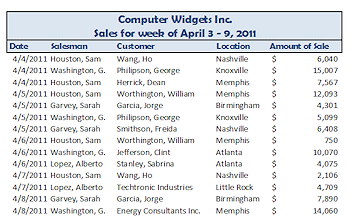
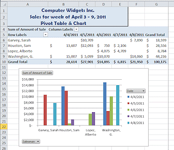
The original data in the illustrations above was sorted by date only. The pivot table shows the salesmen's names at the left and the dates across the top. In the middle is the total sales for that salesman for that date. Check out 4/5 and Sarah Garvey in the original data. She had two sales on that day, for $4301 and $6408. So the pivot table puts the sum of those, $10,709, in the cell for Sarah and 4/5. Simple idea! Powerful when there are many, many rows!
Both the pivot table and the pivot chart based on the table have drop lists that make them interactive. You can filter the display to show just certain days or just certain salesmen or both. You can change the 'total' to show the maximum or minimum or the count for the day and salesman.
| |
Step-by-Step: Pivot Table & Chart |
|
| What you will learn: | to create a pivot table to filter a pivot table to change the function for the pivot table to create a pivot chart |
Start with: ![]() trips23-Lastname-Firstname.xlsx - Specials sheets (saved in previous lesson)
trips23-Lastname-Firstname.xlsx - Specials sheets (saved in previous lesson)
Create Pivot Table
You will create a pivot table that shows in the middle the total of sales for each salesman for each trip. You will have to pick a category for rows and for columns to do this kind of sum.
When you don't need to see the individual rows, creating a pivot table can be faster and easier than creating subtotals and formatting the groups.
-
 Open trips23-Lastname-Firstname.xlsx to
the Specials sheet.
Open trips23-Lastname-Firstname.xlsx to
the Specials sheet.
This sheet has your original trips data.
-
Save
As trips23-pivottable-Lastname-Firstname.xlsx in the excel project4 folder of your Class
disk.
(Yes, we are using a file name that is out of the pattern. That's what happens when a new topic gets slid into an existing sequence.) - Select the data for trip sales, A4:F23 on the Specials sheet.
(Be sure you are on the Specials sheet!) -
 Experiment:
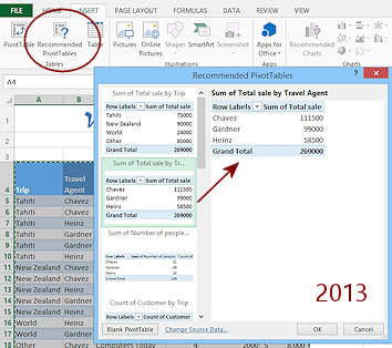
 Excel 2013, 2016: The Insert ribbon tab has an additional button, Recommended Pivot Tables. This button opens a palette of very simple pivot tables.
- Scroll the list of the suggestions on the left.
- Click on a few to see a larger table in the preview area.
-
 On
the Insert ribbon tab, click the PivotTable button.
On
the Insert ribbon tab, click the PivotTable button.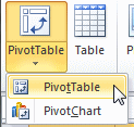

 Excel 2007, 2010: A menu opens. Click on PivotTable in
the menu.
Excel 2007, 2010: A menu opens. Click on PivotTable in
the menu.
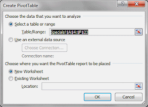
The dialog Create PivotTable opens.
The cells you selected are listed, but you could type in a different selection if you needed to.Leave the default setting, New Worksheet, for the location of the new PivotTable.
-
Click on OK.
A new sheet opens with the PivotTable Field List pane docked at the right.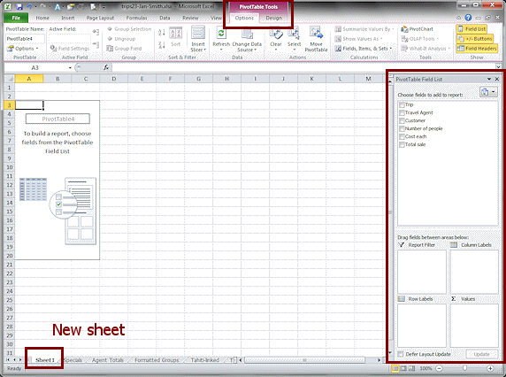
The PivotTable Tools ribbon tab is in view.
There are two subtabs -
Options and Design or Analyze and Design.Where the sheet tab appears depends on which sheet was selected. The number for the sheet and the number for the PivotTable depend on how many times you've tried this and started over!
 In
the PivotTable Field List pane, drag field names
down to the areas at the bottom as follows:
In
the PivotTable Field List pane, drag field names
down to the areas at the bottom as follows:
Drag Trip to Column Labels
Drag Travel Agent to Row Labels
Drag Total sale to Values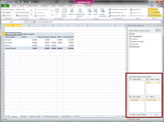
The table starts to appear as you make choices. This makes it easy to correct errors as you go.
The fields you used result in a table that answers questions like:
What was the total of Chavez's sales of Tahiti trips? ($16,500)
What was the total of all Tahiti trip sales? ($75,000)Notice the arrows in the table by Column Labels, and Row Labels. Formatting from the Specials sheet is lost.
Excel 2007: The Trips in the column labels are back
to alphabetical order instead of the order on the Specials sheet.- Save.
[trips23-pivottable-Lastname-Firstname.xlsx]
Filter PivotTable
The table can be filtered on rows or columns or both to change what data shows.
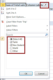 Click the arrow beside Column Labels.
A menu of choices appears for sorting and filtering. This makes the table interactive. You can change what shows on the fly.
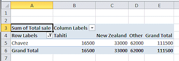
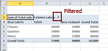 Uncheck the boxes for Other and World and click on OK.
The table changes to match, including the Grand Totals. Cool!
The arrow for Column Labels changes to a Filter button. Now it is clear (if you are paying attention) that the table has a filter in place.
- Open the filter list again and Select
All and click on OK.
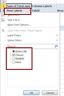 Click the arrow beside Row Labels to see it's sort/filter
list.
Click the arrow beside Row Labels to see it's sort/filter
list.
 Uncheck Gardner and Heinz and click on OK.
The table changes to show only Chavez results.
- Open the filter list again and Select
All and click on OK.
The table returns to its original rows and columns.
Change Function
The data in the middle of the table does not have to be a SUM.
-
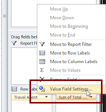 In
the PivotTable Field List pane, click on Sum of Total... at the bottom
right.
In
the PivotTable Field List pane, click on Sum of Total... at the bottom
right.
A menu appears.
- Click on Value Field
Settings...
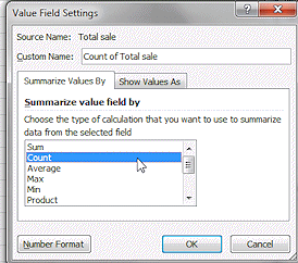
The dialog Value Field Settings appears.
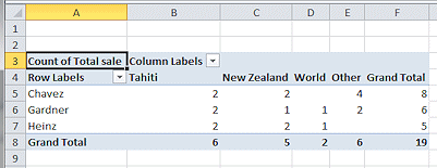 In the list Summarize value field by, click on Count and then on OK.
The table changes to show the number of items instead of the total of sales.
Now you can answer questions like:
How many Tahiti trips did Chavez sell? (2)
How many trips were sold altogether? (19)- Undo.
- Save.
[trips23-pivottable-Lastname-Firstname.xlsx]
-
Experiment: Pivot Table
- Drag different fields to different areas in the PivotTable Field List pane.
- Pick different functions for the values in the middle of the table.
- Try to add more than one field to the Row Labels.
- Can you create a pivot table that gives similar results to the Formatted Group sheet?
-
Drag the Customer field to the
Report Filter area.
Something new appears on the spreadsheet. Try out the choices. - Use Undo to remove your experiment changes or else close without saving changes and reopen.
Create Pivot Chart
A pivot chart has some extra features, too.
If you choose to create a
Pivot Chart before you have a table, you get the table also.
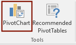
 With
at least one cell of the PivotTable selected, on the ribbon tab PivotTable Tools: Options or PivotTable Tools: Analyze in the Tools tab group, click on the button PivotChart.
With
at least one cell of the PivotTable selected, on the ribbon tab PivotTable Tools: Options or PivotTable Tools: Analyze in the Tools tab group, click on the button PivotChart.
The gallery of chart types appears.
-
Click on the first column chart, Clustered Column.
The chart appears on the same sheet as the table.The ribbon now shows PivotChart Tools, with four subtabs in Excel 2007 and 2010 and three tabs in Excel 2013.
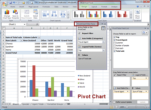 Excel 2007: The chart appears along with a new
floating window or docked pane, PivotChart Filter Pane.
Excel 2007: The chart appears along with a new
floating window or docked pane, PivotChart Filter Pane.You can filter the chart and table at the same time with the drop lists in the PivotChart Filter Pane.
The legend is different from the chart in Excel 2010 because the sorting of the trip names is alphabetical in 2007.
Excel 2010, 2013, 2016: Instead of a new pane like Excel 2007,
the chart has three labels - Sum of
Total sale, Trip, and Travel Agent. The colors are different in Excel 2013 and 2016 and the PivotChart Tools ribbon tab has only 3 subtabs: Analyze, Design, and Format.If you right click on Sum of Total sale, you get the same menu as from the Values area in the pane. The drop lists for Trip and Travel Agent are the same ones you saw with the PivotTable.
You can format the chart just like other charts, making many changes.
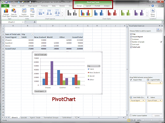
 Drag the chart over to the left, underneath the
PivotTable.
Drag the chart over to the left, underneath the
PivotTable. -
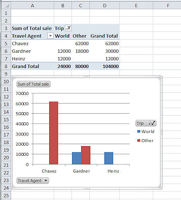
Filter the chart to show only the World and Other trips.
(Uncheck Tahiti and New Zealand in the filter list for Trip.)
The table and chart both change.
(Colors may be different between versions.)
- Click out of the chart to
deselect it.
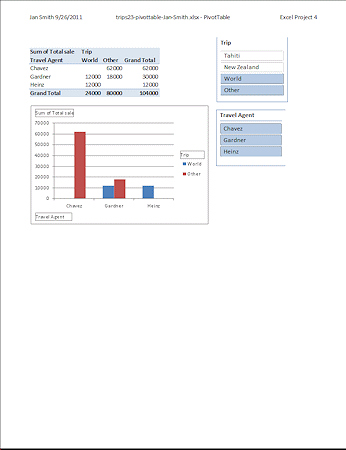
- Rename the sheet to PivotTable.
- Create a header for this
sheet:
On the left: Your name, space, date
In the middle: file name, hyphen, sheet name
On the right: Excel Project 4
-
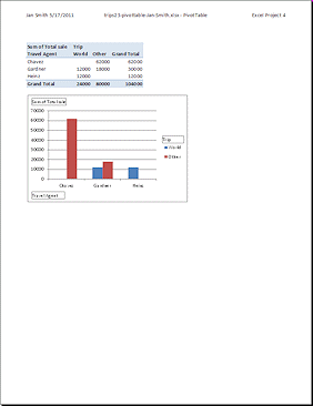
 Print just the PivotTable sheet.
Can you tell from the printed page that this was a pivot table and pivot chart? There are clues!The pivot table includes "Column Labels" and "Row Labels", but without the arrows. These labels cannot be edited out of a pivot table.
The pivot chart has simple text boxes instead of the buttons with arrows or filter symbols.
Excel 2007 version does not have the button labels at all!
- Save.
[trips23-pivottable-Lastname-Firstname.xlsx]
Excel 2010, 2013, 2016: Slicers
Looking at your pivot table and pivot chart, you cannot see what values for Travel Agent or Trip have been filtered out. A slicer is a new feature, starting with Excel 2010, that provides a way to make that clear, both on the screen and in a print-out!
- If necessary, click in the pivot table to make the ribbon PivotTable Tools appear.
-
 On the ribbon tab Options or Analyze, click the Insert Slicer button .
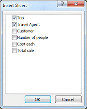
The Insert Slicers dialog appears in a floating window. This lists each of the columns in the original data.
- Click on the box for Trip and for Travel Agent.
Two floating lists appear. The highlighted items are showing in your pivot table and pivot chart. Now you can clearly see what your filters include and what they leave out.
-
Experiment: Filters and Slicers
You can change the filtering by clicking on the items in each slicer.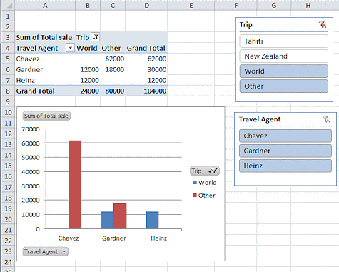
Move the slicer lists so they do not overlap.
Resize if you wish to save space.
-
Click on various combinations of items in the Trip and Travel Agent slicers. You can use the SHIFT and CTRL keys with your mouse clicks to select more than one choice at a time.
Observe how the table and the chart change.
-
Change the filters with the filter drop lists also.
Which way do you like best??
- Return the selected items to World, Other, and all three
agents.
-
 Switch to Print
Preview.
Switch to Print
Preview.
The slicer lists are showing! Now it is clear on the print-out what you have filtered. This is a big help!
- If necessary, switch back to Normal view to size and position the slicer lists so that the sheet will print on one page.
- Save.
[trips23-pivottable-Lastname-Firstname.xlsx]
- Print the active sheet only.
The preview may not show all of the borders but the printed version will. This is an effect of the zoom in print preview, which you cannot adjust.
|
|
| © 1997-2017 Jan Smith All Rights Reserved |
Site Map What's New |
Privacy Policy Terms of Service Copyright Acknowledgements |
~~ 1 Cor. 10:31 ...whatever you do, do it all for the glory of God. ~~
Last updated: March 22, 2017