
Jan's Working with Presentations
Advanced: Tables & Charts: Chart
A picture is worth a thousand words, or so the Chinese proverb says. Turning numbers into a chart can help your audience understand what the numbers mean.
What is a chart?
 A chart is a
way to represent numbers graphically, that is, as a picture. There are many
different types of charts.
A chart is a
way to represent numbers graphically, that is, as a picture. There are many
different types of charts.
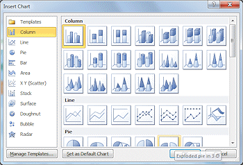
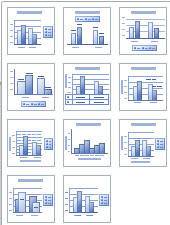
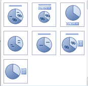
The two most commonly used types are Column and Pie charts. Both of these have several versions.
|
|
|
|
Column
Chart: Most common choice. |
Pie Chart: Shows numbers as parts of a whole. |
Parts of a Chart
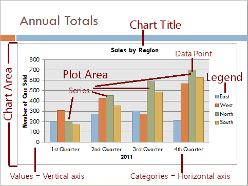 Each labeled part
in the illustration can be formatted on its own or even hidden. Except, of course,
the plot area cannot be hidden. That is the bars or lines or pie wedges. There is no
chart at all without at least a few of those!
Each labeled part
in the illustration can be formatted on its own or even hidden. Except, of course,
the plot area cannot be hidden. That is the bars or lines or pie wedges. There is no
chart at all without at least a few of those!
Chart Layouts
PowerPoint includes several chart layouts for each chart type to get you started. The default layout for each type is the first layout at the top left.
Examples:
Columns
|
Pie
|
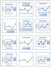
Lines
|
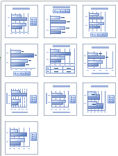
Bars
|
| |
Step-by-Step: Create a Chart |
|
| What you will learn: | to insert a chart to enter data in datasheet by typing to copy and paste data to datasheet |
Start with: ![]() , nz-tabledesign-Lastname-Firstname.pptx
, nz-tabledesign-Lastname-Firstname.pptx
The Story So Far:
You are creating a presentation on New Zealand for World Travel Inc.
to show customers.
You will create a chart of the number of rainy days in each season for
the same places in New Zealand that you used for the table of
temperatures.
Insert Chart
 If necessary, open the presentation nz-tabledesign-Lastname-Firstname.pptx from the powerpoint project3 folder on your
Class disk.
If necessary, open the presentation nz-tabledesign-Lastname-Firstname.pptx from the powerpoint project3 folder on your
Class disk.- Save As with the name nz-chart-Lastname-Firstname.pptx to that same folder.
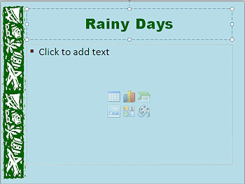 Add a new slide after the Temperatures slide.
The default layout is Title and Content.
- Type Rainy Days as
the slide's title.
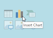
Click the Chart icon on the slide.
The Insert Chart dialog opens.Alternate Method: Insert ribbon tab > Chart
-
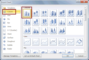
Click on the first Column chart, a plain column chart and then click on OK.
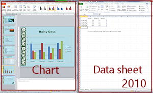
The default chart appears on the slide with an Excel spreadsheet in a separate windows, showing the default data. The colors in the chart come from the current theme. You can resize and rearrange the two windows if you wish.
-
If necessry, arrange the windows so you can see the data on this page, the Excel sheet, and the chart at the same time.
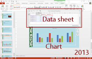
The default chart style is the same in PowerPoint 2007 and 2010 but changed for PowerPoint 2013 and 2016. The default theme in PowerPoint 2013 and 2016 is different also, but you applied the Color theme Office 2007 - 2010 in a previous lesson. Of course the wider default slide size in PowerPoint 2013 and 2016 gives the slides a different look, too.
- Save.
[nz-chart-Lastname-Firstname.pptx]
Enter Data: Typing
 You must replace the default data with your own
by typing it in or pasting it. The chart will change
automatically to match... IF you drag the chart data range to include all of the new
data.
You must replace the default data with your own
by typing it in or pasting it. The chart will change
automatically to match... IF you drag the chart data range to include all of the new
data.
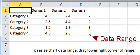
Range handle (Zoomed view): 
You can change the data range by dragging the tiny blue range handle. You can only drag the data range handle one direction at a time, even though the mouse pointer will change to a diagonal shape. You cannot copy and paste from the Temperatures slide. This data is about rain, not temperatures.
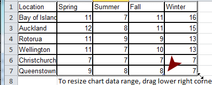
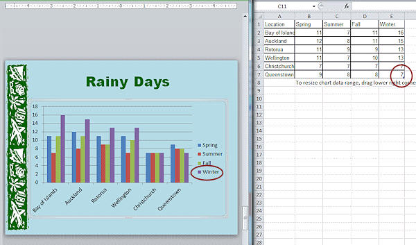
| Location | Spring | Summer | Fall | Winter |
| Bay of Islands | 11 | 7 | 11 | 16 |
| Auckland | 12 | 8 | 11 | 15 |
| Rotorua | 11 | 9 | 9 | 13 |
| Wellington | 11 | 7 | 10 | 13 |
| Christchurch | 7 | 7 | 7 | 7 |
| Queenstown | 9 | 8 | 8 | 7 |
-
Click in the spreadsheet in cell A1 (upper left).
-
Type the word Location and press the TAB key.
The cursor moves to the cell to the right, B1. -
Continue typing the text for each cell to match the table at the right and press the TAB key to move to the next cell.
After the word Fall is entered, where does TAB put the cursor? Not in cell E1 but in A2. Surprise!
A data range is very helpful when it is the correct size. You can just keep typing and using TAB without having to manually change to a new row. When the size is off, you get a mess!
-
Drag the blue range handle one column to the right and continue filling in the data from the table.
When you get to E5 in the last row in the data range and press TAB, what happens?
The data range expands one row. Well, that is unexpected but helpful!Watch how the chart updates while you are typing.
-
When you enter the value in E7, press TAB once more.
You now have a blank row in the data range. -
 Look at your PowerPoint chart, without
closing the data sheetl(!).
Look at your PowerPoint chart, without
closing the data sheetl(!).
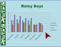
What's that blank area on the right side?
The chart is setting aside space for the blank row that is in the data range.
-
Undo.
Only cells with data are in the data range. No more blank spot in the chart!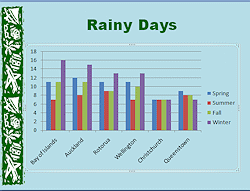
-
Inspect the chart in PowerPoint without closing the datasheet.
Do you see any errors? Make corrections if necessary. -
If all seems to be correct, close the data sheet window.
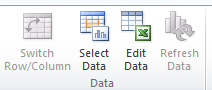
 How to get the data sheet back later:
 Chart Tools: Design > Select Data or Edit Data
- Save.
[nz-chart-Lastname-Firstname.pptx]
Enter Data: Copy and Paste
Next you will create a new slide and make the same chart as before with a different method, copy and paste.
-
Click the thumbnail of the Rainy Days slide and insert a new blank slide.
-
Type Rainy Days in the Title placeholder.
-
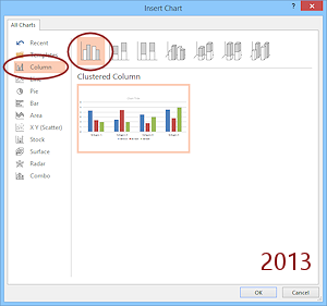
Click the Chart icon in the text placeholder, select the clustered column chart type, and click on OK.
The data sheet opens with sample data again. The data sheet may be in a different location this time if you rearranged the windows earlier. -
Location Spring Summer Fall Winter Bay of Islands 11 7 11 16 Auckland 12 8 11 15 Rotorua 11 9 9 13 Wellington 11 7 10 13 Christchurch 7 7 7 7 Queenstown 9 8 8 7 Drag across the cells in the table at right on this web page and Copy.
- In the data sheet
with the sample data, click in cell A1 (top
left corner) and Paste.
The new data replaces the sample data. -
Inspect the chart carefully. Does all of the data show on the chart?
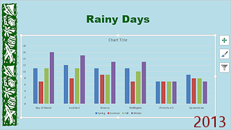
PowerPoint 2013 and 2016 handle the paste well so that the chart is not missing any data. But PowerPoint 2007 and 2010 are not as smart.
 PowerPoint 2007, 2010:
 Problem: Data is missing
The illustration shows a possible result. All six of the locations show on the horizontal axis but there are only 3 different series of bars. Winter is missing, even though it pasted onto the spreadsheet!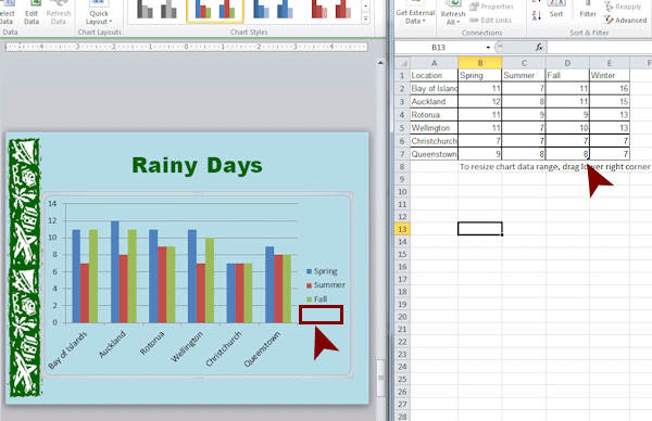
Solution:
-
 In the data sheet, click in a blank cell to
deselect what you just pasted.
In the data sheet, click in a blank cell to
deselect what you just pasted.
- Locate the small blue range handle.
It is at the bottom right corner of cell D7.
-
Drag the handle to the right until the border surrounds all of the data.
You should see 6 locations across the bottom and 4 seasons in the legend at the right.
The corner area handle is in cell D5 originally. When you pasted the data, Excel moved the handle down to row 7, but did not move it over to include column E. Surprise!
It's a bit hard to spot the handle when it's in the middle of data especially when there is a border around each cell. The border was copied when you copied the data from the table on this page. Making one action easier caused a little problem elsewhere. Now THAT should not be a surprise to you by now!
-
Close the data sheet window.
-
-
If necessary, resize the PowerPoint window to whatever size you find useful.
-
Delete the first slide Rainy Days that you created by typing in the data.
Since you pasted the data onto the second copy, you won't have any typing mistakes on that one. Any errors are mine!
(Sometimes I include mistakes so that we can go over how to fix them, but not this time.) -
Save.
[nz-chart-Lastname-Firstname.pptx]
|
|
| © 1997-2017 Jan Smith All Rights Reserved |
Site Map What's New |
Privacy Policy Terms of Service Copyright Acknowledgements |
~~ 1 Cor. 10:31 ...whatever you do, do it all for the glory of God. ~~
Last updated: March 22, 2017