Spreadsheet Design:
Analysis

Did you want Working with Numbers: 2007,2010,2013,2016 or
español![]()
|
|
Spreadsheet Design:
|
|
||||
|
|
||||||
|
|
Good DesignA good design for your spreadsheet makes it easy for you:
Good design does not have to be pretty or colorful, though that often helps. A well-designed sheet will be comfortable to work with and makes it easy to answer the questions you want to ask. How can you tell if a worksheet has a good design? The questions below are a good guide. |
|
Project 5: Design
Search Glossary Appendix |
||||
Analyze a spreadsheetTo analyze the effectiveness of a spreadsheet's design use the following questions about the spreadsheet. With good design you can answer these easily. A poor or bad design makes it hard or impossible.
Bad Design: Example #1What's wrong with the spreadsheet below? Try to answer the analysis questions: Purpose, Data, Calculations, Changes.
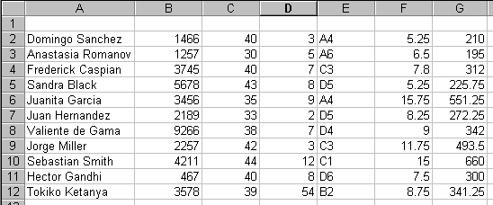
Bad Design #1 You can't tell anything about what is going on in this sheet! You cannot answer any of the analysis questions. The only good thing about the sheet is that it uses the default font, so you can read the values. What's wrong?
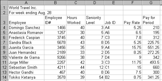
Simple Solution: Adding some simple titles and labels makes the spreadsheet much more understandable, as the version below shows. Now can you answer any of the analysis questions?
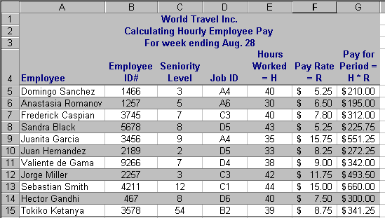
Adding titles and labels explains a lot! It is still not really easy to read the number in F & G, and you can't tell if the Pay for Period entries are calculated or typed in. Even Better Solution: Some formatting and expanded labels and titles will help even more, as the next illustration shows. Can you answer the analysis questions?
Adding formatting and explanation of calculations Now you can see that the Pay for Period is a calculated value using the Hours Worked and Pay Rate. Moving the Hours Worked over puts the values used in the formula next to each other, which makes it easier to see where the Pay for Period comes from - and why some paychecks are bigger than others. This spreadsheet is an example of one that you would not normally have to change later. It is a report of the values at a given date. However, a similar spreadsheet that logs the hours worked each day for each worker would have new data added every work day. Bad Design: Example #2
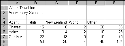
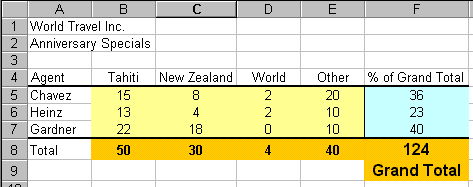
Here is a design problem common when rows and columns are
both being calculated. Can you answer the analysis questions above for this
sheet? What's wrong?
Solution:
The right color coding and labels make all clear Design PrinciplesFrom the examples above and some common sense we can come up with some principals and guidelines that will help you design worksheets that work well.
|
|||||||
|
|
~~ 1 Cor. 10:31 ...whatever you do, do it all for the glory of God. ~~ |