|
The Chart
Wizard is one of Excel's cool features. You can easily create charts of
various kinds using your spreadsheet data. The wizard leads you step by step
to turn your numbers into an cool and colorful chart.


Some of the many types of charts - one to match your every need!
For this introduction to charts, you
will stick with a simple pie chart. A pie chart works well when you want to
see how much of the whole each part is.
|
|
Where you are:
JegsWorks >
Lessons >
Numbers
Before
you start...
Project 1: Excel Intro
Interface
Select & Navigate
Common Tasks

 AutoSum AutoSum
Sort
Chart
Wizard
Number Formats
Summary
Quiz
Exercises
Project 2: Excel Basics
Project 3: Format & Arrange
Project
4: Groups & Formulas
Project 5: Design
Search
Glossary
Appendix
|
|
 |
Step-by-Step: Pie Chart with Wizard |
|
What you will learn: |
to use the Chart Wizard-
to select data and labels
to select chart type
to format chart title, legend, labels
to create a chart on separate sheet
to print a chart
|
Start with:
 (Excel open
to budget.xls from resource
files)
(Excel open
to budget.xls from resource
files)
To use the chart wizard you first select the data to be charted and
also the cells that label this data.
-
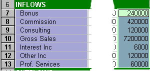 Select the range A7:A13, the row labels in the Inflow section. Select the range A7:A13, the row labels in the Inflow section.
- Hold CTRL down, scroll to the right, and select the range N7:N13, the totals for each row
of the Inflow section.
-
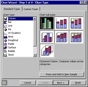 Click on Click on  the Chart Wizard button.
The Chart Wizard dialog opens at step 1 of 4. the Chart Wizard button.
The Chart Wizard dialog opens at step 1 of 4.
- Experiment: Select each chart type and click on each of
its subtypes. Press and hold down the bar below the
subtypes. The pane will show how the data you just selected would look using that chart
subtype. Which types look useful for this Budget data?
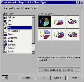 Select the Pie chart type and the first
subtype on the top row. Select the Pie chart type and the first
subtype on the top row.
-
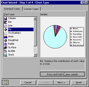 Click
on the button Press and hold to view sample and hold the mouse
button down while you look at the preview pane in the dialog. It shows a rough
estimate of what your data will look like in this chart type. Click
on the button Press and hold to view sample and hold the mouse
button down while you look at the preview pane in the dialog. It shows a rough
estimate of what your data will look like in this chart type.
-
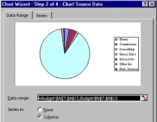 Click on Next. Step 2 of the wizard opens, showing the ranges used for the chart. Click on Next. Step 2 of the wizard opens, showing the ranges used for the chart.
The Data range uses absolute references. Those $ symbols scattered
around do not mean money this time! If you move your data
around on the sheet, the chart will change its references to match. Super
helpful!
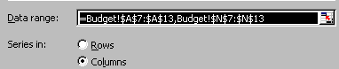  Notice that the
sheet name is included in the cell references, followed by an exclamation point. You can read
the exclamation point ! as "bang" when saying the range aloud. Ranges are separated by a comma. So the correct format for the data range is
NameOfSheet!$Column$Row:$Column$Row and put a comma between each range used for the chart.
The Series tab is used when charting more than one data set at once. Notice that the
sheet name is included in the cell references, followed by an exclamation point. You can read
the exclamation point ! as "bang" when saying the range aloud. Ranges are separated by a comma. So the correct format for the data range is
NameOfSheet!$Column$Row:$Column$Row and put a comma between each range used for the chart.
The Series tab is used when charting more than one data set at once.
-
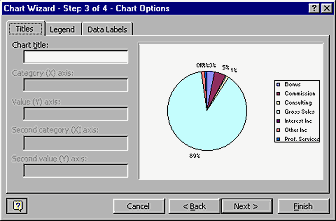 Click on Next. Step 3 of the wizard opens to the Titles tab. The pie chart will change to show your changes. Click on Next. Step 3 of the wizard opens to the Titles tab. The pie chart will change to show your changes.
- For the Chart title type in Budget 1998- Inflows
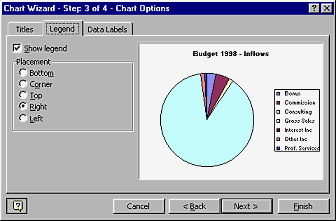
- Click on the Legend tab. A chart's legend tells what the chart colors
represent. You can choose the location of the legend here.
- Click on each choice to see what it does. Choose last
to have the legend on the
right.
-
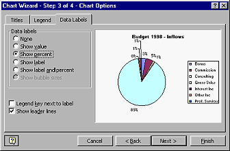 Click on the Data Labels tab.
You can choose what kind of labels to show on this tab. Click on the Data Labels tab.
You can choose what kind of labels to show on this tab.
- Select Show percent or
  Percentage and check the box for Show leader lines. Percentage and check the box for Show leader lines.
-
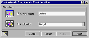 Click on the Next button to continue. Step 4 opens. Click on the Next button to continue. Step 4 opens.
- Choose to create As new sheet and type in the Inflows .
- Click on the Finish button.
Your finished chart appears on a new chart sheet named Inflows.
-
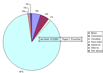 Click in the Formula bar and type your name, 2 spaces, the date, 6 spaces,
Project 1: Excel Intro and press
ENTER. A frame or text box containing your text appears in the center of the sheet. Click in the Formula bar and type your name, 2 spaces, the date, 6 spaces,
Project 1: Excel Intro and press
ENTER. A frame or text box containing your text appears in the center of the sheet.
- Drag the frame/text box to the upper left of the chart's white background.
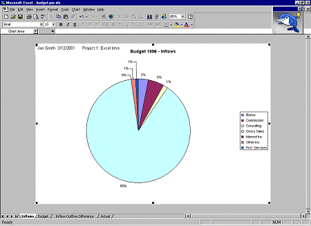
- Click on
 Print Preview to
see how this chart will print. Make corrections if necessary. Print Preview to
see how this chart will print. Make corrections if necessary.
- Click
 the Print button to print this
sheet only. The default settings will print all pages of the
active sheet(s). In this case there is only one page. the Print button to print this
sheet only. The default settings will print all pages of the
active sheet(s). In this case there is only one page.
You do not need to save your changes.
|