
Jan's Working with Databases
Forms & Reports: Forms: Format Form
After you get the controls that you need onto the form, it's time to consider the formatting and layout. It is tricky to get everything exactly right when you first drop controls onto the form.
You will want to create a look and arrangement for your controls that makes it easy to read and to enter data. In the last lesson, you worked with adding controls to the form, resizing them, and aligning them. In this lesson you will look into spacing controls evenly, adding lines and rectangles, and controlling the tab order.
Tab Order
![]() The TAB key has different effects in different programs. In Excel it moves the focus to the next cell to the right. In Word it moves the cursor to the next Tab stop on the ruler. In Access the TAB key moves the focus to the 'next' control. It does not behave quite the same in Form View as it does in Form Design View.
The TAB key has different effects in different programs. In Excel it moves the focus to the next cell to the right. In Word it moves the cursor to the next Tab stop on the ruler. In Access the TAB key moves the focus to the 'next' control. It does not behave quite the same in Form View as it does in Form Design View.
It is important that forms have a clear organization and a logical tab order. The tab order on a form should match the order in which the user will naturally try to enter data.
Tab order for a form is set in Form Design View in the Tab Order dialog, but it only applies to Form View. The Form Design View has it own tab order to help you select objects for editing, like controls, labels, lines, and shapes. You cannot edit the tab order for Design View.
You must set the tab order separately for each section of the form - Form Header, Detail, and Form Footer. Usually you will not want users to be able to TAB in the header or footer. The Detail section is normally where you put the controls which the users would like to select with the TAB key in Form View.
Tab Order in Form Design View:
When you are editing in Design View, it is useful to be able to TAB to select any of the controls, including lines, shapes, and decorative images. Sometimes objects overlap or are too close to a section bar to see or click on.
Useful facts about TAB in Design View:
- TAB key: Moves the selection from control to control, including labels, lines, and decorative images.
- Arrow keys: Move the selected control.
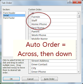
- Default tab order:
 Access 2007: Based on order controls were added to the form


 Access 2010, 2013, 2016: Primarily based on the location on the form - across left to right, then top to bottom.
Sometimes odd things can happen to the TAB order, like a control coming before its label in the tab order. - All controls are part of the tab order in Design View, including labels, lines, rectangles, and images.
- Tab order cannot be edited for Design View. Unexpected!
- Most useful for - Selecting a control that has gotten underneath another or which is too close to a section bar to see and click on.
Tab Order in Form View:
When you are entering or viewing data with a form, you want the TAB key to move the focus ONLY to controls with data.
Useful Facts about TAB in Form View:
- TAB and arrow key: Both can move the focus from control to control.
- In Edit Mode: Arrow keys move the cursor inside the control.
- Default Tab Order: Order in which the controls were added to the form.
- Only data controls are part of the tab order, not labels,
lines, rectangles, or decorative pictures.
Labels for option buttons or check boxes that have the focus show dotted lines around their labels instead of around the radio button or check box. - Change the tab order for Form View using the Tab Order dialog while in Form Design View.
- Most useful for - Moving quickly through controls you do not need to edit while keeping your hands on the keyboard.
It is important that the tab order be logical! If you moved fields around or inserted them without considering the order, you will need to change the tab order.
Setting Tab Order
 If a form is not arranged with a single column of controls, the default tab order may not work well.
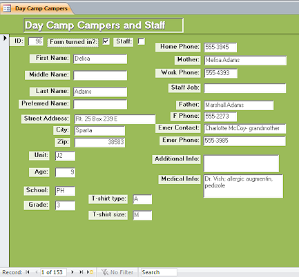
The example is from the DayCamp.accdb database from your resource files. The controls are mostly in two columns but there are strays at the top (check boxes) and bottom (T-shirt boxes).
To open the Tab Order dialog:
Context Menu: Right click in Design View and select Tab Order...
Ribbon:
![]() Access 2007:
Access 2007:
Form Design Tools: Arrange: Tab Order button ![]()
![]()
![]()
![]() Access 2010, 2013, 2016:
Access 2010, 2013, 2016:
Form Design Tools: Design: Tab Order button ![]()
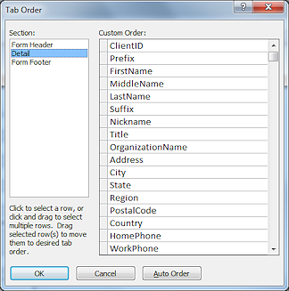
 Tab Order Dialog: Lists the order that the TAB key moves the focus through the controls in
the form. The illustration is for the example form. TAB will move the focus from Comment (which has a caption of 'Medical Info') to T-shirt
type, then to T-shirt size, which is
the last control in the list.
Tab Order Dialog: Lists the order that the TAB key moves the focus through the controls in
the form. The illustration is for the example form. TAB will move the focus from Comment (which has a caption of 'Medical Info') to T-shirt
type, then to T-shirt size, which is
the last control in the list.
But, the way the controls are now arranged on the form (which matches the sign-up forms), the focus should
move down the left column to Grade and then to T-shirt type, then T-shirt
size, and then to the top of the next
column, Home Phone.
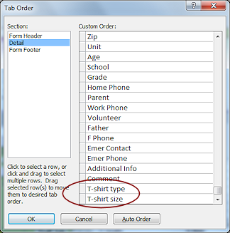
 Auto Order: The
Auto Order button on the dialog sets the order as left-to-right and then
top-to-bottom. The tab order at the right shows the Auto Order for the example form. Compare
this to the example form. Tabbing with Auto Order in place will move you across the form first and then drop down and go across again. Sometimes that is just what you want,
but not for the example form.
Auto Order: The
Auto Order button on the dialog sets the order as left-to-right and then
top-to-bottom. The tab order at the right shows the Auto Order for the example form. Compare
this to the example form. Tabbing with Auto Order in place will move you across the form first and then drop down and go across again. Sometimes that is just what you want,
but not for the example form.
What determines the initial order: The order the controls were added to the form is the default TAB order.
 To change the order: Move the mouse pointer over the left side of
the list until it turns to the Select Row shape
To change the order: Move the mouse pointer over the left side of
the list until it turns to the Select Row shape ![]() .
Click on a name or hold the left mouse button down and drag across several names to select them.
Then move the mouse pointer over the square at the left again until it turns to
the Select shape
.
Click on a name or hold the left mouse button down and drag across several names to select them.
Then move the mouse pointer over the square at the left again until it turns to
the Select shape ![]() .
Drag the selected items to a new position. A thick black
line shows where the selection will be dropped when you release the mouse
button.
.
Drag the selected items to a new position. A thick black
line shows where the selection will be dropped when you release the mouse
button.
Remove from Tab Order
 Users do not need to enter data in calculated controls and AutoNumber controls. It
is annoying to users to have to tab extra times to get past controls that
they cannot edit. So you need to remove those kinds of controls from the tab order.
Users do not need to enter data in calculated controls and AutoNumber controls. It
is annoying to users to have to tab extra times to get past controls that
they cannot edit. So you need to remove those kinds of controls from the tab order.
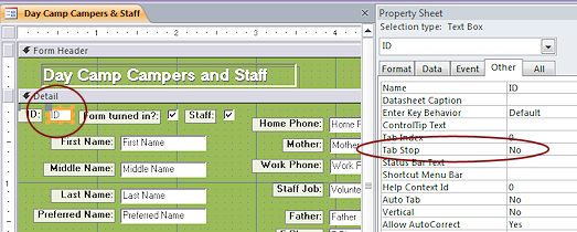
Surprisingly, the Tab Order dialog does not let you delete items from the list. The Tab Stop property for the control is just what you need for this situation. Select the control, open the Property Sheet, set the Tab Stop property to No. (Look on the Other tab of the Property Sheet to find it quickly.)
The control is still clickable, so a user can select it and copy its data if they need it. But the TAB and arrow keys will skip the control.
Disable a Control
 If
do not want users to be able to copy the value in the control,
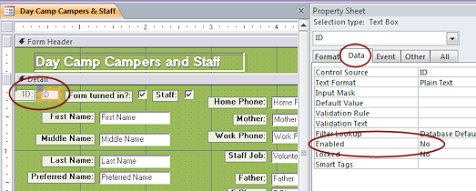
you can also set the Enabled property to No.
If
do not want users to be able to copy the value in the control,
you can also set the Enabled property to No.
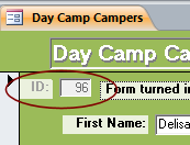 Controls that are disabled
have a different color background and grayed out text. The label text is
also grayed out.
Controls that are disabled
have a different color background and grayed out text. The label text is
also grayed out.
![]() Warning: The user cannot copy a value from a disabled control. Are you sure that won't create a problem?
Warning: The user cannot copy a value from a disabled control. Are you sure that won't create a problem?
| |
Step-by-Step: Format Form |
|
| What you will learn: | to change spacing to edit labels to draw a rectangle to format a rectangle and send to back to copy and paste controls from another form to change the tab order for Form View to remove a control from the tab order and disable a control for editing |
Start with: ![]() , resource files, worldtravel-Lastname-Firstname.accdb from folder databases project4 as updated in the previous lesson
, resource files, worldtravel-Lastname-Firstname.accdb from folder databases project4 as updated in the previous lesson
Change Spacing
Access lets you control the spacing between controls besides dragging things around. You can set all the spaces to be the same = evenly. Or you can increase or decrease horizontal or vertical spacing until you are satisfied.
- If necessary, open the form Clients.
 Did you make a backup copy of the database lately?
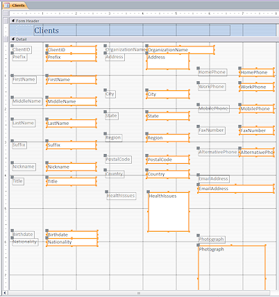
- Select all controls in the Detail section, but not the Clients label in the Form Header.
-
 From
the ribbon tab Form Design Tools: Arrange:
From
the ribbon tab Form Design Tools: Arrange:
Access 2007: Button Increase Vertical  Access 2010, 2013, 2016: Button Size/Space > Increase Vertical
Whoops. Access has gone crazy!
It has added far too much space in some places and removed what was there in others! <sigh>
Note: Your form will probably not look exactly like the illustration, depending on exactly how your columns lined up on the grid.
Let's try a smaller set of controls to help Access not get so confused.
- Undo.
-
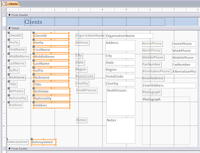 Select the controls in the first column.
You can drag across them or use the ruler to select. Problem: Controls selected that are not in the first column
Solution: Hold the CTRL key down and click on a control to deselect it.
-
 Increase vertical spacing:
From the ribbon tab Form Design Tools: Arrange: Access 2007:
Ribbon tab Format Design Tools: Arrange > Position tab group > Increase Vertical Access 2010, 2013, 2016:
Ribbon tab Form Design Tools: Arrange > Sizing & Ordering tab group > Size/Space button > Increase Vertical
What happened:
- Increased vertical space between the controls
- Made the spacing the same between the controls,
apparently due to DateUpdated having a lot more space above it. - Form size automatically increased to hold the new layout.
 Similarly, select the controls in the second column and then increase vertical spacing.
The spacing between controls increases, but the spacing is not the same as in the first column.
-
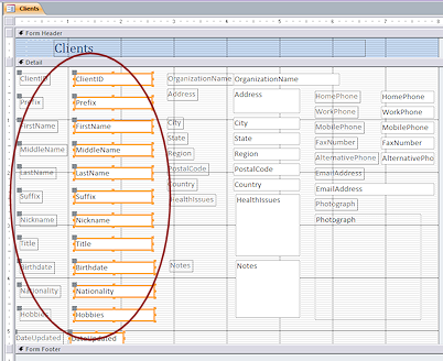
Repeat for the third column.
Some parts overlap! Not at all what you would expect.The overlaps occur with the EmailAddress and Photograph controls, whose labels are above the control instead of being to the left. Access apparently spaces the controls and ignores what that does to the labels in that case.
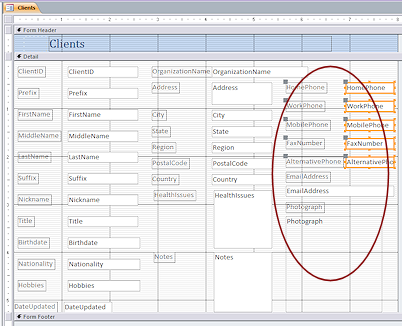 Drag the Photograph control with its label down until its label is clear of the EmailAddress control.
-
Select the phone number controls and Decrease Vertical spacing.
The label for EmailAddress is now in the clear.All controls and labels should be clear of overlaps now.
-
 Save the form.
[Clients]
-
 Switch to Form View and navigate through the records.
Does the data show in the controls nicely? Are the controls comfortably spaced?Everything but a couple of international phone numbers should be showing nicely. Perhaps you should make some changes now to the phone number controls.
Edit Phone Labels
You need to edit the labels and enlarge the controls for phone numbers without making the form any wider than its current 8".
 Switch to Form Design View.
-
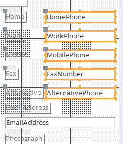 Edit the labels to remove "Phone" and "Number" from the text.
-
Select the labels and size to fit.
-
Select the controls for the phone numbers.
-
Drag them as wide as possible to the left without overlapping the labels.
 Switch to Form View and verify that
those long phone numbers are showing completely.
Switch to Form View and verify that
those long phone numbers are showing completely.
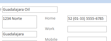
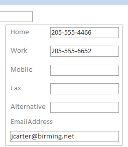
Draw Rectangle
One of the common reasons for viewing a Client record is to get a phone number or email address. There a many ways to make that commonly-needed information easier to spot. One way is to group those controls visually.
The ribbon tab has buttons for drawing lines and rectangles. These are used to divide or group areas on the form, or just for decorative effects.
-
Switch to Form Design View.
-
 On
the ribbon tab Form Design Tools: Design, click on the Rectangle button
On
the ribbon tab Form Design Tools: Design, click on the Rectangle button  .
.
The mouse pointer changes to the Draw Rectangle shape .
.
-
Drag on the form to draw a rectangle around all of the phone numbers and the email address.
Do not draw outside the form boundary. That would force the form to enlarge.
 Switch to Form View to see the effect
of your rectangle.
Switch to Form View to see the effect
of your rectangle.
(It is hard to see it in Design View!)-
Save the form. (Clients)
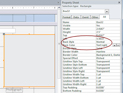
Format Rectangle; Send to Back
The rectangle gathers the phone numbers together visually, but just barely. It is not very visible with its thin border andthe default transparent background. You can change the formatting for the rectangle of the rectangle. Adding a color to the background means you have to change its stacking order. It has to be beneath the controls.
- Switch to Form Design View.
 If necessary, click on the rectangle you just drew.
- If necessary, open the Property Sheet.
-
Change
Back Style = Normal
Back Color = Text Light (from the drop list, not the ellipsis button)This makes the rectangle solid instead of transparent.
Unfortunately, the rectangle now hides the controls it was supposed to make more visible!
-
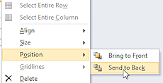 Right click on the rectangle.
 - In the context menu, hover over Position to expand the submenu.
- Click on Send to Back.
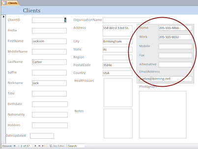 Switch to Form View.
The colored rectangle is now behind the phone numbers and email address. They are now easier to see amid all those text boxes.
Form Header/Footer: Copy and Paste
You created a header in a previous form that you can copy and paste to this one.
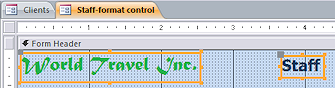 Open the form Staff-format control in Form Design View.
- Click on the unbound control World Travel
Inc.
- Hold the SHIFT key down and click on the
unbound control Staff.
Both controls are now selected.
- Copy.
- Switch back to the Clients form in Form Design View.
- Delete the existing title in the Form Header.
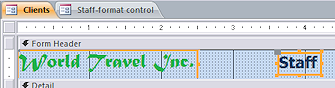 Click on the background of the Form Header.
-
Paste.
The two controls that you copied appear in the Form Header section and the form header enlarged a bit to hold the controls. But the controls did not land where you clicked. They landed at the top left.
- Use the arrow keys to move the controls to the right and down, leaving a row of dots at the top and left of World Travel Inc.
- Click on the Staff control and click again to go to Edit
mode.
- Edit the text to read Clients.
Since the word Clients is longer than Staff, the control resizes to the right. The control is no longer centered. - Click out to deselect Clients.
- Select Clients again and move the control to center it on the 4" mark.
- Save the form as Clients-header.
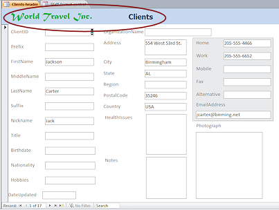 Switch to Form View to see how your changes look.
The form is looking better.- Close the form Staff-format control.
Change Tab Order
"Tab Order" is the order that you move through the controls when you press the TAB key. Design View and Form View handle this differently.
TAB in Design View: The 'next' control is selected. All controls are included in the tab order.
TAB In Form View: Moves the focus to the 'next' control for entering or editing the data in that control. Only data controls are in the tab order.
First you should experience the existing tab order in both Design and Form views, then you can change it to work better.
- Switch to Form Design View.
-
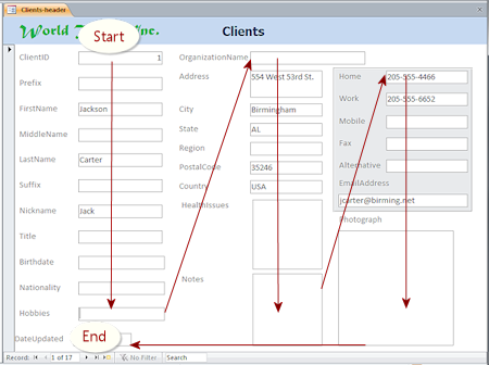
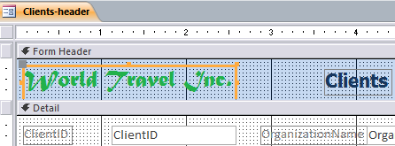 Click on the label World Travel Inc. in the Form Header.
-
Press the TAB key on your keyboard repeatedly to move the selection through the whole form until you are back in the header.
Observe carefully the order that the selection is moving. This is the tab order.Notice that the labels and the rectangle get selected.
Access 2007 uses the order in which the controls were added to the form as the tab order in Design View. Access 2010, 2013, 2016: TAB moves the selection from left to right and then drops down to move left to right again through the controls. This works better if the controls are aligned with each other going across! Your form was deliberately left out of alignment between columns. So the path that TAB takes you on may look rather random at first! Evenly weirder, controls may be skipped altogether! My working copy of the form would not select the Client and OrganizationName controls or labels when tabbing through the controls. It would not go back to World Travel Inc after finishing one round through the controls but wound up on Clients instead. Experimenting with some other forms showed similar unpredictable glitches in the tab order in Design View. - With a control selected, press an arrow key.
Whoops! The selected object moved! Clearly you cannot use the arrow keys in Form Design View to change the focus. - Undo.
If you experimented with the arrow keys, be sure to use Undo to get the controls back in position.
Problem: Controls were moved but Undo does not get them back in position
Why: Only 20 actions are remembered for the Undo list. Happily, you just saved the form.
Solution: Close the form without saving changes and reopen it.
-
 Switch to Form View.
The first control in the tab order has the focus. Its data is selected, as shown by being highlighted. It is normally the first control at the top left of the form.
- Press the TAB key repeatedly until you have moved through
all of the data controls and the insertion point is in the Date Updated control.
The labels and rectangle were not in the tab order in this view. The tab order was not consistent for all columns.
 Insertion Point: If there is data in the control, it will be selected. Any
typing would replace that data. If there is no data, the insertion point
will show at either the left or right edge of the control, depending on
how the data is aligned in that control. This can be hard to see when
there are no characters in the control!
Insertion Point: If there is data in the control, it will be selected. Any
typing would replace that data. If there is no data, the insertion point
will show at either the left or right edge of the control, depending on
how the data is aligned in that control. This can be hard to see when
there are no characters in the control!
Text data type aligns left. Number or Date data type aligns right.
- Press TAB once more.
The form changes to the next record.
 Problem:
Pressing TAB did not change record
Problem:
Pressing TAB did not change record
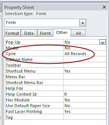
What happens when you leave the last control in the tab order is controlled by the Cycle property in the Property Sheet for the Form. The default is All Records, which will move the focus to the next record. Other choice are to go to the top of the current record or to the top of the current page (used for tabbed forms).
- Switch to Form Design View.
-
 Right click on the form and select Tab Order...
The Tab Order dialog for Form View appears.
The Auto Order button on this dialog sets the tab order as from left-to-right and
top-to-bottom. So TAB would move you across first and then drop down a
row. That is NOT what we want for this form. The logical tab order for this form would be down the first column, then down the second column, and finally down the third column.
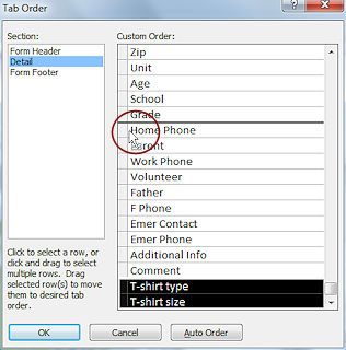
You will change the order by selecting a control's name in the Custom Order list and dragging it to a new position.
-
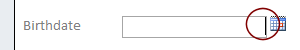
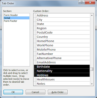 Scroll the list of controls in the dialog until you see Birthdate.
- Move the mouse pointer over Birthdate until it turns into the Select Row shape
 ,
a black arrow that points to the right.
,
a black arrow that points to the right.
- Drag to select Birthdate, Nationality,
and Hobbies.
You added those fields to the form at the same time, though they were not neighbors on the Field List.
-
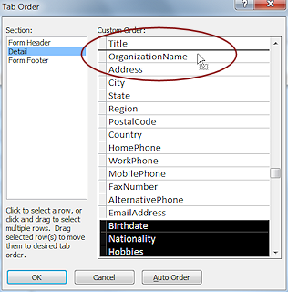 Move the mouse pointer over the selection squares to the left of the selected
items, until it turns into the Select shape
Move the mouse pointer over the selection squares to the left of the selected
items, until it turns into the Select shape  .
.
- Drag the selected names up. A black line shows where they
will drop.
-
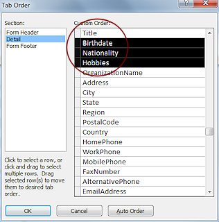 When
the black line is below Title, drop.
When
the black line is below Title, drop.
The selected items move. -
Similarly, move HealthIssues and Notes upwards until they are below Country in the list.
Leave DateUpdated as last in the list. When editing a record or creating a new record, that one should be changed last - to the current date.
- Click on OK to close the dialog and accept the
changes.
- Switch to Form View.
The first control has its data selected, which shows that it has the focus.
 Press the TAB key to move from one control to the next
to verify that the order is now correct.
Press the TAB key to move from one control to the next
to verify that the order is now correct.- If necessary, make any corrections with the Tab Order dialog.
- Switch to Form Design View.
- Click on the label World Travel Inc. at the top left of the form.
- Press the TAB key to move from one control to the next again.
The tab order that you just set did not apply! This is the same order as before.
You cannot modify the TAB order for Design View.
Remove from Tab Order; Disable for Editing
The Property Sheet includes properties that keep a user from being able to TAB into a control and also to disable the control entirely. This is useful for calculated or AutoNumber fields since the user cannot edit those anyway. The disadvantage is that the values cannot be copied if the control is disabled.
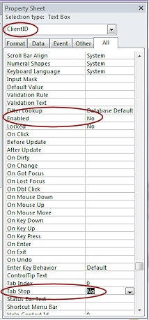 In
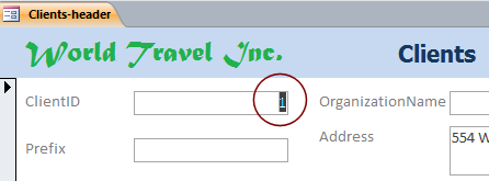
Form Design View, double-click on the ClientID control to select it and to show its Property Sheet at the same time.
In
Form Design View, double-click on the ClientID control to select it and to show its Property Sheet at the same time.
Double click method to open Property Sheet: If the Property Sheet is already open, it will not close
when you double-click a control. But, it will close if you click the Property Sheet button
when the pane is already open.
- Change the Enabled property to No.
This prevents the user from getting the focus into the control even by clicking it.
- Change the Tab Stop property to No.
This keeps the TAB key from selecting the control. But a user can click on the control and copy its contents if the Enabled property is set to Yes.
- Click on another property to save the last change.
-
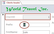
 Switch to Form View.
The ClientID control is now grayed out and the next control has the insertion point in it. The user cannot edit ClientID .
- Save the form.
[Clients-header]
Apply Your Skills: Revise the Staff Form
You can use your new skills to improve the Staff form. Practice makes perfect!
You will add two new skills, too - Adding a dividing line and adding an unbound control with an expression as its source.
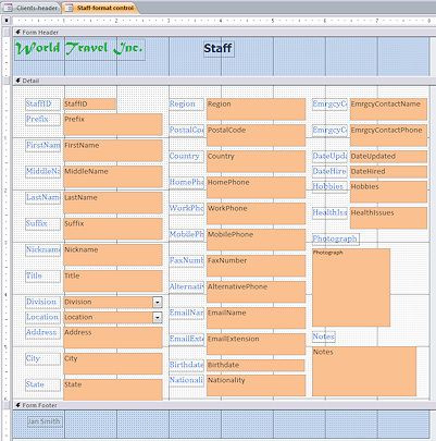 Open the form Staff-format control in Form
Design View.
Open the form Staff-format control in Form
Design View. - Save As Staff-formatted.
Your form may not look quite like the illustration here.
- Make the following changes:
- Caption: Change the form's Caption to Staff-formatted.
- Use the skills you have learned to position the controls to approximately the locations shown in the illustration BELOW these changes.
- Size: Labels should be edited to match the text in the illustration BELOW and then sized To Fit.
Data Controls: The smallest width is 1". Wider controls can be between 1.5" and 2.75". Look at the illustration BELOW.
Photograph control is still 1.5" x 1.5".
Date controls need to have space to the right for the Date Picker calendar that shows when a Date/Time data type control is active. - Rectangle: Add a rectangle behind the phone number controls.
Give it a Back Color of Access Theme 1. - Dividing Line: Draw a line above fields you moved to the bottom (Hobbies, Notes, Photograph, DateUpdate).
- Click the Line button
 on the ribbon tab Form Design Tools: Design.
 - Click at the left above the HealthIssues control.
A 1" line appears. - Change the width of the line in the Property Sheet to 7.9".
Dragging a line straight across is very, very tricky. - Change the Border Width to 2 pt.
This is the thickness of the line. - Change the Border Color to Access Theme 4.
Click elsewhere to deselect the line so you can see its actual color.
- Click the Line button
- Form Size: Resize the form as needed to be just large enough for the controls.
- Switch to Form View and compare to the illustration above.
The sizes of your controls do NOT have to match the illustration exactly. Just be neat and in the approximate width, height, and location. - Change the Tab Order to match the new layout.
TAB should move the focus down the first column and then up to the top off the second column and go down. Similarly for column 3. Then move across the controls that are below the line (from left to right). The last control in the tab order should be DateUpdated. You may only have two changes to make.
- Disable the StaffID field and keep the TAB key from entering that control.
- Add an unbound control in the Form header.
- Delete its label.
- For the control source in the Property Sheet, type the expression:
=[FirstName] & " " & [MiddleName] & " " & [LastName]
Now the form header will show the staff members' full name. Much easier to read than separate fields. - Set the Text Align property for the new control to Center.
- Make the width of the new control about 2".
-
Save the revised form.
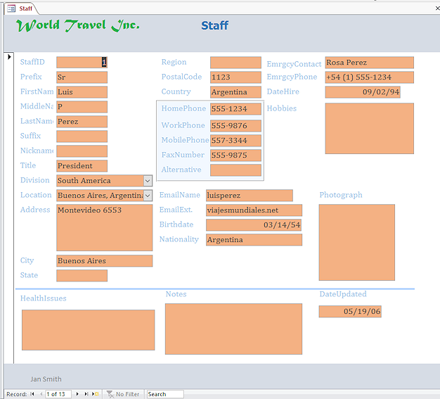
[Staff-formatted] Evaluate: Check all of the records in Form View.
Are the controls in a usable arrangement? An excellent arrangement?Is your monitor screen showing all of the controls at once or do you have to scroll? How about on a laptop? Is the bottom row of controls visible when you first open a record? Should it be?
Should all of the address fields be in the same column? What could be left out or put in another form?These are some of the issues that database designers must consider. There are no perfect answers unless you know what hardware the users of the database will be using - now and in the future!
|
|
| © 1997-2017 Jan Smith All Rights Reserved |
Site Map What's New |
Privacy Policy Terms of Service Copyright Acknowledgements |
~~ 1 Cor. 10:31 ...whatever you do, do it all for the glory of God. ~~
Last updated: March 22, 2017