|
Numbers do not make the same
impact on the brain as a picture. A chart is not only prettier than a list of
numbers, it actually is a better way to show you how the numbers compare.
 From
a pie chart you can immediate tell when certain items take up a big part of the
pie. From
a pie chart you can immediate tell when certain items take up a big part of the
pie.
 From a bar chart you can
easily see which items are larger than the rest. From a bar chart you can
easily see which items are larger than the rest.
|
|
Where you are:
JegsWorks >
Lessons >
Numbers
Before
you start...
Project 1: Excel Intro Project 2: Excel Basics
Getting Started
Arrange
AutoFill
Finish

 Chart Chart
Print-Defaults

Print-Options
Summary
Quiz
Exercises
Project 3: Format & Arrange
Project 4: Groups & Formulas
Project 5: Design
Search
Glossary
Appendix
|
|
 |
Step-by-Step: Pie Chart |
|
What you will learn: |
to use the Chart Wizard to create a pie chart
to add category labels from cells
|
Start with:
 trips7.xls
(saved in previous lesson) trips7.xls
(saved in previous lesson)
- Select range A27:A35, hold down the CTRL key, and drag to
select range C27:C35. Both ranges are now selected. These are the row
labels and the data cells for the number of people who bought trips each week.
- Click on
 the Chart Wizard button. The chart wizard opens. the Chart Wizard button. The chart wizard opens.
-
 Select the Pie chart type and click the Next button.
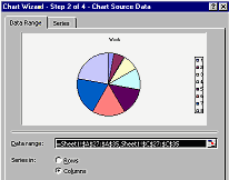
Step 2 of the Chart Wizard opens. Hmmm. The wedges do not appear to match the #
of people numbers. Something is wrong here. Select the Pie chart type and click the Next button.
Step 2 of the Chart Wizard opens. Hmmm. The wedges do not appear to match the #
of people numbers. Something is wrong here.
 Problem: The first column you selected
is the row labels. The labels are numbers instead of text. Excel has gotten confused and is
trying to use the labels as a second series of data to chart. It would be very
noticeable if you had chosen a bar graph since you would have 2 sets of bars but
no labels. You can fix this problem! Problem: The first column you selected
is the row labels. The labels are numbers instead of text. Excel has gotten confused and is
trying to use the labels as a second series of data to chart. It would be very
noticeable if you had chosen a bar graph since you would have 2 sets of bars but
no labels. You can fix this problem!
- Look at the Data range shown. It lists all ranges to be charted.

 The sheet's name is separated from the range with an exclamation point !,
which you can read as "bang". The sheet's name is separated from the range with an exclamation point !,
which you can read as "bang".
-
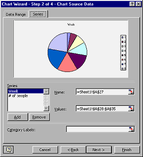 Click on the Series tab.
The Category Labels box is blank when it should show the Week range. Click on the Series tab.
The Category Labels box is blank when it should show the Week range.
- With the Series Week selected on the left, click the Remove button.
- Click in the text box Category Labels.
- Click on
 the Collapse Dialog button at the end of the Category Labels text box, so you can see your data cells.
-
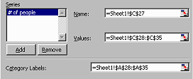 Drag on Sheet1 from
A28 to A35. The range you selected appears in the text box. Drag on Sheet1 from
A28 to A35. The range you selected appears in the text box.
- Click on
 the Restore Dialog button to open the dialog back up. Now you are ready to format the chart.
Alternate: You could have just typed in the range for the Category labels.
Or you could have copied the range before you removed the Week series and then
pasted into the Category labels text box. You would have wound up with an extra
legend item - Week- unless you edit the range to start with A28 instead of the
original A27. But then, you would not had such fun with the Collapse and Restore Dialog buttons!
- Click the Next button. Step 3 - the Chart Options- opens. The Chart Wizard automatically makes the title the same as the
column label you selected and puts the legend on the right. You could change
those on the Titles and Legend tabs, but the defaults are just fine this time.
- Switch to the Data Labels tab, if necessary, and click on Show percent
(
  Percentage) to label each wedge of the pie. The
Show leader lines box should be checked. Percentage) to label each wedge of the pie. The
Show leader lines box should be checked.
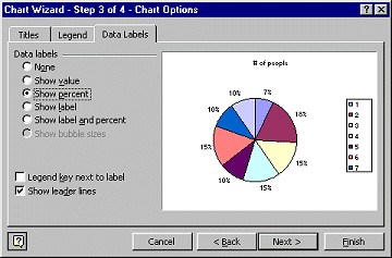
The first item in the legend always has its left edge at the top center. The next item is to its right, clockwise.
- Click the Next button. Step 4 - Chart Location- opens.
You have two choices for where to put the chart you are creating: As new
sheet and As object in.
The As new sheet choice creates a new worksheet in your workbook. The chart
will take up the whole sheet. This automatically gives you the largest size on
screen with the whole chart visible at once. The chart will automatically print
as large as will fit on the piece of paper. This is wonderful, except that
it can be too big for charts with only a few items. The As object in choice lets you
place the chart on an existing sheet. For small charts you might want to have the
chart on the same page as the data. You can add other charts, data, or text
easily to a sheet.
-
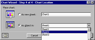 Select As object in and drop the list. Choose Sheet
2. Select As object in and drop the list. Choose Sheet
2.
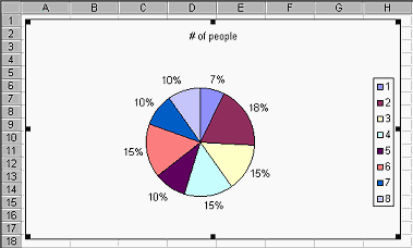
- Click on the Finish button. The chart is created and placed in the middle of the screen on Sheet 2.
The size of the chart depends on the size of your document window.
- Drag the chart to the upper left of the sheet.
- Click outside the chart to unselect it.
- Double-click the Sheet2 tab at the bottom and retype the name as Pie Chart and press ENTER. The
tab now shows the new name.
- Save
As
trips8.xls .
 How to handle a full disk How to handle a full disk
|