
Jan's Working with Numbers
Design: Analysis
What is Good Design for Spreadsheets?
A good design for your spreadsheet makes it easy for you:
- to read the data
- to understand the point of the sheet
- to use the sheet's information
- to update the sheet
- to spot the important parts quickly
Good design does not have to be pretty or colorful, though that often helps. A well-designed sheet will be comfortable to work with and makes it easy to answer the questions you want to ask.
How can you tell if a worksheet has a good design? The questions below are a good guide.
Analyze a spreadsheet
To analyze the effectiveness of a spreadsheet's design use the following questions about the spreadsheet. With good design you can answer these easily. A poor or bad design makes it hard or impossible.
- Purpose: What is it for? What questions does it answer?
- Data: What data is used and where did it come from?
- Calculations: How did they do that?
(What parts are calculated and what formulas are used to do the calculations?) - Changes: Does this sheet allow you to add or change data later? Is that important for this particular sheet? Will it be easy to do?
Bad Design: Example #1
What's wrong with the spreadsheet below? Try to answer the analysis questions: Purpose, Data, Calculations, Changes.
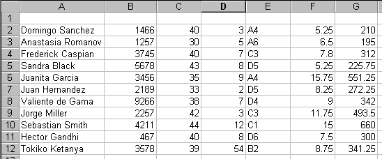
Bad Design #1
You can't tell anything about what is going on in this sheet! You cannot answer any of the analysis questions. The only good thing about the sheet is that it uses the default font, so you can read the values.
What's wrong?
-
No titles to tell you what this sheet is about.
-
No column labels to explain all the numbers.
-
Not clear whether any of the numbers are calculated.
-
The numbers in the last two columns are hard to read and compare to each other because they are not lined up on the decimal point.
Simple Solution: Adding some simple titles and labels makes the spreadsheet much more understandable, as the version below shows. Now can you answer any of the analysis questions?
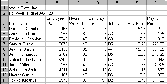
Adding titles and labels explains a lot!
It is still not really easy to read the numbers in columns F and G, and you can't tell if the Pay for Period entries are calculated or typed in.
Even Better Solution: Some formatting and expanded labels and titles will help even more, as the next illustration shows. Can you answer the analysis questions?
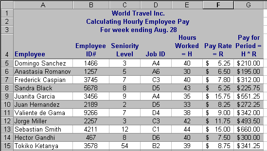
Adding formatting and explanation of calculations
Now you can see that the Pay for Period is a calculated value using the Hours Worked and Pay Rate. Moving the Hours Worked over next to the Pay Rate puts the values used in the formula next to each other, which makes it easier to see where the Pay for Period comes from - and why some paychecks are bigger than others.
This spreadsheet is an example of one that you would not normally have to change later. It is a report of the values at a given date. However, a similar spreadsheet that logs the hours worked each day for each worker would have new data added every work day.
Bad Design: Example #2
Here is a design problem common when rows and columns are both being calculated. Can you answer the analysis questions above for this sheet?
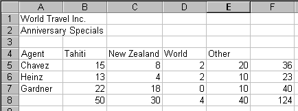
What's wrong?
-
What formulas? Row 8 and Column F look like they could be calculations.
-
Is cell F8 related to the row values, the column values, or something else?
Solution:
-
Use formatting for F8 that matches the source data.
-
Add labels and other formatting to group related cells. In the revised sheet you can see that F8 is the SUM of Row 8.
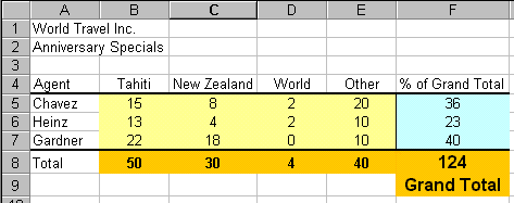
The right color coding and labels make all clear
Design Principles
From the examples above and some common sense we can come up with some principals and guidelines that will help you design worksheets that work well.
- Easy to read: Choose fonts and backgrounds and colors for good
contrast and easy reading. Consider how the sheet will look in print as
well as on screen.
- Logical positions: Position data logically, both for
reading and for entering data.
- Describe: Create helpful labels and titles that make the purpose
and function of the sheet clear.
- Important parts: Position and format the key values, like totals, to make them stand out from the crowd of data.
- Changes: Arrange the sheet so that adding new data will not
break formulas. Surround data groups that may have additions later with blank cells and
write formulas that include the blanks. Use absolute references
to cells that will not move if data is added.
- Original data: Use copies or links to original data for
actions that may be hard to undo, such as sorting and subtotals. This
preserves the
original data for other uses later.
- Future: Think ahead to the future uses of your sheet. Anticipate the needs of other people who may use your sheet without knowing all that you know about it.
|
|
| © 1997-2017 Jan Smith All Rights Reserved |
Site Map What's New |
Privacy Policy Terms of Service Copyright Acknowledgements |
~~ 1 Cor. 10:31 ...whatever you do, do it all for the glory of God. ~~
Last updated: March 22, 2017