
Jan's Working with the Web
Formatting: Page Format
Naturally you want your page to be attractive. You will want to use colors and images that look pretty together. People can have quite different opinions about that!
You must think like an artist while remembering that what your viewers actually see depends on their hardware and software.
Page Settings
As a web author, you can set many features for the page as a whole. The most common features that you might want to change are:
- text color
- page background
- link colors
Appearance of Colors
As a web author, you need to understand what affects how colors appear on the screen. The following factors can make a difference in what your viewers will see:
- Operating system (Windows, Mac,...)
- Color depth of the display (gray scale, 256 colors, 16 bit color, 32 bit color...)
- Video card
- Manual settings on the monitor (brightness, contrast, gamma correction)
- Browser
Colors: Text vs. Background
The colors for your page background and text make an amazing difference in the look and feel of your web page.
Choose wisely. It is easy to get carried away with bold color schemes. Don't make the text hard to read!
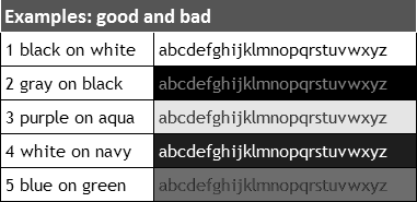
Dark vs. Light
| Examples: good and bad | |
|---|---|
| 1 black on white | abcdefghijklmnopqrstuvwxyz |
| 2 gray on black | abcdefghijklmnopqrstuvwxyz |
| 3 purple on aqua | abcdefghijklmnopqrstuvwxyz |
| 4 white on navy | abcdefghijklmnopqrstuvwxyz |
| 5 blue on green | abcdefghijklmnopqrstuvwxyz |
Dark text on a pale background is easiest to read.
Light text on a dark background is second best. Use it sparingly because it is more tiring to the eyes in large quantities.
Contrast
 Keep a sharp contrast between the text color and the
background color.
Keep a sharp contrast between the text color and the
background color.
Your page may be printed or viewed in gray scale. The illustration at the right is what the table above looks like in gray scale. Quite a difference!
Note example 5, which had blue text on a green background. On some printers these colors print in nearly the same shade of gray! Not much fun to read!
Background Images
You can use an image as the background for a page or of part of a page instead of using a solid color. Normally the browser will tile the image, repeating it across the page and then down the page until the whole window is filled. The smaller the image, the faster the page will display.
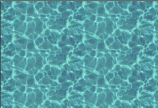
A texture is a background that creates an overall effect on the page. Realistic textures look like sand, grass, water, brick, wood, etc. Some people call all small background images textures. A bit confusing.
A watermark is a background which does not scroll when you scroll the page. The name comes from the world of paper. High quality stationary has a faint design in the paper called a watermark. You can see the design when you hold the sheet of paper up to the light.
Types of background images:
-
Blended- Edges of the repeated image blend together for a continuous pattern. It is difficult to create such as image.
-
Obvious repeat - Pattern cannot be strong or it competes with the text too much for easy reading.
-
Side border - Solid color or a picture at the left with contrasting solid color to the right. Can have borders on both sides IF the page has a set width. The text will not wrap in a window that is too small.
Blended Image edges blend together when tiled |
As tiled on page |
Obvious Repeat Object images for |
As tiled on page |
Side Border
Side border background images |
Side border as repeated down the page |


Problems with Backgrounds
![]() Problem: Background is distracting
Problem: Background is distracting
Normally a background on a web page should be somewhat boring. An image that is interesting by itself will drag the eye away from the text and make the page hard to read.
Solutions: Make the colors less intense and the image less complex or just use a solid color.
![]() Problem:
Text falls on top of side border
Problem:
Text falls on top of side border
Unless the border is very narrow, you must design your page carefully to keep the text off of the side border.
Solution 1 - HTML: Put your text in a table with an empty column over the border.
Solution 2 - CSS: Put your text in a division, DIV tag, and use a STYLE to set its width and position on the page.
![]() Problem: Side border repeats across page
Problem: Side border repeats across page
If the side border image is not as wide as the window, it will be used more than once across the page.
Solution: Make the image wider than the window you expect your viewers will be using. Large monitors are getting cheaper all the time, so more and more people will be able to use the higher resolutions and large window sizes. But for really big monitors, users would probably not use a full screen window. A width of 2600 pixels should currently guarantee no repeats across.
Colors for Links
Remember that a link is created when text or an image is surrounded by an anchor tag.
There are four states that an anchor can be in:
- a:link - a normal link that is not in your browser's History. You have not visited it lately. Default color is blue.
- a:visited - a link the user has been visited and is still in your browser's History. Default color is purple.
- a:hover - a link with the mouse pointer
over it. Default is to only change the mouse pointer to a pointing hand
 .
. - a:active - a link at the moment it is clicked. Default color is bright red.
You can change the default formatting for these states.
Design Thoughts for Link Colors:
-
Unvisited links should be more noticeable than visited ones.
-
It should be obvious when the mouse is over the link or when a link is selected (that is, active).
-
All of the colors should be easy to read against your background.
-
Are different colors worth the risk of your viewers not understanding which are which?
Underlines:
The default is for a text link to be underlined. Do not underline words that are not part of a link! Instead, use italics or bold or colors for emphasis.
Underlining for emphasis was OK in the olden days of typewriters, which could not do bold or italics. Be modern!
How to Change Default Link Colors
Old HTML Method: In the BODY tag you can set colors for unvisited links, visited links, and active links. But there is no way to format the hover state there. You cannot change any other properties of the links with this old method, just the colors.
Example:
New CSS Method: You can override the browser's defaults for every property that affects how a link looks, in all four different states by defining a style for each in a pseudo-class, like a:link, in an internal or external style sheet. (The next lessons explains this more!)
Example with color names and background-color:
a:link {color:#00ff00;}
a:visited {color:aqua;}
a:hover {background-color:wheat;}
a:active {color:white;}
</style>
![]() View the result in a new window
View the result in a new window
Example using color numbers:
a:link { color:#0000FF; }
a:vlink { color:#880088; }
a:hover { color:#0099FF; }
a:alink { color:#FF0000; }
</style>
![]() View the result in a new window
View the result in a new window
![]() Order can be important! In
the style sheet, the order of the anchor definitions should be as they are
listed above. Otherwise your formatting may not show up when and where you
expect. You can leave any or all of these to the browser's default by just
not writing a new definition.
Order can be important! In
the style sheet, the order of the anchor definitions should be as they are
listed above. Otherwise your formatting may not show up when and where you
expect. You can leave any or all of these to the browser's default by just
not writing a new definition.
You can change all of the properties of an anchor, not just its color, including background, font, font size, underlining, or any other characteristic that can be styled. So many choices! We will be using more than just color properties in later lessons.
Experiment with Page Formatting
![]() Try out a cool Color Picker
Try out a cool Color Picker ![]() utility at Joe Barta's PageTutor.com. You can experiment with various color
combinations for a background color, background image, text, and links.
There is even a version you can download
utility at Joe Barta's PageTutor.com. You can experiment with various color
combinations for a background color, background image, text, and links.
There is even a version you can download ![]() to play with offline. Scroll the window to see both the CSS way
and the old HTML way of setting these features.
to play with offline. Scroll the window to see both the CSS way
and the old HTML way of setting these features.
Your resource files include some background images that you can use in the Color Picker.
HTML Code and CSS for Page Formatting
You can add a background color or a background image and also change the formatting for normal text for the page as a whole.
Old HTML method: Adds attributes to the BODY tag like:
![]() View the result
in a new window
View the result
in a new window
New CSS method: Add a BODY style to an internal or an external style sheet. The next lesson will explain how these style sheets work. The example below shows an internal style sheet, which would apply only to its own page.
<html>
<head>
<meta content="text/html; charset=windows-1252" http-equiv="Content-Type">
<title>This is a paragraph with a link- CSS</title>
<style type="text/css">
body {
background-color:#c0ffff;
color:#00ccff;
}
a:link {color:#0000c0;}
a:visited {color:#00c000;}
a:hover {background-color:#c0c0c0;}
a:active {color:#ff0000;}
</style>
</head>
<body>
![]() View the result
in a new window
View the result
in a new window
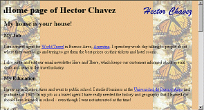
![]() Evaluate: Were the colors
chosen well? (I don't recommend them! I picked them to be quite different
from the usual colors.) What would you recommend?
Evaluate: Were the colors
chosen well? (I don't recommend them! I picked them to be quite different
from the usual colors.) What would you recommend?
|
|
| © 1997-2017 Jan Smith All Rights Reserved |
Site Map What's New |
Privacy Policy Terms of Service Copyright Acknowledgements |
~~ 1 Cor. 10:31 ...whatever you do, do it all for the glory of God. ~~
Last updated: March 22, 2017