 Previous
Jan's Working with Windows 10:
Dialogs
A dialog is a special purpose window which asks for your input. You may have to type in something, like your name or a file name. You might need to select Yes or No in answer to a question. There are several types of inputs to help make it all easier for you. You have seen some types of input in the previous lesson. Now you will see some others.
Windows 10 currently [April 2017] has two types of dialogs - new (Modern/Metro) style and Classic style.
Type of Input Controls - New Style
The new Modern/Metro style dialogs are optimized for touch - bigger items that are further apart. There is usually a menu on the left.
This style is used by the Settings dialog and its subsections. Apparently this style will take over for the Control Panel and its items eventually.
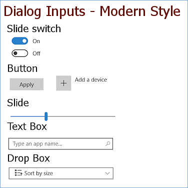
How they work
(The examples above don't work!)
Switch: Drag the dot left for Off and right for On. Or you can just click the end without the dot.
Button: Click or press the button. Some have text on the button, others show a symbol and might have text nearby, but others do not look like a button until you hover over the text or symbol.
Slide: Drag the slide crossbar left or right to increase or decrease the effect. The slider may allow only certain positions.
Text box: Type in the box and then press the ENTER key.
Drop Box: Click a box with an arrow at the right end of the box to open a list. Click on an item in the list to choose it. In this style an open list hides the box and can extend up above the box as well as below it.
You may also see some choices to click on to select, like a palette of colors or a list of apps.
Type of Input Controls - Classic Style
Here are examples of the most common types of inputs in a classic style dialog, especially for Control Panel items. These samples are selected from several different classic dialogs. You won't find them all together like this anywhere!
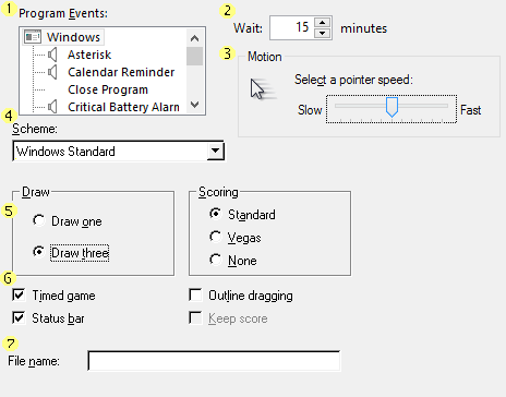
How they work
(The examples in the illustration don't work!)
 List box: Click on
an item in the list to select it. Use the scroll bar to see items out of view.
List box: Click on
an item in the list to select it. Use the scroll bar to see items out of view.
 Spin control box: Use the tiny arrows at the right to move through the list of available values. Only one value will be visible at a time. You can also type in a value. This type of input is used a lot for numbers.
 Slide: Drag the slide pointer to a new point. Most slides do not have continuous values. Instead they let you position the slide pointer only at specific spots.
 Drop list: Click the down arrow to open a list of choices. Click on your choice
just like in a list box.
Drop list: Click the down arrow to open a list of choices. Click on your choice
just like in a list box.
 Option button: Click on the circle of your choice. Also called a radio button. In a group of options buttons,
only one choice can be chosen at a time. "Draw" and "Scoring" in the illustration are separate
groups.
Option button: Click on the circle of your choice. Also called a radio button. In a group of options buttons,
only one choice can be chosen at a time. "Draw" and "Scoring" in the illustration are separate
groups.
 Checkbox: Click a box to
select it. In a group of checkboxes, any number of boxes can be checked at
the same time. A checkbox is in gray if it
is not available to be chosen right now, like the Keep Score checkbox in the illustration.
Checkbox: Click a box to
select it. In a group of checkboxes, any number of boxes can be checked at
the same time. A checkbox is in gray if it
is not available to be chosen right now, like the Keep Score checkbox in the illustration.
 Text box: Click in the box and then type your entry.
By the way, the name radio button comes from an old type of car radio which had round push buttons on the front. You could set each button for a particular radio frequency. You could just push the button to switch stations instead of having to carefully tune in the signal. This probably prevented a lot of auto accidents!
Tabs
Dialogs with tabs can show you a large number of choices in a small space. Just click on a tab label to bring that tab to the front.
 Try it on
the image below.
Try it on
the image below.
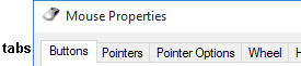
 The keystroke
combo CTRL + TAB will bring the next tab to the front. (But not on the
image above!)
The keystroke
combo CTRL + TAB will bring the next tab to the front. (But not on the
image above!)
|
|
| © 1997-2017 Jan Smith All Rights Reserved |
Site Map What's New |
Privacy Policy Terms of Service Copyright Acknowledgements |
~~ 1 Cor. 10:31 ...whatever you do, do it all for the glory of God. ~~
Last updated: April 24, 2017