|
|
Jan's CSS: BordersWith CSS borders you can control the width and color of a border plus other characteristics like rounded corners and shadows. You can set the border for each side separately if you wish. That is particularly helpful when you need a dividing line on just one side. Syntax: For a simple border you can use a shorthand property that combines three properties: border: width style color;
For example, the BORDER property below creates a dotted border around its element: border: 4px dotted blue; If you want to set the characteristics separately: border-width:3px;
border-style:dashed;
border-color:rgb(110,110,0);
If you want to set a characteristic for just one side, instead of border: use border-left: , border-right: , border-top:, or border-bottom:
|
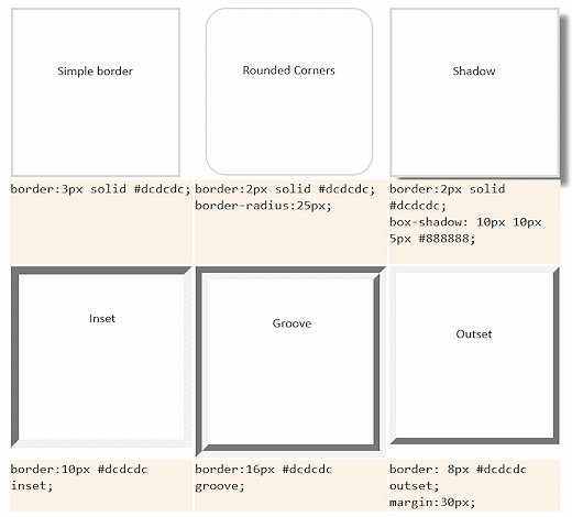
Simple border | Rounded Corners |
Shadow
|
| border:3px solid #dcdcdc; | border:2px solid #dcdcdc; border-radius:25px; |
border:2px solid #dcdcdc; box-shadow: 10px 10px 5px #888888; |
Inset | Groove |
Outset |
| border:10px #dcdcdc inset; | border:16px #dcdcdc groove; | border: 8px #dcdcdc outset; margin:30px; |
Image of the results:

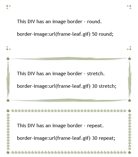
New for CSS3-- Border Image: Too cool to leave out! This property is not supported yet by all of the common browsers, but most have their own version. In the sample code below, the property names with leading hyphens like -webkit-border-image tell the browser to use its own version of the border-image property. The image usually has a transparent center plus you have to set a border-width that is wide enough to hold the design. The repeat property can have values round, stretch, or repeat. The middle image on the side is used for the repeat.
Syntax:
Original image used for the border with transparent center: 
This DIV has an image border - round.
border-image:url(frame-leaf.gif) 50 round;
This DIV has an image border - stretch.
border-image:url(frame-leaf.gif) 30 stretch;
This DIV has an image border - repeat.
border-image:url(frame-leaf.gif) 30 repeat;
Full Code for the first example:
.borderwithimage-round {border:15px solid transparent;
padding:10px 20px;
margin-bottom:20px;
-webkit-border-image:url(frame-leaf.gif) 50 round; /* Safari */
-o-border-image:url(frame-leaf.gif) 50 round; /* Opera */
border-image:url(frame-leaf.gif) 50 round;
}
Image of border-image effects above:

.borderwithimage-round {border:15px solid transparent;
padding:10px 20px;
margin-bottom:20px;
-webkit-border-image:url(frame-leaf.gif) 50 round; /* Safari */
-o-border-image:url(frame-leaf.gif) 50 round; /* Opera */
border-image:url(frame-leaf.gif) 50 round;
}
Image of border-image effects above:

You do not always get the same effect in every browser. So be careful to check what the major browsers do with your border-image choices.
