|
 |
Step-by-Step: Format Column Chart |
|
What you will learn: |
to change chart
type
to set chart
options
|
Start with:
 trips15.xls (saved in
previous lesson)
trips15.xls (saved in
previous lesson)
Format Chart: Chart Type
-
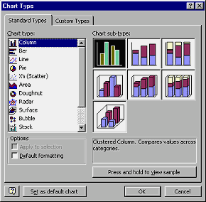 Right click in a blank area of the chart and choose from the popup menu.
The Chart Type dialog opens. Right click in a blank area of the chart and choose from the popup menu.
The Chart Type dialog opens.
- Select Column, which is Excel's default chart type,
and choose the first sub-type.
- Click OK.
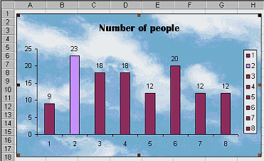
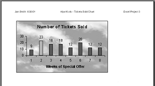
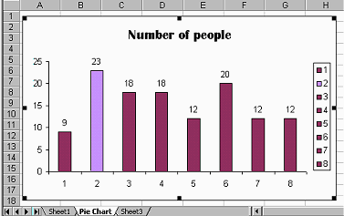 The chart is redrawn as a set of columns, using the default settings for this chart type. The data points are now labeled with the values they represent instead of the percentages. The chart is redrawn as a set of columns, using the default settings for this chart type. The data points are now labeled with the values they represent instead of the percentages.
The 18% wedge for Week 2 now is labeled 23 but
it retained the pattern you assigned to it. All the other wedges are converted to the default dark red columns. The legend does not accomplish
much in this case. You will get rid of it shortly.
Since Week 2 had the highest number of tickets
sold, it actually works well to have it's column a different color from
the rest.
Format Chart: Chart Area
The blank background is good for many charts, but sometimes a pattern
or image can help.
-
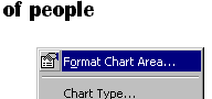 Right click in a blank area of the chart and choose from the
popup menu. The Format Chart Area dialog opens, with tabs for Patterns,
Font, and Properties. Right click in a blank area of the chart and choose from the
popup menu. The Format Chart Area dialog opens, with tabs for Patterns,
Font, and Properties.
- On the Patterns tab, click on the Fill Effects button. The Fill Effects dialog opens with tabs for Gradient, Pattern, Texture, and Picture. Experiment with some of the choices.
- Click on Picture and on the Select Picture button.
-
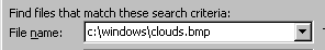 In the File name text box type: In the File name text box type:
 c:\windows\clouds.bmp . c:\windows\clouds.bmp .
 c:\windows\FeatherTexture.bmp c:\windows\FeatherTexture.bmp
Or you can browse to find another picture to use. The paths are to files that
are backgrounds that comes with Windows, if you installed to the folder Windows.
If you don't find one of these files on the hard disk,
use some other picture or use one of the choices on the Texture
tab of the dialog. A light color will work best.)
-
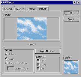 Click OK to close the Fill Effects dialog. Click OK to close the Fill Effects dialog.
- Click OK again to close the Format Chart
Area dialog.
Your chart now shows the clouds image as a
background. Much prettier than a plain white background! Of course a
busy or dark image could make it hard to read your
chart.
Format Chart: Chart Options
- From the menu select | The Chart Options
dialog opens with 6 tabs. Check out the various options on each tab.
Choice, choice, choices.
- Click on the tab Legend and uncheck
the box for Show legend. This particular chart is not
helped by a legend. (You could have clicked the legend on the chart
to select it and press DELETE.)
-
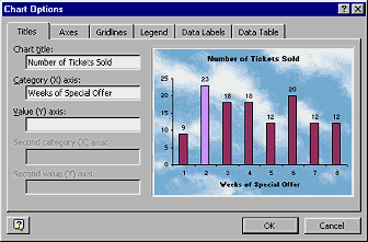 Click on the tab for Titles. Click on the tab for Titles.
- In the text box for Chart title, edit the title to read Number of Tickets Sold ,
which explains the chart better.
- In the text box for Category (X) axis, type Weeks of Special Offer
- Click on OK.
- Rename the Pie Chart sheet as Tickets Sold Chart (Hint: Right click on sheet tab and choose Rename or
double-click the tab and type.)
- Deselect the chart by clicking off the chart.
- Open Print Preview. (File | Print Preview)
The preview is not in gray scale, even if the printer is set to print that way. This makes it hard to be sure what the
printed page will look like.
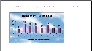
Print Preview
Print-out in gray scale
- Save as trips16.xls on your Class disk in the excel project3 folder.
-
 Print the sheet. Printing in color is certainly prettier for this
one.
Print the sheet. Printing in color is certainly prettier for this
one.
|
