-
 Chart
button
Chart
button
 Slide layout icon
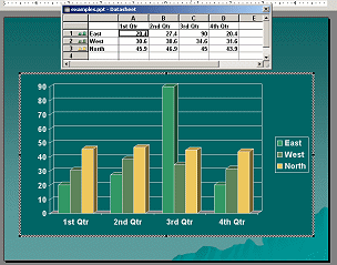
Clicking the Chart button or icon opens a default table called a datasheet and
a 3-D chart based on the datasheet. It's a bit confusing to see data
already in the datasheet!
 You are
actually working in a supplementary program named Microsoft Graph when you are creating a chart from
scratch. The menus and toolbars change while Microsoft Graph is open.
You are
actually working in a supplementary program named Microsoft Graph when you are creating a chart from
scratch. The menus and toolbars change while Microsoft Graph is open.
 Undo for Last Step
Only: While
in Microsoft Graph, Undo will work only for the previous single action. There is
no list of actions to undo!
Undo for Last Step
Only: While
in Microsoft Graph, Undo will work only for the previous single action. There is
no list of actions to undo!
You must remove the default data and enter your own data in the
datasheet. This looks a lot like Microsoft Excel.
Once you have your own data entered, you can change the chart type and
change the formatting, too.
Unhappily, unlike in Excel, you cannot select data in an existing PowerPoint table and use
it to
create a chart automatically. You can use the Paste data method below.
-
Paste data: Copy data from an existing table or
spreadsheet. Insert a chart. Paste into the datasheet.
-
Import data: PowerPoint can import existing data from Excel or Word
or Lotus 1-2-3 or a text data file. You must Insert a chart first and then
select from the menu |
and navigate to the file that has your data. You may need to pick the
correct sheet
in a spreadsheet.
 |
Step-by-Step:Create a Chart |
|
What you will learn: |
to add a chart
to enter data in datasheet
to choose a chart type
to format a chart |
Start with:  ,
nz-table.ppt
,
nz-table.ppt
The Story So Far:
You are creating a presentation on New Zealand for World Travel Inc.
to show customers.
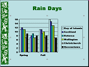
You will create a chart of the number of rainy days in each season for
the same places in New Zealand that you used for the table of
temperatures.
Insert Chart
-
 Add a new slide after the Temperatures
slide.
Add a new slide after the Temperatures
slide.
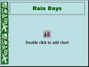
- Type Rain Days as
the title.
-
Apply
the Title-Chart layout
 from the Slide Layout task pane.
-
 Double-click
the icon on the slide. The default chart and datasheet appear
with the default data.
Double-click
the icon on the slide. The default chart and datasheet appear
with the default data.
Enter Data
You must replace the default data with your own. The chart will change
automatically to match.
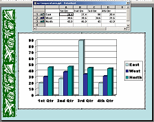
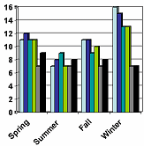
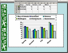
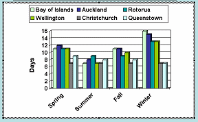
- Enter the data from the table below into your datasheet. The numbers are
the number of days with rain in the season. You do not need to worry about the
cell size in the data table.
Printable copy of data table
Alternate to typing it all: Copy the table below and paste it into
Word or Excel. Copy the whole table from Word or Excel and paste into
your datasheet. You cannot copy the table directly from this web page and
paste into your datasheet because each row will paste into 1 cell!
|
Places |
Spring |
Summer |
Fall |
Winter |
|
Bay of Islands |
11 |
7 |
11 |
16 |
|
Auckland |
12 |
8 |
11 |
15 |
|
Rotorua |
11 |
9 |
9 |
13 |
|
Wellington |
11 |
7 |
10 |
13 |
|
Christchurch |
7 |
7 |
7 |
7 |
|
Queenstown |
9 |
8 |
8 |
7 |
-
 Click
on the slide to close the Microsoft Graph interface. The chart is
showing on the slide.
Click
on the slide to close the Microsoft Graph interface. The chart is
showing on the slide.
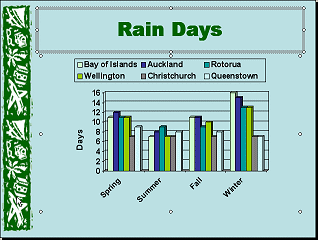
You can make some formatting and layout changes that will make this chart
easier to read and more attractive.
-
Save
As to your Class
disk as nz-chart.ppt .
 How to handle a full Class disk
Format Chart
You actually have a lot of control over how your chart looks. You can change
the fonts, color, background, and layout.
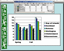
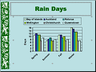
You will fix the following problems:
- Missing some seasons from the X-axis.
- Color for Bay of Islands data is same as the background.
- The colors of the chart bars are not attractive.
- The legend is taking too much space.
Unfortunately, your chart text may look more jagged than expected.
Anti-aliasing does not work as well for charts in PowerPoint. If you use
PowerPoint Viewer to run you show on a computer that does not have
PowerPoint installed, all the fonts will be more jagged.
Remember: While
in Microsoft Graph, Undo will work only for the previous action. There is
no list of actions!
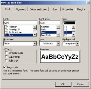
- Double-click the chart to open it in Microsoft Graph again.
Alternate method: Right click and choose Chart Object | Edit.
-
X- and Y-Axes:
The default font is Arial Black. The characters are too large for all of the
season names to fit on the X-axis. The numbers on the Y-axis are hard to read. The
strokes are too thick.
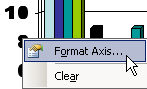
 Right click on the X-axis labels (Spring, Fall).
- From the popup menu select
The Format Axis dialog appears with several tabs.
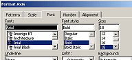 On the Font tab,
change the Font to Arial.
On the Font tab,
change the Font to Arial.
-
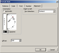 On
the Alignment tab, change the Orientation to 45º by
dragging the Text line up. The dot turns red when you are at exactly 45º.
On
the Alignment tab, change the Orientation to 45º by
dragging the Text line up. The dot turns red when you are at exactly 45º.
If you have trouble with dragging, you can type 45 in the Degrees box.
Now all four seasons show. Sometimes all you need to do is change the font
or font size.
-
Click on OK to accept the changes to the X-axis.
-
 Right
click on the Y-axis (the vertical numbers) and choose
Right
click on the Y-axis (the vertical numbers) and choose
-
 Change
the Font to Arial and click on OK.
Change
the Font to Arial and click on OK.
- Bar Colors:
The light blue color on the first series of bars looks OK on the white
background, but the chart background is actually transparent. On the slide those
bars are the same color as the background. Not good!
 The automatic
colors are chosen first from the colors in the slide color scheme and then
from standard colors.
The automatic
colors are chosen first from the colors in the slide color scheme and then
from standard colors.
-
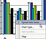 Right
click on a light blue bar. All of the light blue bars are selected and
show handles.
Right
click on a light blue bar. All of the light blue bars are selected and
show handles.
Clicking
twice on a bar will select just that one bar. Be careful how many times
and where you click!
- From the popup menu select
The Format Data Series dialog opens.
-
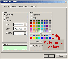 If necessary, click on the Pattern tab.
-
Click
the light green color at the bottom of the upper color palette and
click on OK.
All the bars for Bay of Islands are now light green. The legend changed to
match.
Automatic colors: The colors
used automatically for the data bars are listed in the second palette of colors.
The first row is the colors from the slide's color scheme. The order on the
palette is the order in which they will be picked.
If
you change your color scheme later, only the colors that you chose from the
scheme will change to match the new color scheme.
-
 Repeat for the
black bars, choosing light blue from the upper color palette.
Repeat for the
black bars, choosing light blue from the upper color palette.
- Legend:
The legend at the left takes up way too much space and the font is too
thick to read easily.
-
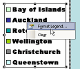 Right
click on the legend.
Right
click on the legend.
- From the popup menu select
The Format Legend dialog opens.
- On the Font tab, change the Font to Arial.
-
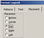 On
the Placement tab, select Top.
On
the Placement tab, select Top.
- Click on OK to close the dialog.
The legend moves to run across the top of the chart and the chart expands
horizontally.
Add Text Box
Perhaps it is clear to you that the numbers on the Y-axis are a number of
days. Some people might think it's the number of inches of rain. To make it
clear, you should add a label. Unlike
Excel, Microsoft
Graph does not include an option to add an axis label, so you will have to add
a text box yourself.
- With the chart displayed in Microsoft Graph,
display the Drawing toolbar. [View | Toolbars | Drawing]
- Click on
 the Text Box button on the Drawing bar.
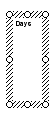 To the left of the Y-axis, drag to create a small vertical text
box. (Exact dimensions do not matter right now.)
To the left of the Y-axis, drag to create a small vertical text
box. (Exact dimensions do not matter right now.)
- Type the word Days. The font size is far
too small.
- Right click on the border of the text box.
-
 From the popup menu select
The Format Text Box dialog opens with several tabs.
From the popup menu select
The Format Text Box dialog opens with several tabs.
 If the dialog
only shows a Font tab, then you clicked inside the text box instead of on the
border.
If the dialog
only shows a Font tab, then you clicked inside the text box instead of on the
border.
- Font Size: On the Font tab, change the Size to 20.
-
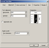 Text
Direction: On the Alignment tab, select the orientation for text
from bottom to top.
Text
Direction: On the Alignment tab, select the orientation for text
from bottom to top.
- Click on OK to close the dialog.
- If necessary, drag the text box down to center the word Days
vertically along the Y-axis.
-
Click onto the slide to close the chart and go back to the
slide.
Align
With all the editing you have done, it is likely that your title placeholder and the chart are not quite in
alignment, making the slide feel unbalanced. The Drawing Bar can come to the
rescue!
-
 Click on the
Title placeholder to select it.
Click on the
Title placeholder to select it.
- Hold the SHIFT key down and click on the chart. Now both the placeholder
and the chart are selected.
- Click on
 the
Draw button
on the Drawing bar.
the
Draw button
on the Drawing bar.
-
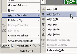 From the Draw menu, select
and then .
From the Draw menu, select
and then .
If your parts were not centered, a small shift occurs that aligns the legend and the placeholder better.
-
Save to your Class
disk.[nz-chart.ppt]
How to handle a full Class disk
Evaluate
View the slide full screen.
 How
easy is it to read? Is there too much data? Could you accomplish the same
purpose with fewer data bars? Multiple charts?
How
easy is it to read? Is there too much data? Could you accomplish the same
purpose with fewer data bars? Multiple charts?
~~ 1 Cor. 10:31 ...whatever you do, do it all for the
glory of God. ~~

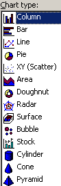 A chart is a
way to represent numbers graphically, that is, as a picture. There are many
different types of charts.
A chart is a
way to represent numbers graphically, that is, as a picture. There are many
different types of charts.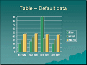 Column
Chart: Most common choice. Good for showing a pattern of change in the
values over time or to compare sets of values.
Column
Chart: Most common choice. Good for showing a pattern of change in the
values over time or to compare sets of values.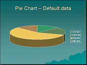 Pie Chart:
Shows numbers as parts of a whole.
Pie Chart:
Shows numbers as parts of a whole.