|
Step-by-Step: Brochure Inside |
|
|
What you will learn: |
to manage text in linked text
boxes
to create a Body Text style
to create captions for
images
|
Start with: 
 ,
brochure-tahiti5.doc from the
previous lesson, tahiti.doc
from the resources files
,
brochure-tahiti5.doc from the
previous lesson, tahiti.doc
from the resources files
You will copy more of tahiti.doc and paste it into the linked
text boxes that make up the inside of the brochure. Then the formatting fun
begins!
Copy and Paste Text
- Open tahiti.doc from your resource files and
brochure-tahiti5.doc from your
Class disk.
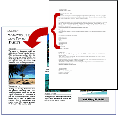
- On page 2 of brochure-tahiti5.doc, start from Text Box 4 on the left and drag to select the text in the 3
linked text boxes.
Whoops. All you can select is what is in Text
Box 4. Click somewhere else to deselect the text. You
can use a different method of selection.
 With the cursor in Text Box 4, on the menu choose . The text in all three linked text boxes is selected.
 Another way to select all
the contents is CTRL + A.
Another way to select all
the contents is CTRL + A.
- Press the
DELETE key to remove this temporary text.
 If the cursor is in
the document body instead of the text box, you will select the whole
document and delete everything, including the first page!
If the cursor is in
the document body instead of the text box, you will select the whole
document and delete everything, including the first page!
- Switch to tahiti.doc and select the lines from What to see and do in Tahiti through
Call 54 (1) 821-6543 .
- Copy these
lines.
- Switch back to brochure-tahiti5.doc and paste in Text Box 4.
The text fits entirely in this text box for
now.
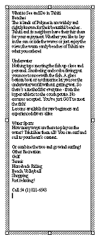
Headings
-
Place the cursor in line 1 What to See and Do in
Tahiti and apply Heading 1.
-
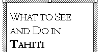 Select this heading text and format Font as:
Garamond
Regular
size 28
Small caps
Condensed by 1.25 pt
Kerning at 14 pt. and above.
- Format the Paragraph with:
Space before=0
Space after = 24 pts.
Line spacing = exactly at 24 pts..
- Update the style to match your changes.
- Select the word Tahiti in the heading and make it Bold.
- Apply Heading 2 (which you modified earlier in Format Flap) to the lines Beaches , Underwater , Water Sports , and Other Recreation .
Some of the lines are in the
next text box now.
Body Text
The default paragraph style for Word
documents is Normal. If you want to format your ordinary paragraphs
differently, you will want to create a Body Text style.
-
 Select the paragraph that starts
The
islands of Polynesia... .
Select the paragraph that starts
The
islands of Polynesia... .
- Format it as
Font:
Garamond
Regular
size 12
Condensed by .25 pt.
Paragraph:
Alignment = Justify
Line spacing after = 12 pt.
- Create a new style named Body Text from
this paragraph
 The style Body
Text already exists: Modify it to match the selection.
The style Body
Text already exists: Modify it to match the selection.
- Apply the Body Text style to the paragraphs which begin with Nothing tops… , How many
ways… , and Or combine…
The differences may be subtle, but overall
the fit will be better.
Block Quote
-
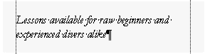 Select the paragraph Lessons
available…
Select the paragraph Lessons
available…
- Apply the style Block quote to it. (You may have
to scroll the list of styles up to find it.)
- Left justify the paragraph by clicking
the button on the Formatting toolbar.
Bulleted List
-
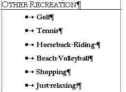 Select the lines from Golf through
Just relaxing .
Select the lines from Golf through
Just relaxing .
- Click on the Bullets button. The bullet scheme
applied is what you just did on page 1, if no one has used a different
one
in the meantime. But you don't want to use that scheme here. Sometimes
is is worth a try to see if the right scheme is ready.
- Undo.
- From the menu select | .
- Modify a scheme to use a small solid black circle for the bullet and no indentions.
- Format with Paragraph:
Spacing before =
0
Spacing after =
12 pt
- Indent
once with the Indent button
- Make Bold.
- If necessary, on the ruler change the tab stop so the space after the
bullet looks like the illustration.
Phone Number
-
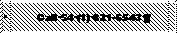 Select the last line - Call …
- Apply Heading 3.
-
 Format the Font as:
Arial Black
Bold
size = 14
Condensed .5 pt
Character spacing lowered 4 pt
- Format the Paragraph as:
Centered
Spacing before = 3pt.
Spacing after =
3 pt.
- Add Shading with pattern Lt. Dwn Diagonal (light down diagonal) applied to paragraph.
- Add Border as Box white Âľ pt applied to paragraph. Options - all four distances = 9 pts
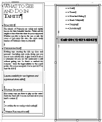
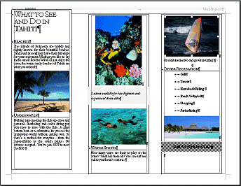
Add Images
In the resource files in the
tahiti subfolder you will find photo images
to add to the brochure. If you print your brochure with only black ink, you will be disappointed with the way it looks compared to what you see on the screen. Color makes a tremendous difference. Photos often look a lot different in black and white because all colors of the same darkness will show up as the same shade of gray. In fact some photos are completely worthless when changed to shades of gray.
- Insert images from the resource files as listed
below. These images have been sized with a graphics program to save
space. Word will automatically resize large images to fit in the text
box.
There should be a blank line that is styled with Body Text at the spot
where you insert each image. Check for the style before
inserting. Create such a line if it doesn't exist
yet. The wrong paragraph style, like Heading 2, can crop your image! Try it!
after Beaches paragraph palm.gif
after Underwater paragraph scuba.gif
after the block quote snorkel.gif
before "Or combine…" windsurf.gif
after Just relaxing paragraph hut.gif
-
 Center
each image by selecting it and clicking the Center button.
Center
each image by selecting it and clicking the Center button.
- Select the scuba picture and drag it by a bottom corner to
resize it so that the Water Sports paragraph is entirely in the same
textbox, down toward the bottom of the text box.
Final Changes
- Select Text Box 4 and move it down until the Header with
your name shows completely.
- Select Text Boxes 4, 5, and 6 and format them with no border. (Right click menu | |
Color =
No line)
- Spell Check.
Make any spelling or grammar changes needed.
- Inspect the brochure's two pages in Print Preview. Make corrections if necessary.
- Save as brochure-tahiti6.doc to the word project
3 folder of
your Class disk.
 How to handle a full disk
 Print only page 2.
If you want to print this page on the back of page 1, you must put page 1 back in the printer's stack of paper. Test first to be sure you know how a page should be oriented in the paper stack for your page to print on the correct side and right side up
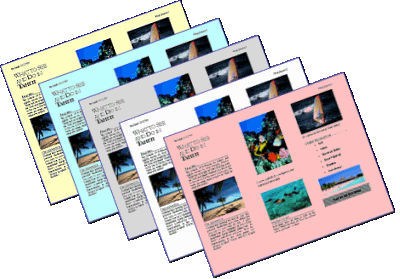
 Colored Paper:
The look of your brochure is also
affected by the paper you print it on. Commercial brochures often use
slick, shiny paper. Photos look their best on this kind of expensive
paper.
The color and texture of the paper make a difference,
also.
If you have some colored paper, try
printing the brochure to see how different it looks with different papers. The
white parts of photos will be the color of the paper! Look at the
beach and the surf in the pictures. The pink paper shows the effect the
most of the examples.