
Jan's Working with Numbers
Format: Exercise Excel 3-3
 You
will use data from a previous exercise and Paste Link it to a new sheet. You
will apply table style and cell styles. You will create a line chart and
then change the theme.
You
will use data from a previous exercise and Paste Link it to a new sheet. You
will apply table style and cell styles. You will create a line chart and
then change the theme.
Exercise Excel 3-3: |
Amazon Pings -
|
| What you will do: | Paste Link data Format numbers - ribbon or Format Cells dialog Apply a table style and convert back to range Create and apply cell styles Create a line chart Format the chart Rename sheets Scale to fit one sheet Change the theme |
Start with: ![]() , ex2-3-amazon-Lastname-Firstname.xlsx (created in previous exercise)
, ex2-3-amazon-Lastname-Firstname.xlsx (created in previous exercise)
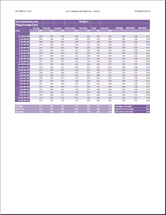
The spreadsheet ex2-3-amazon-Lastname-Firstname.xlsx [created in Exercise Excel 2-3] contains the records of a series of tests (over several weeks) of Internet speed to the Amazon.com site. Each test measures the time for a signal to make the round trip to amazon.com and back. This signal is called a "ping".
You will create a sheet for the data for a single week, along with a chart of average, maximum, and minimum ping times for each day.
-
 From your Class disk open the file ex2-3-amazon-Lastname-Firstname.xlsx that you saved in the excel project2 folder for Exercise Excel 2-3.
 - Save As with the name ex3-3-amazon-Lastname-Firstname.xlsx to the folder excel project3.
- Paste Link: In Normal view, copy the titles and labels in
Column A and Paste Link them to Sheet2 in cell A1.
Copy the data for the second week - J1:P33 - and Paste Link to cell C1.
(Do not copy whole columns to paste link. Paste Link will take quite a while to paste to the last possible row!) - Edit: Delete all the zeros that appear where there were blank cells originally.
- Format Sheet2: All cells A1:M33 as Calibri, 11 pt.
Using the ribbon Number Format control or the Format Cells dialog:
Time- Format cells A6:A29 as time like 1:30:55 PM
Date- Format cells C4:I4 as dates like 03/04 (Use the Format Cells dialog - Number tab)
Data- Format the data cells and calculated values as Number with 0 decimals. - Enter data: In cell G1 type Week 2.
In cell K3 type Average, in L3 type Maximum, in M3 type Minimum.
In cell K31 type Average of all data:, in cell K32 type Maximum of all data:, in cell K33 type Minimum of all data: -
Formulas: Add formulas - in cell K6 average the data in that row, in cell L6 find the maximum value in the row, and in cell M6 find the minimum value in the row.
Copy these formulas down the column for each hour of the day.
Write a formula in cell M31 for the average of all of the data cells C6:I29, in cell M32 to find the maximum, and in cell M33 for the minimum.
- Format as Table: Select A3:M29 and Format as Table with style Medium 5, shades of purple.
- Convert to Range and repair: Immediately Convert to Range.
Remove the added 'Column 1' and similar labels from row 3.
If necessary, resize Column A to show the times. -
Create Cell Styles: Select cell A3 and create from it a cell style named Label 1.
Select A4 and format as Bold, font color White, Fill color = Purple, Accent 4, Lighter 40%.
Create a new cell style from these, named Label 2.
-
Apply Cell Styles: Apply the Label 1 cell style to A1:M3, A5:A29, and K31:M33
Apply Label 2 style to A31:I33 and A4:M4.Repair: Set the dates back the 2/27 formatting.
Set the times back to 12:38:00 AM formatting.
Set the calculated values back to no decimals.Select A1:M2 and increase the font size twice and change the font to Cambria.
[Changing your mind about formatting can create a lot more work!]
- Resize: Resize columns B and J to 20 pixels. These are blank columns that create space.
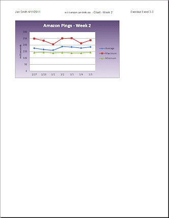
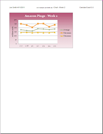
- Create Chart: Select the dates across the top and the values
at the bottom of the same columns for Averages, Maximum, and Minimum.
Use the ribbon to create a Line chart with markers at each data point.
Change the Layout to include a title and axis label for the vertical axis.
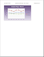
Title = Amazon Pings - Week 2 and label on the Value (Y) Axis = milliseconds.
Select Data and name Series 1 = Average, Series 2 = Maximum, Series 3 = Minimum.
Move the chart to Sheet3 and drag the chart to the upper left of Sheet3. - Format Chart: Format the Chart area with Fill > Gradient. Use a preset color gradient or create your own so that the background of the chart is in shades of Purple - dark for stop
1 at the top, light at the bottom. Change the title's font color to
White.
If necessary, format the Plot Area to use a White background color.
- Rename sheets: Change the name of Sheet1 to Original Data, Sheet2 to Week 2, Sheet3 to Chart - Week 2.
-
Prepare to print: Create or edit the header for each sheet to include your name and date in the Left section, file and sheet name in the Center section, and Exercise Excel 3-3 in the Right section.
Spell Check. View Page Break Preview and/or Print Preview for sheets Week 2 and Chart - Week 2.Select the sheet Week 2 and set scaling to fit 1 page wide by 1 page tall in Portrait orientation.
Select sheet Chart - Week 2 and set to print at scaling = 100%.
- Save.
[ex3-3-amazon-Lastname-Firstname.xlsx] -
 Print: Group sheets Week 2 and Chart - Week 2 and print
the two active sheets. Check the print preview to be sure your Page
Setup choices are still there. You should have two pages only.
Print: Group sheets Week 2 and Chart - Week 2 and print
the two active sheets. Check the print preview to be sure your Page
Setup choices are still there. You should have two pages only.
-
Change Theme: Make the sheet Week 2 the active sheet. On the Page Layout tab open the gallery of Themes. Hover over each one and check the sheet Week 2. Changing the theme is a quick way to see if you were consistent in formatting with theme colors and fonts. Apply a cell style to fix any cells that were not formatted with the correct cell style.
What changes on the sheet Week 2 when you change the theme?
Switch to the chart sheet and select the chart. Try out all of the themes again. (You should move the chart to the right temporarily so that the gallery of themes doesn't hide it.) What changes on the chart?
Which themes make these sheets easy to read? Which make these sheets hard to read? Which would mean you have to resize a column?
Pick a theme like Paper or Banded to both the sheet Week 2 and to the chart.
(Your chart background may not look like the illustration.) - Preview and Print: Check Print Preview first to be sure your columns are wide enough and that the chart is back in its proper place. Fix any errors.
- Close WITHOUT SAVING CHANGES.
If you accidentally saved with the new theme in place, Undo and save again.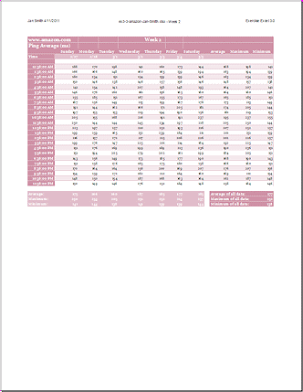
|
|
| © 1997-2017 Jan Smith All Rights Reserved |
Site Map What's New |
Privacy Policy Terms of Service Copyright Acknowledgements |
~~ 1 Cor. 10:31 ...whatever you do, do it all for the glory of God. ~~
Last updated: March 27, 2017
These exercises use files from the the Project 2. Save the changed documents to your Class disk in the excel project3 folder. This keeps the original files intact in case you need to start over or another student will be using this same computer.