
Jan's Working with Numbers
Intro: Common Tasks: Chart
Charts are one of Excel's coolest features. You can easily create charts of various kinds using your spreadsheet data. The ribbon makes it easy to pick just what you want to turn your numbers into an cool and colorful chart.
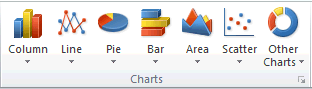
Some of the many types of charts - one to match your every need!
For this introduction to charts, you will stick with a simple pie chart. A pie chart works well when you want to see how much of the whole each part is. It uses just one column of data and a column of labels. Later you will work with column charts. These are the two most often used types.
| |
Step-by-Step: Pie Chart |
|
| What you will learn: | to select data to create a chart to create a pie chart to move a chart on a sheet to move a chart to a separate sheet to pick a chart layout to edit a chart title to format and position data labels - all or single to change the chart style to change the workbook theme to format a single data point to create a header that includes a field to print a chart |
Start with: ![]() budget-2010-Lastname-Firstname.xlsx from previous lesson
budget-2010-Lastname-Firstname.xlsx from previous lesson
This time you will be saving your work as a new file!
Create Pie Chart
To create a chart you first select the data to be charted and
also the cells that label this data.
For this lesson you will create a pie
chart that shows how the Inflow categories compare to the total.
-
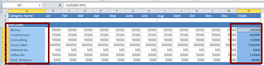 Select the range A7:A13, the row labels in the Inflow section.
- Hold CTRL down and select the range N7:N13, the totals for each row
of the Inflow section.
(You may need to scroll to see column N.) -
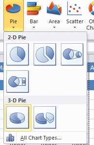 Click on Insert tab and then on the Pie Chart button.
The menu of types of pie charts appears.
-
 Click on 3-D.
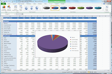
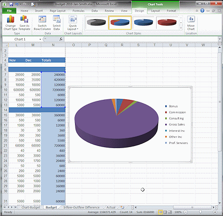
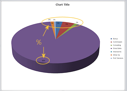
A chart appears in the middle of the sheet.The Chart Tools group of tabs shows as long as the chart is selected.
Your pie chart may use different colors from the illustration and the legend may be in a different location.
Next you will make some changes to this chart. It certainly needs to be in a different place!
- Click the Office button or the File tab and then on the command Save As.
The Save As dialog opens. [Do NOT click on the Save button in the Quick Access Toolbar! You need to change the file name and location.]
-
 In the Save As dialog, navigate to where you will be
saving your documents for these lessons.
In the Save As dialog, navigate to where you will be
saving your documents for these lessons.
- If necessary, create a folder named excel
project1 and open it.
- Change the
file name to:
budget-2010-chart-Lastname-Firstname.xlsx
- Click on Save.
Move Chart: Drag
You can drag a chart to an open spot on the current sheet or you can put it on a sheet of its own. A chart sheet is different from a normal worksheet.
-
 With
the chart still selected (handles are showing), move your mouse over the
chart edge.
With
the chart still selected (handles are showing), move your mouse over the
chart edge.
The pointer changes to the Move shape.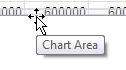
- Drag to the right until the chart is clear of the
data and drop.
 Problem:
Chart did not move; part of chart shifted
Problem:
Chart did not move; part of chart shifted
You did not catch the edge of the chart with your pointer but part of the inside of the chart.
Solution: Undo and try again.
- Save.
[budget-2010-chart-Lastname-Firstname.xlsx]
Move Chart: New Sheet
The Move Chart button is not about moving the chart on the worksheet but instead about which sheet tab it should be on.
-
 With the chart still selected, on the tab Chart Tools: Design, click the button Move Chart ,
at the far right end of the tab.
With the chart still selected, on the tab Chart Tools: Design, click the button Move Chart ,
at the far right end of the tab.
The Move Chart dialog appears.
-
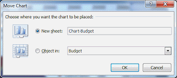 Click the radio button New sheet: and enter as the name for the new sheet Chart-Budget.
- Click on OK.
The chart now appears on its own chart sheet with its own tab at the bottom and is not on the Budget sheet anymore.
- Save.
[budget-2010-chart-Lastname-Firstname.xlsx]
Edit Chart: Change Layout
You can make a lot of changes to a chart. There are several pre-designed chart layouts to choose from. Plus you can change the colors, show or hide the legend and change its location on the chart, add a title, show values or percentages for the pie wedges. You can even change the chart type without having to start over!
 On
the Chart Tools: Design tab, click the More button
On
the Chart Tools: Design tab, click the More button  beside Chart Layouts or Quick Layout.
The gallery of pre-designed pie chart layouts appears.
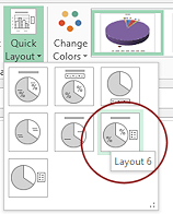
- Hover over each layout to let Live Preview show what effect it will have on your chart. The name of the layout appears as a popup.
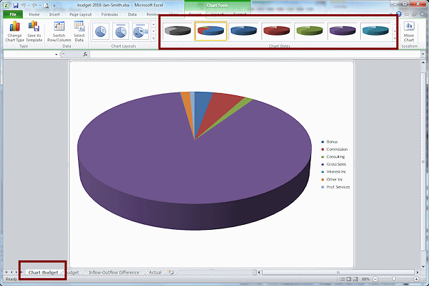
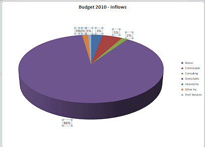
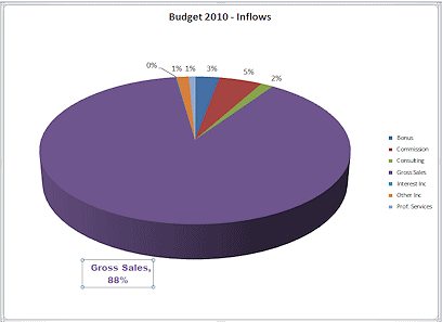
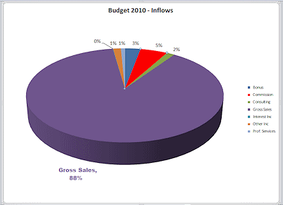
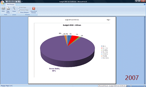
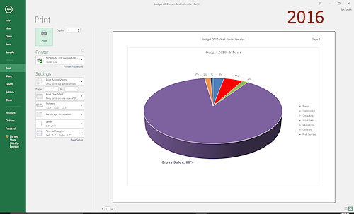
- Click on Layout 6, which shows a title, legend at the right, and percentages for the pie wedges:
Edit Chart: Change Title
-
 Click on Chart Title in the chart.
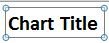
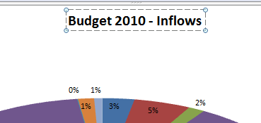
The text box containing the words "Chart Title" is now ready for you to edit. - Select the text 'Chart Title" and type in Budget 2010 -Inflows
- Click out of the text box to deselect it.
- Save.
[budget-2010-chart-Lastname-Firstname.xlsx]
Edit Chart: Data Labels
The position, size, color, and font for the labels for your data can be changed from the defaults to make the labels easier to read or to emphasize part of the data.
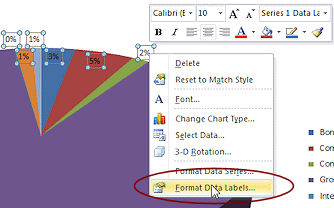 Right
click on one of the percentages in the chart.
Right
click on one of the percentages in the chart. -
Click on Format Data Labels...

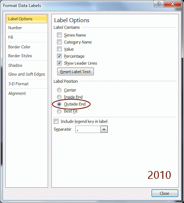
 Excel 2007, 2010: The dialog Format Data Labels opens to the Label
Options tab.
Excel 2007, 2010: The dialog Format Data Labels opens to the Label
Options tab.

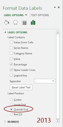
 Excel 2013, 2016: The Format Data Labels pane appears.
The font sizes are small and the numbers that are on a dark color are hard to read.
-
 Experiment: Formatting Data Labels
While the data labels are selected, any formatting changes apply only to the labels. You can use the Mini-Toolbar, the Home tab, or the Format Data Labels dialog or pane.Try different font sizes, fonts, font colors, background colors, and positions for your data labels.
You can format just one label or all of them.
When you are ready to continue, Undo your changes. -
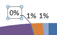
Change the Label Position to Outside End.
The % values move so that all are outside the pie shape.
 While
all data labels are still selected, on the Home ribbon tab, click the button Increase Font Size
While
all data labels are still selected, on the Home ribbon tab, click the button Increase Font Size  four times.
The font size increases for ALL of the data labels but not for the chart title or the legend text.
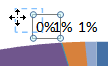
The text boxes for percentages at the top left are on top of each other. You can drag one of the labels to a better position.
-
 With
the data labels still selected, hover over the
label 0%.
With
the data labels still selected, hover over the
label 0%.
The mouse pointer is still in the Move shape .
.
-
Drag the 0% to the left and up a bit
 .
.
The new position should be far enough away that the leader line shows. That's the line from the number to its pie wedge.Only 0% is selected now.
Edit Chart: Format a Single Data Label
-
 Click the data label 88%. If necessary, click again
so that it is the only data label selected.
Click the data label 88%. If necessary, click again
so that it is the only data label selected.
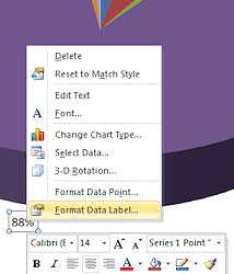
-
Right click on 88% and then click on Format Data Label...
Changes will apply only to the selected label. Excel 2013, 2016: You may need to navigate in the Format pane to the Label Options again. -
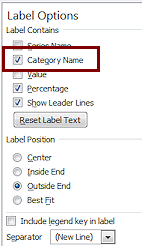
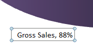 Check the box Category Name. Excel 2007, 2010: Close the dialog.
 The data label changes to "Gross Sale, 88%".
-
While the data label 88% is still selected, change the font to Arial Black.
-
Change the font color to Purple, Accent 4, Darker 50%.
-
 Save.
Save.
[budget-2010-chart-Lastname-Firstname.xlsx]
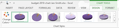
Edit Chart: Chart Style
The colors for the pie wedges were automatically assigned, based on the current color theme and each category's place in the legend list. If you pick a new theme, the colors will likely change, sometimes quite dramatically. You can manually change the color for individual wedges to emphasize a particular value.
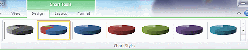
The Chart Styles gallery behaves differently in Excel 2013 and 2016.
![]()
![]() Excel 2007, 2010: The
Chart Styles gallery shows variations on the colors using only colors
from the color theme.
Excel 2007, 2010: The
Chart Styles gallery shows variations on the colors using only colors
from the color theme.
![]()
![]() Excel 2013, 2016: The Chart Styles gallery shows variations on the layout using the current color theme.
Excel 2013, 2016: The Chart Styles gallery shows variations on the layout using the current color theme.
Format with Chart Style and/or Theme:
-
Experiment: Chart Styles
On the Chart Tools: Design tab:
Excel 2007, 2010: Click on several
of the chart styles.
(There is no Live Preview for chart styles in Excel 2007 and 2010) Excel 2013, 2016: Hover over each of the chart styles but do NOT click.
Live Preview shows the effect of your choice on the chart.Open the gallery of chart styles by clicking the More button
for the tab group and try some of these styles.
Which style do you think works best for this particular chart?? Excel 2007, 2010: When you are ready
to continue, click on Style 2. Excel 2013, 2016: If you did not click on any styles, move your mouse pointer off the styles gallery. If you did click on any styles, use Undo to remove any changes.
Excel 2007, 2010: When you are ready
to continue, click on Style 2. Excel 2013, 2016: If you did not click on any styles, move your mouse pointer off the styles gallery. If you did click on any styles, use Undo to remove any changes.
-
 Experiment: Themes
The current theme is Office 2007-2010. It is not in the list of themes in Excel 2013 and 2016. The Office theme is not the same as the theme Office 2007-2010 at all!You will need to use Undo to get back to the correct theme after your experiment.
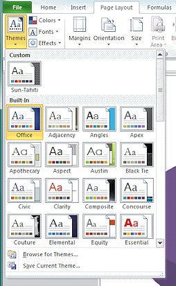
- On the Page Layout tab in the Themes tab group, open the gallery of Themes.
(There is no Live Preview for charts when you hover over a theme.) -
Select several different themes and check what changes about the chart and the other sheets.
A theme can set fonts, colors, and effects. Changing a theme may affect the font for the title, legend, and data labels as well as the colors in the chart.
Did you find a theme that makes the chart look better than the Office theme?
 Changing
theme affect all sheets: A theme affects the whole
workbook, not just the current sheet.
Changing
theme affect all sheets: A theme affects the whole
workbook, not just the current sheet.
-
When you are ready to continue...
 Excel 2007, 2010: Return the theme to Office by clicking it in the gallery.
Excel 2013, 2016: Use Undo to return the chart to how it looked before you started experimenting with themes.
- On the Page Layout tab in the Themes tab group, open the gallery of Themes.
Edit Chart: Format a Single Data Point
Again, formatting changes will apply only to what is selected whether you are using the ribbon tools, the Mini-Toolbar, or a formatting dialog or pane.
-
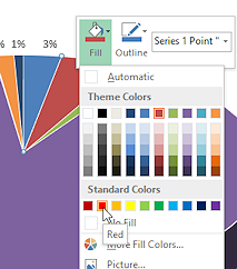 Click twice on the red 5% pie wedge so that it is the only
selected wedge.
Click twice on the red 5% pie wedge so that it is the only
selected wedge.
Handles appear ONLY on the tips of the one wedge.
- Right click on the selected wedge.
The Mini-Toolbar and context menu appear.
- Click on the Mini-Toolbar on the Fill button.
The palette of colors opens.
- Click in the Standard Colors on Red.
The wedge changes to the brighter red.
-
 Save.
Save.
[budget-2010-chart-Lastname-Firstname.xlsx]If you had clicked on the Outline button, the color change would apply to the line around the edge of the wedge.
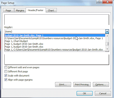
Create Header
For a normal sheet, the Page Layout view makes it easy to add a header or footer. But when you are looking at a chart sheet, the Page Layout and other view buttons are disabled. You have to use an old style dialog to add a header or footer to the print-out of a chart sheet.
-
 On the Insert tab in the Text tab group, click on the Header & Footer button.
The Page Setup dialog opens to the Header & Footer tab.
- In the Header text box, click the down
arrow to open the list of common items.
-
Scroll down and click on the choice with the file's name, page 1.
The preview above the text box changes to show how your choice will print.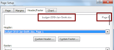
- Click on OK to close the dialog.
The chart sheet did not change. The new header only shows in Print Preview.
We won't get into the many options Excel has for printing just yet. Printing a chart sheet pretty easy.
- Open Print Preview.
Excel 2007: Office button > Print > Print Preview Excel 2010, 2013: File tab > Print
-
Inspect the Print Preview window for the choices you have.
Excel 2007 shows the buttons on the ribbon , but has not changed much from previous versions.
Excel 2010, 2013, and 2016 put the preview in the Print pane, which shows printing choices directly in the pane instead of making you open a dialog.
- Verify that options are correct, especially which printer will be used. The orientation should be Landscape.
-
 Print.
Printing without color: The
preview shows colors even if the selected printer cannot
print in color.
Wet paper: If you are using an ink jet printer, the large dark areas may stay wet for quite a while. Carefully remove the page from the printer before another page lands on it.
-
Save.
[budget-2010-chart-Lastname-Firstname.xlsx]
|
|
| © 1997-2017 Jan Smith All Rights Reserved |
Site Map What's New |
Privacy Policy Terms of Service Copyright Acknowledgements |
~~ 1 Cor. 10:31 ...whatever you do, do it all for the glory of God. ~~
Last updated: March 22, 2017