|
Pie charts are most useful for showing how the
parts relate to the
whole.
In the sample chart below, the sizes of the wedges give you a
quick feel for the relative sizes - which pieces are biggest, which are
smallest, which are about the same size, which parts make up the bulk of the
whole. You get more exact numbers when you include the values or the percentages
as part of the data label.
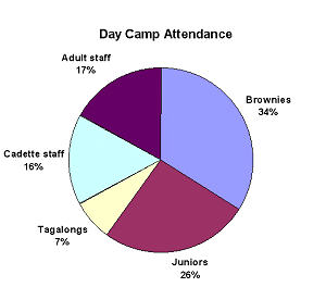
Sample Pie Chart
|
|
Where you are:
JegsWorks >
Lessons >
Numbers
Before
you start...
Project 1: Excel Intro
Project 2: Excel Basics
Project
3: Format & Arrange
Format Cells
Format
Chart 
 Pie
Chart Pie
Chart
Column
Chart
Arrange
Summary
Quiz
Exercises
Project 4: Groups & Formulas
Project 5: Design
Search
Glossary
Appendix
|
|
 |
Step-by-Step: Format Pie Chart |
|
What you will learn: |
to format chart title
to explode a pie
chart
to explode one wedge of a pie chart
to format data
points
|
Start with:
 trips14.xls (saved in
previous lesson)
trips14.xls (saved in
previous lesson)
Format Chart: Title
In the previous lesson Basics: Chart, you created a pie chart for the number of
tickets sold for each week that World Travel Inc. had their
special offers. Now you will learn how to make changes to the formatting.
- Open trips14.xls from your Class disk in the
excel project3 folder, if it is not
still open.
- Select the sheet named Pie Chart.
- Click on the chart's title to select it. When you changed the column label from
# to Number, the chart was updated automatically. Cool feature!
-
 Use the Formatting bar to format the title as: Use the Formatting bar to format the title as:
Font = Britannic Bold
Font Size = 16
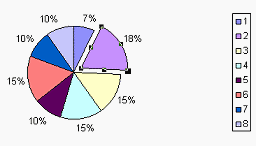
Format Chart: Explode whole pie or part
-
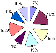 Click on the pie to
select
it. Drag away from the center of the chart. You have exploded the whole
pie! Click on the pie to
select
it. Drag away from the center of the chart. You have exploded the whole
pie!
- Drag back to the
center to glue your pie back together.
-
 Click on the red wedge labeled 18% to select it. This is wedge with the largest percentage. Click on the red wedge labeled 18% to select it. This is wedge with the largest percentage.
- Drag the selected wedge up and to the right a little. You've
"exploded" a piece of the pie. This is a handy way to emphasize a special part of
a pie chart.
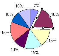
Format Chart: Data Point
-
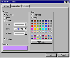 Right click on the dark red 18% wedge and choose from the popup
menu. A dialog appears with three tabs - Patterns, Data Labels, and
Options. Choices made on these tabs apply only to the selected wedge (the
data point). Right click on the dark red 18% wedge and choose from the popup
menu. A dialog appears with three tabs - Patterns, Data Labels, and
Options. Choices made on these tabs apply only to the selected wedge (the
data point).
- Using the Patterns tab, experiment with different colors and
fill effects.
-
 On the Patterns tab, click on the Lavender color square (5th row, next to last column). Then click OK. The color
of the selected wedge is changed, and the matching box in the chart
legend also changes. On the Patterns tab, click on the Lavender color square (5th row, next to last column). Then click OK. The color
of the selected wedge is changed, and the matching box in the chart
legend also changes.
 Be careful when changing color and pattern assignments. Excel carefully places colors next to each other that won't look the same if printed in
gray scale. You can make your chart unreadable with the wrong color or pattern choices. Be careful when changing color and pattern assignments. Excel carefully places colors next to each other that won't look the same if printed in
gray scale. You can make your chart unreadable with the wrong color or pattern choices.
-
With the chart selected, create a header like
the one on the first sheet. Your name and the date on the left, the
workbook name and sheet name in the middle, and Excel Project 3 on the
right.
-
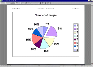 Open
the Print Preview. The chart is sized to fill the page. Close
the preview. Open
the Print Preview. The chart is sized to fill the page. Close
the preview.
-
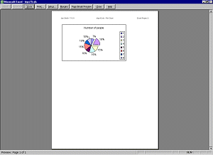 Deselect
the chart by clicking on a cell somewhere else on the sheet. Deselect
the chart by clicking on a cell somewhere else on the sheet.
-
Open Print Preview again. This time the chart covers only a
part of the page. This page will print much faster and will use less
ink!
But wait! What happened to the header you just created? Did it vanish?
If so, when you created the header with the chart selected,
you did not create a header for the whole sheet! Unexpected! This does
not happen in all versions.
-
If necessary, close the Print Preview and (with the chart not
selected!) create your standard header: Your name and the
date on the left, the workbook name and sheet name in the middle, and
Excel Project 3 on the right.
-
Save as trips15.xls on your Class disk in the excel project3 folder.
-
 Print the sheet.
|