|
Chart Wizard
The Chart Wizard
walks you through the choices to create a chart from data in a single
table or
query. After the wizard is done, you can change the source to include
other tables or queries. If you want to use a Value List instead of an
existing table or query, you should insert a default chart and then
modify the Row Source property of the chart.
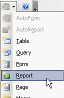
Start Wizard: There are two ways to open the Chart Wizard,
depending on whether you want to add a chart to an existing report or you
want to create a report containing just the chart.
-
 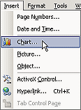 In
Report Design View, from the menu- | In
Report Design View, from the menu- |
- Open the New Report dialog and pick Chart Wizard. You will get
a new report, containing just the chart.
Source: Depending on which method you used to start the wizard,
you will either see a Chart Wizard window or the New Report dialog. Pick
one table or query
as the source of your data.
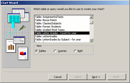
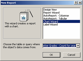
 A suitable table or query
must already exist to start you out! You can add others to the underlying
query only after the wizard finishes. You may want to create a
special query or table first so that your data is ready for the chart, as
was done for this example. A suitable table or query
must already exist to start you out! You can add others to the underlying
query only after the wizard finishes. You may want to create a
special query or table first so that your data is ready for the chart, as
was done for this example.
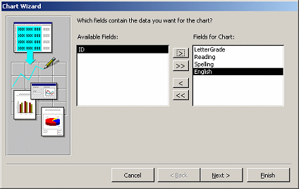 Fields:
Pick which fields to use
in the chart. Fields:
Pick which fields to use
in the chart.
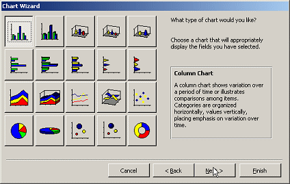 Chart
type: Pick the type
of chart. There are fewer options than in Excel. Chart
type: Pick the type
of chart. There are fewer options than in Excel.
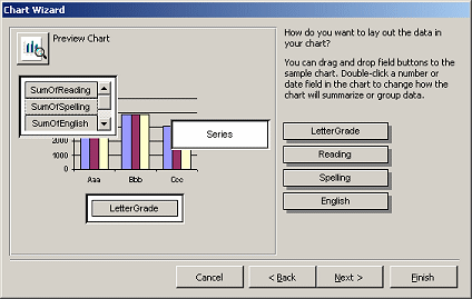 Data
Layout: The Chart Wizard makes a guess as to which
data belongs where on the chart. You can change that. Data
Layout: The Chart Wizard makes a guess as to which
data belongs where on the chart. You can change that.
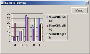  The Preview
Chart button opens a more accurate display than what shows on the
wizard page itself. The Preview
Chart button opens a more accurate display than what shows on the
wizard page itself.
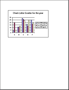
For this example, I had to drag the Spelling and English items from the
right and drop them in the area to the upper left of the sample chart to
create several series of columns.
 Chart
Title: Enter a title for the
chart. This is not the name for the report! Just what will show on the
chart itself. Chart
Title: Enter a title for the
chart. This is not the name for the report! Just what will show on the
chart itself.
 The
default chart size is rather small on the page. You will likely want to
resize it in Report Design View unless you are inserting a chart into the
Detail section. The
default chart size is rather small on the page. You will likely want to
resize it in Report Design View unless you are inserting a chart into the
Detail section.
Editing a Chart
Once
the wizard has finished, you cannot get back to the wizard pages. You
must either recreate the chart with the wizard or edit it in Report
Design View. It looks quite different in this view! Not right at all!!
 Report Design View
uses default data and will never show your actual data. Only
the chart title is from what you just chose in the wizard! Report Design View
uses default data and will never show your actual data. Only
the chart title is from what you just chose in the wizard!
You can resize the chart by selecting it and dragging its
handles. You can drag it to a new position on the page.
To change the data underlying the chart, go to the Properties dialog
for the chart control and in the Source property, open the Query Builder
and edit the query as much as you wish.
If you want to show a static
chart that is not based on Access data, create it in Excel and paste it
to your report.
 Format
chart features with Microsoft Graph: Double-click the chart and
chart's border changes and the toolbar also changes, showing that the chart is now in Microsoft Graph.
A datasheet window may appear, but it and the
chart show only the default sample data. You can edit the
chart's title and format chart parts like the axes and legend from this
window. You can change the fonts, font sizes, and alignment of axes
labels. You can change the colors of the series bars and hide or show the
legend. Format
chart features with Microsoft Graph: Double-click the chart and
chart's border changes and the toolbar also changes, showing that the chart is now in Microsoft Graph.
A datasheet window may appear, but it and the
chart show only the default sample data. You can edit the
chart's title and format chart parts like the axes and legend from this
window. You can change the fonts, font sizes, and alignment of axes
labels. You can change the colors of the series bars and hide or show the
legend.
Default Data always
in Report Design View: In Report Design View, the chart always uses the
default data from Microsoft Graph. Access cannot figure out the
actual data until it formats the chart for Print Preview. Any changes to the datasheet values in the chart's
datasheet while in Microsoft Graph will show in Report Design View but
will NOT show on the actual chart
in Print Preview. The datasheet values are replaced when Access
formats the report. This can be quite confusing!
Check changes in Print
Preview: When you make formatting changes in Report Design view, you
will not see what will print. You must check the print preview carefully
to see the effect of your changes. You may need a different font size or
alignment for the actual text to fit well.
 |
Step-by-Step: Chart Wizard |
|
|
What you will learn: |
to use the Chart Wizard |
Start with:
 ,
resource files,
worldtravel.mdb from the previous lesson ,
resource files,
worldtravel.mdb from the previous lesson
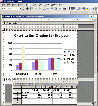
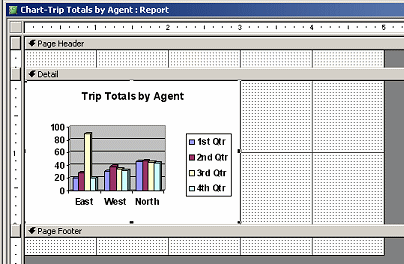
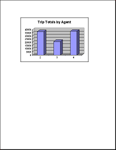
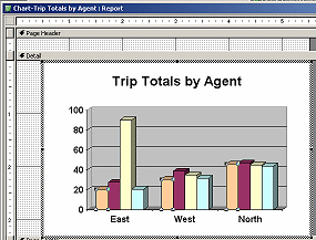
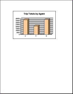
You are going to create a report containing a chart of the
total price of trips sold for each agent. The Chart Wizard does
not allow you to use more than one table, so you will have to
edit the query that the wizard creates to get an understandable
chart.
-
From
the menu select New Objects | Report.
The New Report dialog opens.
-
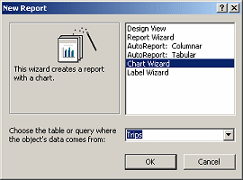 Select
Chart Wizard and as the source, the table
Trips. Select
Chart Wizard and as the source, the table
Trips.
- Click on OK.
The Chart Wizard opens to the page about fields.
-
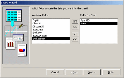 Click
on AgentID and Price
and then on the > button to move them to the right column, Fields
for Chart. Click
on AgentID and Price
and then on the > button to move them to the right column, Fields
for Chart.
- Click on Next.
The wizard opens the page for chart type.
-
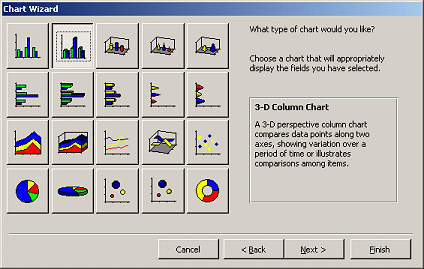 Click
on the 3-D column chart, in the top row. Click
on the 3-D column chart, in the top row.
- Click on Next.
The Chart Wizard makes a guess as to how you want the data displayed,
AgentID across the bottom and a total of prices for that AgentID in the
column. That's right!
-
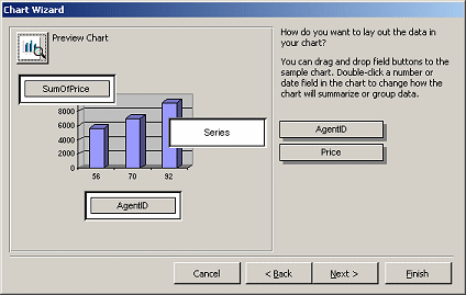 Click
on the Preview Chart button to see how your chart will
look. Click
on the Preview Chart button to see how your chart will
look.
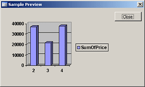 Hmmm.
In the preview, you can see the actual axes and columns. The legend
seems useless this time. Hmmm.
In the preview, you can see the actual axes and columns. The legend
seems useless this time.
The only problem is that the labels across the bottom are numbers
instead of names. That is because the Trips table contains only the
AgentID number. You will have to change the
source to fix this issue, but it's not all that hard.
- Close the preview.
- Click on Next.
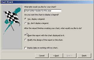
The Chart Wizard wants a title for the chart.
-
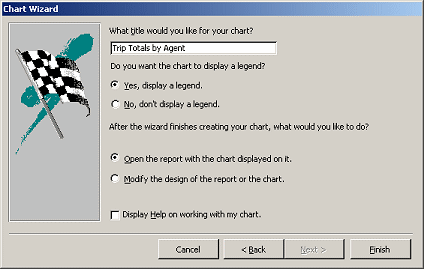 Type
Trip Totals by Agent as the title. Type
Trip Totals by Agent as the title.
- Click on the option button
- Leave the default choices ,Yes, display a legend
and Open the report with
the chart displayed on it.
-
 Click on Finish. Click on Finish.
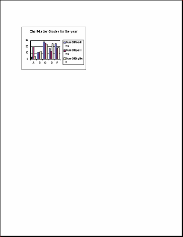
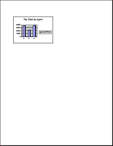
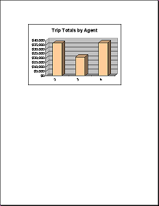
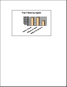
The report opens with a small chart.
 Save
the report as Chart-Trip Totals by Agent Save
the report as Chart-Trip Totals by Agent
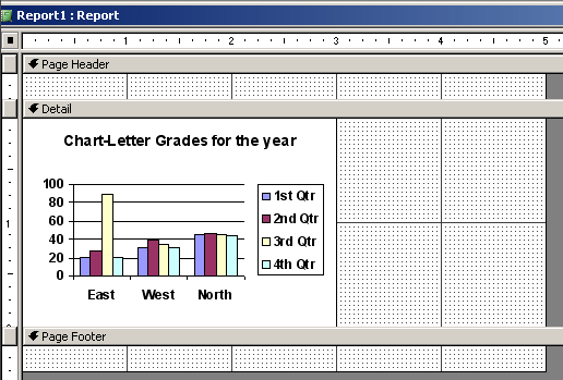
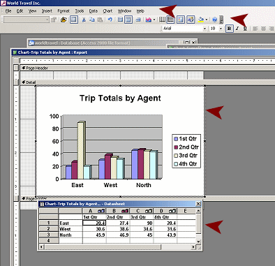
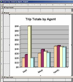
Working in Report Design View
A chart looks different in design view since it can only show the
default sample data. There are some tricks to formatting the chart, too.
To edit the chart's features, you must open the chart in Microsoft Graph.
-
 Switch
to Report Design View. Switch
to Report Design View.
The chart does not look the same! Remember, the chart will always
use the default sample data when you are in design view.
- If necessary, click on the chart to select it.
The handles should show at the corners and center of each side.
- Move your mouse pointer over the bottom right corner of the
chart until the pointer changes to the diagonal Resize shape
 . .
-
 Drag
down and to the right until the black bars on the ruler
are at 5" wide. Drag
down and to the right until the black bars on the ruler
are at 5" wide.
- Switch to Print Preview.
The chart is noticeably larger but it is not centered.
-
 Switch
to Report Design View. Switch
to Report Design View.
- Move your mouse over the chart until the pointer turns to the
Move shape
 ,
an open hand. ,
an open hand.
- Drag the chart to the right.
The black bar on the ruler extends as you drag.
- When the black bar is at the 5.5" mark on the ruler, drop.
-
 Switch
to Print Preview. Switch
to Print Preview.
Is your chart centered on the page? Try again.
- Switch to Report Design View.
The remaining changes cannot be made directly in Report Design View.
You must open the chart in Microsoft Graph.
Working in Microsoft Graph
Microsoft Graph is a program that comes with Microsoft Office. It opens
only when called upon by an Office program. You will remove the legend
and change some formatting of the chart.
-
 Double-click
the chart. Double-click
the chart.
 The
border of the chart changes to diagonals. The
border of the chart changes to diagonals.
The toolbar and menu change.
You may see a datasheet below the chart.
All these changes are quite surprising when you don't expect them.
-
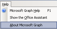 Click
on the Help menu. Click
on the Help menu.
Surprise!
The last item is "About Microsoft Graph". This tells you what program
you are in.
You can now make some changes to the chart.
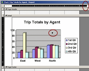
Remove Legend
-
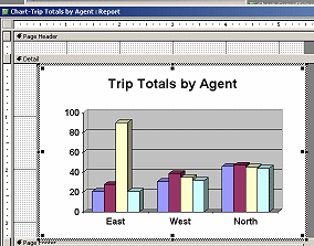 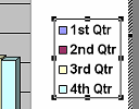 Click
on the Legend to select it. Click
on the Legend to select it.
Handles appear.
- Press the Delete key.
Bye-bye, Legend. The chart expands to take up the extra space.
With the sample data, this does not look like a good choice. Remember
that your chart only has one set of bars, so the legend is not really
needed.
Change Column Color
-
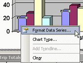 Right
click on the first column at the left of the chart. Right
click on the first column at the left of the chart.
- From the popup menu, select The Format Data Series dialog appears.
-
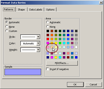 On
the Patterns tab, click on the light orange square in the fifth row from
the top. On
the Patterns tab, click on the light orange square in the fifth row from
the top.
- Click on OK.
In the chart, the whole series of columns changes color.
-
 Click
off the chart to get out of Microsoft Graph and back to Report
Design View. Click
off the chart to get out of Microsoft Graph and back to Report
Design View.
The menu and toolbar change back to Access.
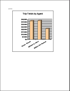
- Switch to Print Preview.
How do your changes look with the actual data?
The legend is gone and the columns are in light orange, like the first
series in the sample data. Success!
Change Fonts and Alignment
-
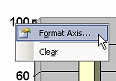 Switch to Report Design View and double-click
the chart to get back into Microsoft Graph. Switch to Report Design View and double-click
the chart to get back into Microsoft Graph.
- Right click on the vertical axis and from the popup menu
select .
The Format Axis dialog appears.
-
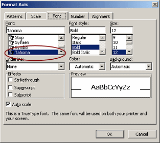 On
the Font tab, change the font to Tahoma. On
the Font tab, change the font to Tahoma.
- Click on the Number tab.
Since the values on the vertical axis are total prices, it makes sense
to format the labels as money.
-
 Change
the Category to Currency. Change
the Category to Currency.
- Reduce the Decimal places to 0.
- Click on OK.
You are back in Microsoft Graph with a new look for the vertical axis
labels.
-
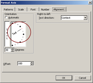 Right
click on the horizontal axis labels and from the popup menu
select . Right
click on the horizontal axis labels and from the popup menu
select .
The same dialog appears as before.
- On the Fonts tab, change the font to Tahoma.
- On the Alignment tab, drag the angle pointer up to 30
degrees.
- Click on OK.
The labels for the horizontal axis are now angled. It is not as clear
that the font has changed also.
-
 Click
off the chart to get out of Microsoft Graph and back to Report
Design View. Click
off the chart to get out of Microsoft Graph and back to Report
Design View.
The menu and toolbar change back to Access.
- Switch to Print Preview.
How do your changes look with the actual data? The labels across the
bottom of the chart look funny. They are angled, but that makes them
harder to read.
Why were you asked to angle the labels? A bit later you will edit the
chart and the new labels won't fit in the space unless they are angled.
Just thinking ahead a bit!
Changing the Source
Let's do something about those ID numbers now. Those AgentID numbers
are just not very helpful. We really need to see the agent's names. You
will have to change the source for the chart, using the Query Builder in
the Properties dialog.
-
 Switch to Report Design View. Switch to Report Design View.
- Click on the chart to select it. (Do not
double-click!)
- If necessary, open the Properties dialog by clicking
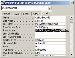
the Properties button.
The title bar for the Properties dialog shows that it is for an Unbound
Object Frame, name OLEUnbound0.
Numbering Objects: The default
names for objects include a number, starting with zero.
-
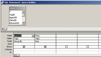 Click
in the property Row Source and then on the ellipsis button. Click
in the property Row Source and then on the ellipsis button.
The Query Builder opens and show the Trips table and the two fields that
you chose in the Chart Wizard.
- Click the Show Table button
 on the toolbar.
- Click on the Queries tab and select the query
QFullName-Staff.
- Click the Add button.
The query appears in the Query Builder.
- Close the Show Table dialog.
-
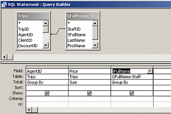 Drag
the field AgentID from the
Trips list and drop it on the
field StaffID in the list of fields for
QFullName-Staff. Drag
the field AgentID from the
Trips list and drop it on the
field StaffID in the list of fields for
QFullName-Staff.
A join line appears.
- Drag the field SFullName and
drop it in the grid.
-
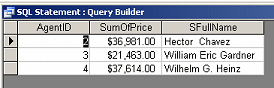 Run
the query by clicking the Run button Run
the query by clicking the Run button
 . .
The datasheet shows 3 values, one for each agent, and includes their
names. Hurrah! Now we have actual names to use.
-
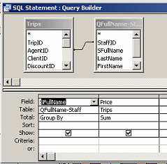 Switch
to the Query Design View. Switch
to the Query Design View.
- Delete the column AgentID.
- Drag the SFullName column to the
left of Price.
- Close the query by clicking the Close button,
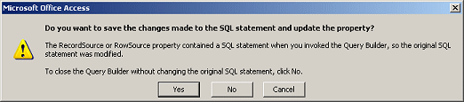
not by saving.
A message appears to ask whether you want to save the changes. You do!
-
 Click
on Yes. Click
on Yes.
You are back in Report Design View with no apparent change.
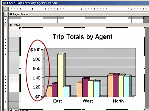
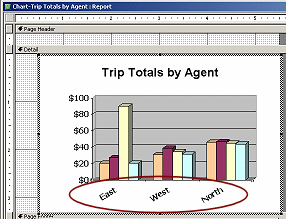
- Switch to Print Preview.
There is definitely a change!
Those agent names are in view and angled. That's what we wanted.
The columns have shifted location. That is because the order is based on
the names, not the ID numbers.
The vertical axis labels are crowded together. The names are taking up a lot of
space and the chart cannot resize itself larger. It must resize chart
parts within the dimensions of the chart. You need to help out.
- Switch to Report Design View.
- If necessary, click on the chart to select it. (Do not
double-click.)
- Move your mouse pointer over the handle in the middle of the bottom
edge of the chart.
The point should have the Resize Vertical shape
 ,
and not the shape for resizing the section ,
and not the shape for resizing the section
 . .
-
 Drag
down to make the chart taller. Drag
down to make the chart taller.
The Detail section automatically enlarges to hold the chart.
- Switch to Print Preview.
If your chart is not tall enough for easy reading, try again.
- Save the report. (Chart-Trip Totals by Agent)
-
 Add a
label containing your name to the Page Header at the left. Add a
label containing your name to the Page Header at the left.
 Print.
|