Forms & Reports:
Controls

Did you want: Working with Databases: Access 2007, 2010, 2013, 2016
|
Forms & Reports: |
Did you want: Working with Databases: Access 2007, 2010, 2013, 2016 | ||||
|
| ||||||
|
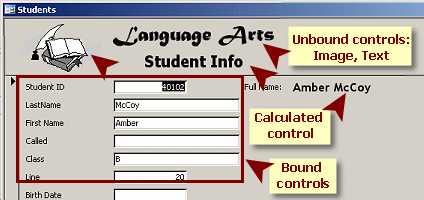
Whether you create your form with AutoForm, the Form Wizard, or manually, your form is made up of controls and their labels. ControlsA control is an object on a form or report or data access page that displays data or controls an action or is a decoration like a line or an image.
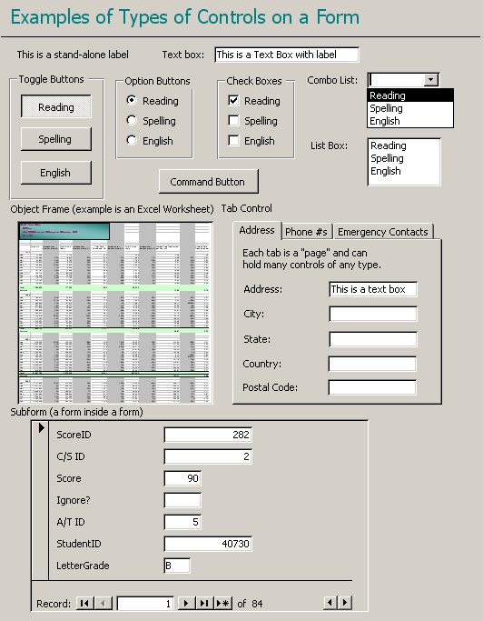
Examples of types of controls, based on
source Previously in Access Basics, you did just a little bit of formatting of the controls on an AutoForm:
In this lesson you will learn more about how to format controls and their labels. |
|
Project 4: Forms & Reports
| ||||||||||||
| |||||||||||||||
|
|
|
 |
Step-by-Step: Format a Control |
|
|
What you will learn: |
to select a control to format control's appearance to use Format Painter to resize control to move control to add Form Header |
Start with:
 ,
resource files,
worldtravel.mdb from the previous lesson
,
resource files,
worldtravel.mdb from the previous lesson
You will work with the form from the previous lesson, Form Wizard. While the Form Wizard created a formatted form quickly, you will soon see that it can take a lot of work to make the form truly useful.
 If
necessary, open the database
worldtravel.mdb and open the form
Staff, which you created in the
previous lesson.
If
necessary, open the database
worldtravel.mdb and open the form
Staff, which you created in the
previous lesson.
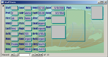
This form need some changes to make it useable! It's crowded and the text
boxes for data and their labels are not wide enough to show what is in
them.
 Switch to
Form Design View.
Switch to
Form Design View.
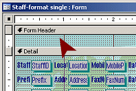
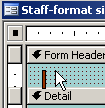
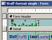
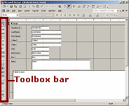
The design window shows a section bar for Form Header but apparently
there is nothing worth showing!
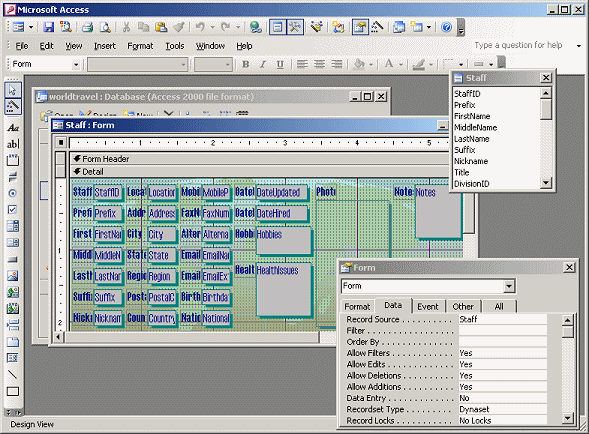
Form Design View with Field
List and Properties dialog
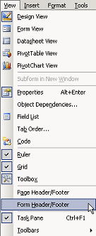
From the menu select | so we won't have to look at that unnecessary section bar.
Let's experiment a bit with the formatting for just one control. Once you have found a good combination you can apply it to other controls.
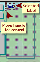 Select
label:
Select
label:
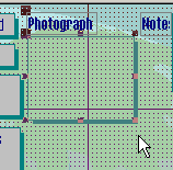
Click on the label Photo to select
it.
Handles appear at the corners and sides of the label.
The control below the label gets only a Move handle which overlaps the Resize handle for the label.
This makes the handles look a bit odd!
 Size
label to fit: Mouse
Size
label to fit: Mouse
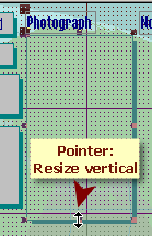
Move the mouse pointer over the Resize handle in the middle of the
right edge of the label. The pointer changes to the Resize Horizontal
shape
 .
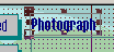
.
Double-click. The label resizes itself to fit the text. This label
was far too narrow! The text is Photograph, not just Photo.
 You cannot size controls with
data "to fit", only labels.
You cannot size controls with
data "to fit", only labels.
 Resize
control:
Resize
control:
Click on the control below the label to select it.
Move the mouse pointer over the Resize handle in the middle of the
bottom edge of the control. The pointer
changes to the Resize Vertical shape
 .
.
Drag upwards until the control is approximately square and then
release. The control is resized.
 Move
control separately:
Move
control separately:
If you resize other labels to fit, they will be underneath their
controls. How do you move a control out of the way??
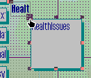
Click on the control HealthIssues to
select it.
Move your mouse pointer over the Move handle for the control
and drag it down below the bottom edge of the label.
 Size
label to fit: Menu
Size
label to fit: Menu
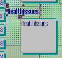
Select the label for the HealthIssues
control.
From the menu select ||
The label expands to fit the text. The selection does not change.
Edit label:
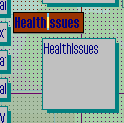 Click
in the label again, while it is still selected.
Click
in the label again, while it is still selected.
The label changes to Edit mode, with reverse color for the background.
Use the arrow keys as necessary to put the insertion point
between the h and I.
 Press
the spacebar, which creates two separate words.
Press
the spacebar, which creates two separate words.
Click out to remove the selection.
 From the menu
select Save As and save the form with a new name,
Staff-format single.
From the menu
select Save As and save the form with a new name,
Staff-format single.
Active form's title: The form that is open is now the copy that you just
saved, as the Title bar shows in Design View.
But, in Form View, the title bar still shows what is in the form's Caption property.
This can be
confusing!
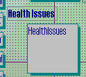
You can change the look of a control or of its label or of both. You have MANY choices for colors, fonts, font sizes, borders, and special effects. Rather than walk you through a bunch of choices, this time you get to play around with it yourself!
 Experiment: Using the Health Issues control and its label, experiment with various
choices from the toolbar and menus: font,
font size, color, special effect, border, background, etc. You are looking for combinations
that are more readable than what the Form Wizard created. You may need to
resize the label again. You may want to apply some changes to just the
label or to just the control.
Experiment: Using the Health Issues control and its label, experiment with various
choices from the toolbar and menus: font,
font size, color, special effect, border, background, etc. You are looking for combinations
that are more readable than what the Form Wizard created. You may need to
resize the label again. You may want to apply some changes to just the
label or to just the control.
Switch to Form View and navigate to different
records to see if your choices work well with the data.
Once you have
found a formatting combination that you like, save the form
(with the same name Staff-format single). Your
formatting will not likely be the same as another student's.
Switch
to Form Design View.
Select the Health Issues control, which you formatted to suit
yourself.
Click on the Format Painter button
 .
.
Click on the DivisionID
control at the bottom left of the form.
The control and its label now match the formatting of the one you
formatted, including the spacing between them.
Was this a good choice?
Moving the Health Issues control below its label was a good choice for
that control, but not necessarily what you want for other controls.
Make any needed changes to the
DivisionID control so that the control and its
label are readable. Consider whether or not you need to change the
spacing or formatting or size.
Select the DivisionID
control and click the Format Painter button again.
Click on the WorkPhone control, which is to the
right of DivisionID.
WorkPhone is now formatted like DivisionID.
 Evaluate:
How is your formatting working out?
Evaluate:
How is your formatting working out?
Save
your form again, with the same name,
Staff-format single.
It might be obvious to you today what your form is about. It helps new users to show a title. An unbound label is the type of control that you need.
 In
Form Design View, from the menu select |.
In
Form Design View, from the menu select |.
Two new sections appear in the design, above and below the Detail
section. You may want to resize the window for more work space.
Be careful to choose the Form
Header/Footer and not the Page Header/Footer, which will not show in Form
View, only when printing.
 Problem:
Form Header has no space
Problem:
Form Header has no space
If you got the section bar, that says "Form Header", but you do not
see any space below it, move your mouse over the dividing line between the
header and the detail sections until it changes to the Resize Vertical
shape
 . Drag down.
That will enlarge the section vertically.
. Drag down.
That will enlarge the section vertically.
On the Toolbox toolbar at the left of the form, click on the
Label button
 .
.
Move the mouse pointer over the blank Form
Header. The pointer changes to a new shape, Draw Label .
.
 Click
in the Form Header. A tiny label is created, ready for your typing.
Click
in the Form Header. A tiny label is created, ready for your typing.
You can also drag while the pointer is in
the Draw Label shape, to create a label of the size that you want. The size
of the label does not affect the size of the text.
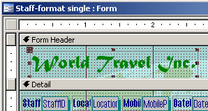
 Type
World Travel Inc. in the label.
Type
World Travel Inc. in the label.
The label automatically resizes as you type.
You cannot format the label while it is in Edit mode.
 Click
out to deselect the label.
Click
out to deselect the label.
 Click the label World Travel Inc. again to
select it.
Click the label World Travel Inc. again to
select it.
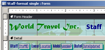
From the toolbar, format the label with:
Font: Matura MT Script Capitals
Font size: 20
Color: Green
The
label does not automatically resize to hold the text in its new size and
font! You can, of course, resize the
label "to fit".
 Move
your mouse pointer over one of the Resize handles and
double-click.
Move
your mouse pointer over one of the Resize handles and
double-click.
The label resizes. The Form Header section will probably resize also,
depending on exactly where your label was and how large it got. This is a helpful
feature!
If the header section did not resize, you may need to move the label up
to the second row of grid dots and enlarge the header to match the
illustration.
Similarly, create a label to the right of
World Travel Inc. and type into it the text
Staff.
Format the label Staff as :
Font: Tahoma
Font size: 16
Bold
 Resize
the new label to fit.
Resize
the new label to fit.
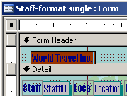
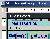
Move the labels so that they are positioned as in the illustration.
World Travel Inc. is at the left edge of the layout and centered vertically in the Form Header.
Staff is one grid row below top edge of the label World Travel Inc. and
there are 4 grid dots between the labels.
Switch to Form View to see how your form is
looking now.
Save
your form again, with the same name,
Staff-format single.
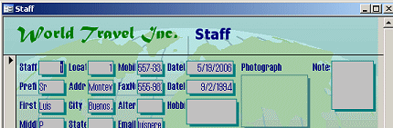
For now, we will leave this version of the Staff form as it is, even though you have two controls formatted differently from the others and some controls are not a good size for the data. Later you will have a way to format this form to match a new one.
This lesson illustrates the advantages and difficulties of picking a complex AutoFormat early in the design process. All the controls have the same look but they are not sized for the data that you expect and it requires a lot of moving around. The controls appear on the form in the order that they are listed in the Table Design, which may not match the order that will be easiest to use.
In the next lesson you will create a form manually so that you will have more control over the process.
|
|
~~ 1 Cor. 10:31 ...whatever you do, do it all for the glory of God. ~~ |
 Form Design View
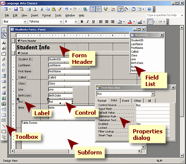 In the
Form Design View you can change the source, layout, and behavior of the
form. You do not change the records themselves in this view, so you are
free to play around with everything about the form.
In the
Form Design View you can change the source, layout, and behavior of the
form. You do not change the records themselves in this view, so you are
free to play around with everything about the form.  Properties
Dialog
Properties
Dialog
 :
:  What are the dots?
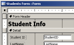
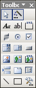
 Toolbar
for Controls = Toolbox
Toolbar
for Controls = Toolbox Click on each button in the image of the a bar below. A short explanation
about what the button does will appear in a separate window. You can
switch back and forth between that window and this one, or you can use
the Next button in the new window to go through all the buttons in order
for that toolbar.
Click on each button in the image of the a bar below. A short explanation
about what the button does will appear in a separate window. You can
switch back and forth between that window and this one, or you can use
the Next button in the new window to go through all the buttons in order
for that toolbar. 
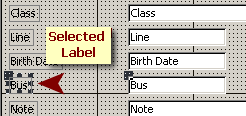
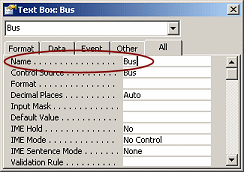
 The
default Name for a data control is the field that is its
Control Source, like
The
default Name for a data control is the field that is its
Control Source, like  The
default name for other controls is the control type plus a number,
like
The
default name for other controls is the control type plus a number,
like  Names of
Calculated Controls: If you are using an expression to calculate a
control, the name of the control must not be the same as a field that is
used in the expression. Doing so creates an error called a
Names of
Calculated Controls: If you are using an expression to calculate a
control, the name of the control must not be the same as a field that is
used in the expression. Doing so creates an error called a
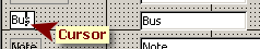
 To
select a control:
To
select a control:
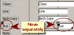 Move Separately
 :
:
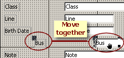 Move Together
 :
:  .
. .
.