
Jan's Working with Numbers
Excel Basics: Finish: Chart
Numbers do not make the same impact on the brain as a picture. A chart is not only prettier than a list of numbers, it actually is a better way to show you how the numbers compare.
 From
a pie chart you can immediate tell when certain items take up a big part of the
whole.
From
a pie chart you can immediate tell when certain items take up a big part of the
whole.
![]() From a
column chart you can
easily compare values to each other.
From a
column chart you can
easily compare values to each other.
![]() A line chart shows trends well over time.
A line chart shows trends well over time.
| |
Step-by-Step: Pie Chart |
|
| What you will learn: | to create a Pie Chart to change the chart type with context menu to change the chart type with ribbon button to select data source to modify a chart layout by adding data labels to move chart to its own sheet to add a text box to chart |
Start with: ![]() trips7-Lastname-Firstname.xlsx (saved in previous lesson)
trips7-Lastname-Firstname.xlsx (saved in previous lesson)
Create a Pie Chart
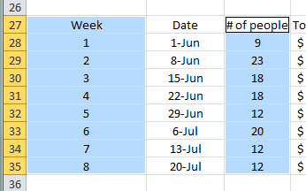
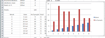
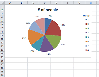
You are going to create a pie chart to show the number of people who were booked for trips during each of the eight weeks of the special sales promotion. This makes it easy to see how each week compares to the whole.
-
 Save As trips8-Lastname-Firstname.xlsx to your Class disk in the excel
project2 folder.
Save As trips8-Lastname-Firstname.xlsx to your Class disk in the excel
project2 folder.
-
 Select range A27:A35, hold down the CTRL key, and drag to
select range C27:C35.
Select range A27:A35, hold down the CTRL key, and drag to
select range C27:C35.
Both ranges are now selected. These are the row labels and the data cells for the number of people who bought trips each week during the special sales promotion.
- On the Insert tab in the Charts tab group, click on the Pie Chart button
 .
.
A list of types of pie charts opens.
-
Click on the first 2D chart type.
The chart appears in the middle of the page and the Chart Tools tabs appear in the ribbon.
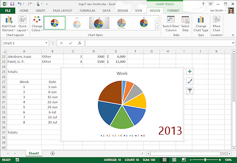
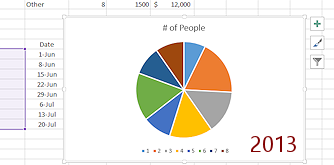
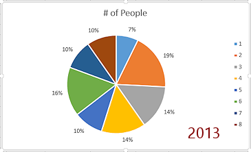
This chart does not look quite right, not counting the fact that Excel 2013 and 2016 have a somewhat different style for the pie and put the legend at the bottom instead of the right.
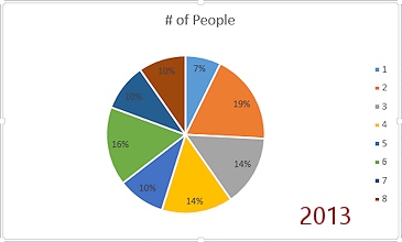
- Title is "Week" instead of "# of people".
- The legend looks OK, 1, 2, 3....
- Sizes of the pie wedges does not match column C values of 9,
23, 18, 18....
They increase in size starting from the top center.
What happened??
Excel has put the first column of data (1, 2, 3, ...) in the pie instead of the second column (9, 23, 18, etc.). The values in the first column are the row labels for the chart but they are numbers instead of the text that Excel expects for row labels. That's why the legend looked right. Whoops indeed!
A pie chart can only show one series of data, so Excel is showing just column as that series. If you had chosen a bar or column chart type, it would be clear immediately that there was a problem. You would see two sets of bars.
Let's look at the data in a column chart and then you will fix this problem!
 Text
for row labels: Avoid
using plain numbers as row labels or else format those numbers as
text.Order
of wedges in pie chart: The first item in the legend
of a pie chart always has its left edge at the top center. The next item is to its right, clockwise.
Text
for row labels: Avoid
using plain numbers as row labels or else format those numbers as
text.Order
of wedges in pie chart: The first item in the legend
of a pie chart always has its left edge at the top center. The next item is to its right, clockwise. - Save.
[trips8-Lastname-Firstname.xlsx]
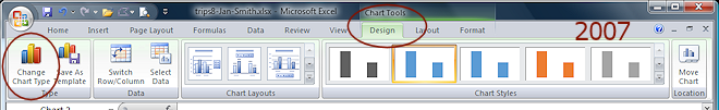
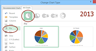
Change Chart Type
There are two ways to open the Change Chart Type dialog: the context menu for a chart and the Chart Tools: Design ribbon tab.
Context Menu:
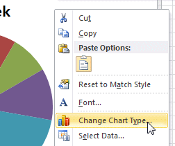 Right
click on a blank area of the chart.
Right
click on a blank area of the chart.
A context menu appears.-
Click on Change Chart Type.
The Change Chart Type dialog appears.
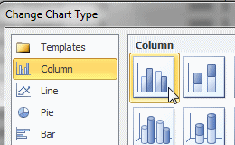
-
Click on Column and then on the first choice, 2D and then on OK.

 Excel 2013, 2016: The dialog
shows thumbnails of some common choices and uses the actual data. Nice feature.
Excel 2013, 2016: The dialog
shows thumbnails of some common choices and uses the actual data. Nice feature.
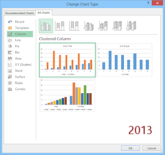
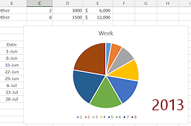
 The chart changes and shows two data series in different colors. That shows that there is a problem.
 The legend for the chart shows that Excel is using the data from column A, label 'Week', as the first series. Now we can clearly see what Excel is trying to do! Too bad Excel is only partly smart when it does so much to 'help'.
Ribbon tab:
-
If necessary, switch to the tab Chart Tools: Design.
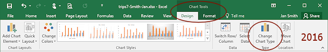
- Click on the button Change Chart Type.
The dialog Change Chart Type opens again.
-
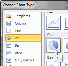 Click on Pie and then on the 2D flat style again.
 Excel 2013 and 2016 offer two choices. The one on the right is what we are trying to get! But don't pick it this time.
 -
Click on OK.
Your chart is back to the incorrect Pie Chart. -
Save.
[trips8-Lastname-Firstname.xlsx]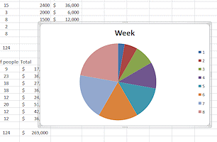
Select Data
Now you can fix the pie chart settings by changing the data source for the chart. Then it will show the correct pie slices.
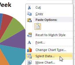 Right
click on a blank area of the chart.
Right
click on a blank area of the chart.
A context menu appears.-
Click on Select Data...
The Select Data Source dialog appears.
This dialog lets you manually edit or re-select the cells to use for a data series or for the labels.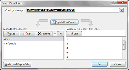 The dialog shows two series
on the left, named 'Week' and '# of people'.
'Week' is selected. There are no cells listed on the right to use
as labels for the chart. Instead there are just numbers.
The dialog shows two series
on the left, named 'Week' and '# of people'.
'Week' is selected. There are no cells listed on the right to use
as labels for the chart. Instead there are just numbers.
The text box at the top, Chart data range, shows which cells are in the chart.
 The sheet's name is separated from the range with an exclamation point, !,
which you can read as "bang".
The sheet's name is separated from the range with an exclamation point, !,
which you can read as "bang". - With Week selected on the left of the dialog, click the Remove button.
There is only one series left on the left, # of people. The data range at the top changes to match.
-
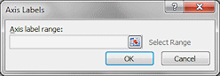 Click on the right on the Edit button for the
Horizontal (Category) Axis Labels.
Click on the right on the Edit button for the
Horizontal (Category) Axis Labels.
The dialog Axis Labels appears. You can type in cell references here or drag in the worksheet.
-
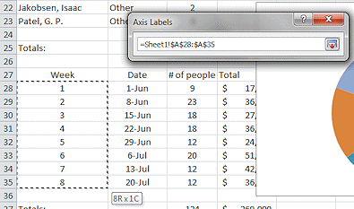 Drag
from A28 to A35.
Drag
from A28 to A35.
When you start to drag, the dialog gets smaller to help you see what you are doing (whether you needed the help this time or not). When you release the mouse, the dialog enlarges again. It shows the complete cell reference for these cells, including the sheet name.If a dialog of this type is in the way of where you need to click or drag, you can click the Collapse Dialog button
 at the right end of the text box. You can also drag it out of
the way by dragging its title bar.
at the right end of the text box. You can also drag it out of
the way by dragging its title bar. -
When you finish selecting the cells, click the Restore Dialog button
 .
.
- Click on OK.
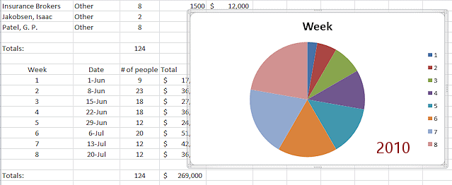
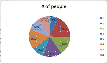
The chart automatically reflects your changes. It now correctly shows pie wedges for the number of people. These wedges are different sizes than in the first version. When checking your work, the details are important!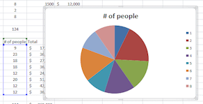
- Save.
[trips8-Lastname-Firstname.xlsx]
Now you are ready to format the chart.
Add Data Labels to Chart
You can change the formatting of just about every piece of this chart yourself. You can also add some features.
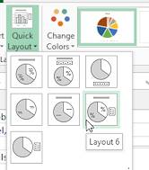
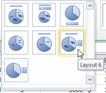 On
the Chart Tools: Design tab in the Chart Layouts tab group, open the Layouts palette
On
the Chart Tools: Design tab in the Chart Layouts tab group, open the Layouts palette-
Click on Layout 6.
This layout adds data labels for the percent each wedge is of the whole.
The pre-designed layouts are not all you can do!
-
Position Data labels:

 Excel 2007, 2010: On
the Chart Tools: Layouts tab in the Labels tab group, click on Data Labels.
Excel 2007, 2010: On
the Chart Tools: Layouts tab in the Labels tab group, click on Data Labels.
The menu of choices appears.
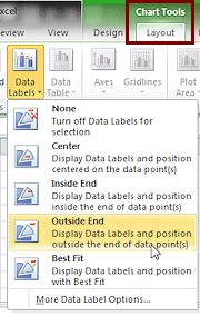
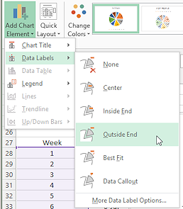 Excel 2013, 2016: On the Chart Tools: Layouts tab, click the button Add Chart Element.
A menu of choices appears.Hover over Data Labels.
A sub menu appears.
-
Click on Outside End.
This choice moves the percentages to outside the pie, beside their wedges.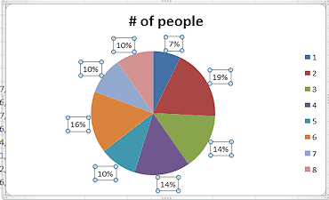
- Save.
[trips8-Lastname-Firstname.xlsx]
Move Chart to Sheet 2
A chart can appear on a sheet with data cells (which might be blank) or on a special Chart sheet alone. The Chart-type sheets fill the screen and the printed page with the chart. That is not always a good use of ink!
Excel 2007 and 2010 by default have 3 blank sheets in a new workbook. But Excel 2013and 2016 have only one sheet in a new blank document.
 Excel 2013, 2016: Beside the Sheet 1 tab at the bottom of the window, click the Add Sheet button
  .
.
The default name for the new sheet is Sheet2, unless you have already added other sheets. Even if you have deleted sheets, Excel keeps count for this session and increases the sheet number for the next sheet that you add.- If necessary, switch back to Sheet1 by clicking its tab and then click on the chart to select it.
 On
the Chart Tools: Design tab at the
right end of the ribbon in the Location tab group by itself, click on the button
On
the Chart Tools: Design tab at the
right end of the ribbon in the Location tab group by itself, click on the button
Move Chart .
.
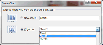
The Move Chart dialog opens.
You have choices!
 New sheet = only the chart shows
 Object in = existing sheet with data cells, which
may or may not be empty
Object in = existing sheet with data cells, which
may or may not be empty-
 Click the arrow to open
the list for the text box 'Object in'.
Click the arrow to open
the list for the text box 'Object in'. - Click on Sheet2.
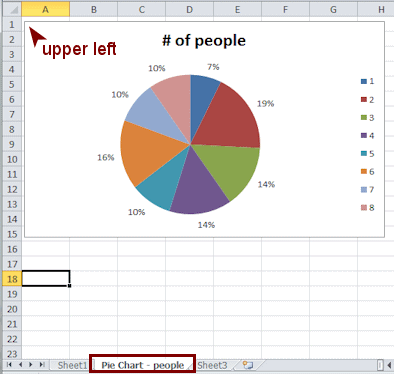
The chart moves over onto Sheet2 in the same location as it was on Sheet1. Surprise!
Depending on your window size, the chart may be out of sight! - If necessary, scroll to find the chart on Sheet2 and drag the chart by its border to the
upper left corner of the worksheet.
You may need to scroll to get there. - To change the sheet's name, double-click the tab for Sheet2 at the bottom of the window.
- Type Pie Chart - people and press the ENTER key.
- Click outside the chart to deselect it.
- Save.
[trips8-Lastname-Firstname.xlsx]
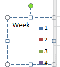
Add Text Box to Chart
The legend is not really clear at this point. What do those numbers mean? They are the weeks of the special offers promotion. You can add a title for the legend, with a little help from the ribbon.
- Select the chart on its new sheet.
- To add a text box to the chart:
Excel 2007, 2010: Switch to the ribbon tab Chart Tools:
Layout. In the Insert tab group, click on the button Text Box.
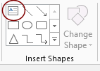 Excel 2013, 2016: On the ribbon tab Chart Tools:
Format in the Insert Shapes tab group, click on the Text Box shape in the palette of shapes.
Excel 2013, 2016: On the ribbon tab Chart Tools:
Format in the Insert Shapes tab group, click on the Text Box shape in the palette of shapes.
- Move the mouse pointer over the chart area above the legend.
Your mouse pointer has changed shape, , to a sword shape. This is the shape used to create a text box.
 -
 Click in the chart area above the legend.
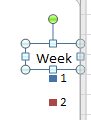
A text box appears. - Type Week.
This text is likely not centered well over your legend. You must resize and position the text box. - Drag the bottom right handle of the text box up and left until the box is just large enough to hold the text.
- Move the mouse pointer over the edge of the
text box until the pointer changes to the Move shape
 .
.
-
 Drag the box until it is centered over the legend.
 - If necessary, click on the legend to see its borders and drag the whole set left until the legend and its new label line up nicely.
- Save.
[trips8-Lastname-Firstname.xlsx]
|
|
| © 1997-2017 Jan Smith All Rights Reserved |
Site Map What's New |
Privacy Policy Terms of Service Copyright Acknowledgements |
~~ 1 Cor. 10:31 ...whatever you do, do it all for the glory of God. ~~
Last updated: March 22, 2017