
Jan's Working with Numbers
Format: Chart: Column Chart
Column charts are good at showing how the data points relate to each other, instead of to the whole. It is much easier to see how each column compares to the others than it is to compare the wedges of a pie chart to each other. Plus, a column chart can compare different series of data to each other. A pie chart can only show one data series.
Example: Sheet with two charts - single series and three series
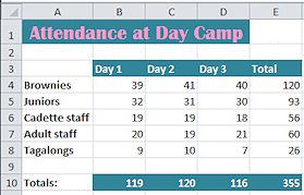
Original data
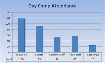
Chart of Total values. Compares totals to each other.
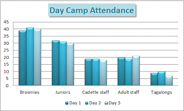
Chart of range B4:D8 grouped to compare values for Day 1, Day 2, Day 3
| |
Step-by-Step: Format Column Chart |
|
| What you will learn: | to change chart
type to format chart area with background texture to remove a chart part to edit chart title to format plot area (Excel 2013, 2016) to add and edit Axis Titles to format a column |
Start with: ![]() trips14-Lastname-Firstname.xlsx (saved in previous lesson)
trips14-Lastname-Firstname.xlsx (saved in previous lesson)
Change Chart Type
- Open trips14-Lastname-Firstname.xlsx from your Class disk in the excel project3 folder to Sheet2, if it is not still open.
-
 Save
As trips15-Lastname-Firstname.xlsx in the excel project3 folder on your Class disk.
Save
As trips15-Lastname-Firstname.xlsx in the excel project3 folder on your Class disk.
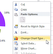 Right click in a blank area of the chart and choose Change Chart Type… from the
context menu.
Right click in a blank area of the chart and choose Change Chart Type… from the
context menu.
The Chart Type dialog opens.
-
Select Column, which is Excel's default chart type, and choose the first sub-type, Clustered Column.
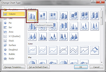
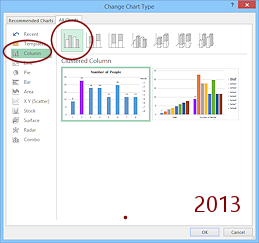
- Click OK.
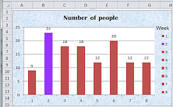
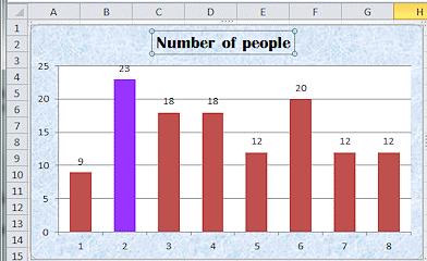
The chart is redrawn as a set of columns, using the default settings for this chart type.
The changes you made are kept, like the title text, the added text box 'Week', and the data point color.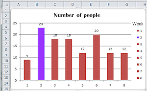
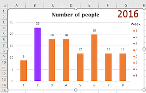
Data Point Labels: The data points are now labeled with the values they represent instead of the percentages that were in the pie chart.
Colors: What was the 19% wedge for Week 2 is now the purple column, labeled 23. It retained the color you assigned to its pie wedge. All the other wedges are converted to the default color, which is different in Excel 2013 and in Excel 2016.
The legend does not accomplish much since there is only one series of columns. You will get rid of it shortly.
You colored Week 2 differently because it had the highest number of tickets sold. That works well in a column chart, too.
- Save.
[trips15-Lastname-Firstname.xlsx]
Chart Area: Add Texture Background
The solid white background is good for many charts, but sometimes a gradient color, pattern, or image can make your chart more attractive. You do have to be careful that the chart remains easy to read.
-
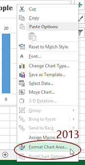
 Right click in a blank area around the chart and choose Format Chart Area… from the
context menu.
Right click in a blank area around the chart and choose Format Chart Area… from the
context menu.
The Format Chart Area dialog or pane opens to its first page, Fill, with the Automatic radio button selected. Problem: No 'Format Chart Area' command
You clicked on a chart part or in the Plot Area instead of a blank area around the chart.
Solution: Right click beside the title text box but not in that text box.
-
 Experiment: Fill
Try out other choices on the Fill page for fills. Live Preview works once you have made a selection.Try different solid colors, gradients, pictures, textures, and patterns.
You can even use your own pictures as a background.When you are ready to continue...
- Click on the radio button Picture or
texture fill.
More choices appear below the radio buttons. - Click on the Texture button to open its gallery.
-
Click on Blue tissue paper on the 4th row down.
For once the choices are the same in Excel 2007, 2010, 2013, and 2016.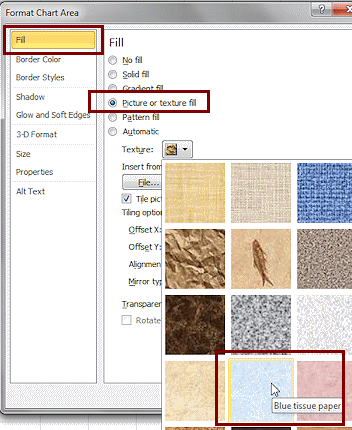
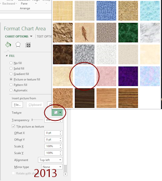
- Click on OK to close the dialog.
Your chart now shows a repeating blue textured image as a background. Much prettier than a plain white background! Of course a busy or dark image could make it hard to read your chart.
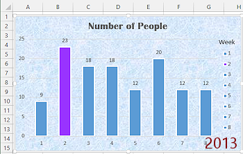
In Excel 2007 and 2010 the Plot Area still has a white background. But Excel 2013 and 2016 change the Plot Area background to None when you apply a Chart Area fill. This lets the fill show through the Plot Area, too. Do you like this effect? Does it make the chart harder to read?

 Excel 2013, 2016: Fix Plot Area fill
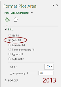 Click in the Plot Area (where the columns are) but not on a column or a grid line.
The formatting pane changes to Format Plot Area.-
Click on Solid fill.
If necessary, change the Color to White.
The chart gets its white background back for the Plot Area.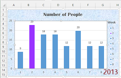
- Save.
[trips15-Lastname-Firstname.xlsx]
Remove Chart Part: Legend
There are two ways to remove a chart part - Select and press the DELETE key or use a ribbon menu of formatting options and choose None.
![]()
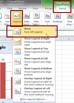
![]() Excel 2007, 2010: The
Chart Tools: Layout tab has buttons which open a menu of choices for
formatting various parts of a chart. 'None' is the first choice on all
of these buttons.
Excel 2007, 2010: The
Chart Tools: Layout tab has buttons which open a menu of choices for
formatting various parts of a chart. 'None' is the first choice on all
of these buttons.
![]()
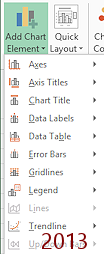
![]() Excel 2013, 2016: The ribbon tab Chart Tools: Design has a button Add Chart Element that opens a cascading menu of chart parts. Each chart element includes the choice 'None'.
Excel 2013, 2016: The ribbon tab Chart Tools: Design has a button Add Chart Element that opens a cascading menu of chart parts. Each chart element includes the choice 'None'.
- If necessary, select the chart again.
-
Experiment: Legend
-
View the choices for formatting the Legend:
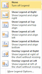

 Excel 2007, 2010: On the Chart Tools: Layout ribbon tab in the Labels tab group, click on the button Legend.
A list of positions for the legend appears.
The icons show a sample of the legend's position.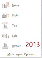 Excel 2013, 2016: On the ribbon tab Chart Tools: Design click the button Add Chart Element and hover over Legend to see the submenu.
- Try out each one.
- Click on More Legend Options... to open the Format Legend dialog.
- Try out various combinations of Fill, Borders, Effects, etc.
The current chart is not really helped by a legend at all since there is only one data series.
When you are ready to continue...
-
View the choices for formatting the Legend:
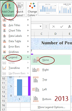
 Open the menu of formatting choices again for Legend and click on None.
The legend vanishes, but the text box Week that you added to label it remains.
Alternate method: Click the legend on the chart to select it and press DELETE.
-
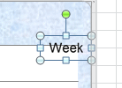 Click on the text box containing Week to select it.
 - Press the DELETE key.
The text box is gone and the plot area expands to take up the space.
-
 Save.
Save.
[trips15-Lastname-Firstname.xlsx] - Experiment: Other chart parts
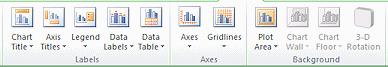
- Try out choices for formatting chart elements from the ribbon, like Labels, Axes, and Background. You can hide or reveal any of these parts of a chart. You can format many features, including background and lines.
- Use Undo to return your chart to its previous state or close without saving and reopen the document.
Edit Chart Title
You can edit the title and axis labels on a chart directly on the chart or in the Formula bar. Your typing will replace all of the text unless you select part of it first.
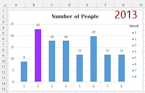
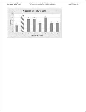
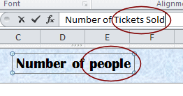 Click on title of the chart, 'Number of people'.
You want the text box selected, not the text. That way your typing will replace this text.The Formula bar is blank!
- Type Number of Tickets Sold,
which will show in the Formula Bar but the chart title does not change yet.
-
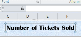 Press the ENTER key or click out of the chart.
Your typing will replace the existing text. The new text shows in the Formula Bar only at first. It shows in the text box after you press ENTER or click out.This text explains the chart better and has more appropriate capitalization.
Alternate method: Select the title's text box and then drag inside the text box to select the text. Your typing shows directly in the box.
This is a good method for editing text in place. If you have trouble with the selecting, you can edit in the Formula Bar.
- Save.
[trips15-Lastname-Firstname.xlsx]
Show Axis Titles
There
are many parts that can be on a chart, but they may not be on the
layout you picked to start with. The ribbon makes it easy to add the
ones you need.
![]()
![]() Excel 2007, 2010: Add Axis Titles
Excel 2007, 2010: Add Axis Titles
 With the chart selected, on
the Chart Tools: Layout ribbon tab in the Labels tab group, click on the button Axis Titles.
With the chart selected, on
the Chart Tools: Layout ribbon tab in the Labels tab group, click on the button Axis Titles.
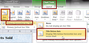
A menu appears with only two choices.- Hover over Primary Horizontal Axis Title to expand its submenu.
-
Click on Title Below
Axis.
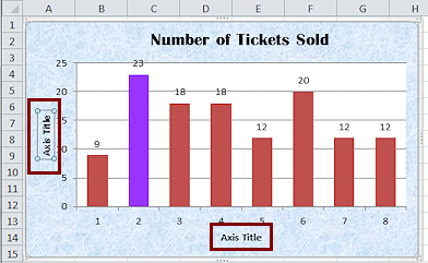
A new text box appears below the horizontal axis (the X-axis) and the chart resizes to make room for it.The text in the box is not helpful = Axis Title. You will change that shortly.
-
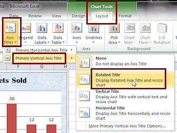 Click on the Axis Titles button again and hover over Primary Vertical Axis Title.
The menu that opens has more choices. Look carefully at the icons. Can you tell what each choice will do? -
Click on Rotated Title.
A new label appears to the left of the vertical axis (the Y-axis). Letters in the box run from the bottom to the top and are rotated compared to the rest of the chart.Again the chart resizes to make room for the axis title.
 Save.
Save.
[trips15-Lastname-Firstname.xlsx]
![]()
![]() Excel 2013, 2016: Add Axis Titles
Excel 2013, 2016: Add Axis Titles
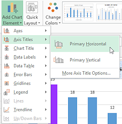 With the chart selected, on the ribbon tab Chart Tools: Design, click the Add Chart Element button.
- Hover over Axis Titles to expand the submenu.
-
Click on Primary Horizontal.
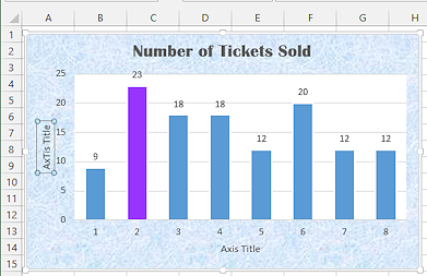
There are no formatting choices in the submenu.A text box appears centered under the horizontal axis (the X-axis). The default text is not very helpful - Axis Title.
Did you notice that the chart resized to make room for the axis title?
-
 Repeat the steps above but click on Primary Vertical instead.
A text box appears at the left with text rotated to be parallel to the vertical axis (the Y-axis).
Again the chart resized to make room for the additional text box.
The chart now has text boxes labeling both the horizontal and the vertical axis.
- Save.
[trips15-Lastname-Firstname.xlsx]
Edit Axis Titles
-
 Since
the title for the vertical axis, Y-axis, is already selected, type Tickets Sold and
press ENTER.
Since
the title for the vertical axis, Y-axis, is already selected, type Tickets Sold and
press ENTER.
Your typing shows in the Formula Bar until you press ENTER. Then it replaces 'Axis Title'. - Click the box for the title of the horizontal axis (X-axis) and type Week of Special Offer
- Click out of the text box to enter
your change.
The font size seems a bit small compared to the title and the size of the columns. - Click on the vertical axis title.
- On the Home tab, click on the Increase
Font Size button
 twice.
The plot area resizes to be narrower as the title takes up more space. - Click on the horizontal axis title and do the
same.
Again the plot area resizes. - Save.
[trips15-Lastname-Firstname.xlsx]
Edit Sheet Tab and Print
- Change the name of the sheet from 'Pie Chart'
to Tickets Sold Chart
Hint: Right click on sheet tab and choose Rename or double-click the tab and type.) - Deselect the chart by clicking off the chart.
-
Open Print Preview.
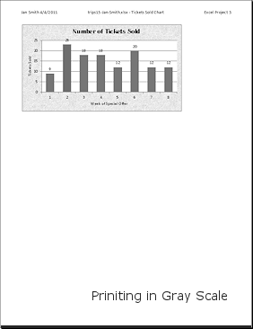
The preview is not in gray scale, even if the printer is set to print that way. This makes it hard to be sure what the printed page will look like.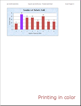
- Save.
[trips15-Lastname-Firstname.xlsx] -
 Print the sheet.
Printing in color is certainly prettier for this one.
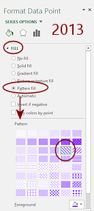
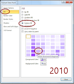
Excel 2010, 2013, 2016: Format Column: Pattern Fill
Are all of the bars the same shade of gray when printing in black and white? If not, is the difference clear?
You can make that purple column clearly different, even in black and white. It is a good idea to select your formatting with non-color printing in mind.
Excel 2010, 2013, and 2016 offer a particularly nice way to make the purple column different using a pattern fill.
 Return to
Normal view.
Return to
Normal view.- Click on the purple column.
The whole series of columns is selected. - Click on the purple column again.
Only the one column is now selected. - Right click on the purple column,
The Format Data Point dialog or pane opens. - Open the Fill page.
- Click on Pattern fill.
A palette of patterns in purple opens. - Select the pattern Wide diagonal downward.
This pattern will show clearly when printed in black and white. The patterns that have less white space will not print well with some printers - Click off the chart to deselect it.
 Save as trips15-pattern-Lastname-Firstname.xlsx to your excel project3 folder on your Class disk.
- Print the sheet in black and white.
You may need to open Printer Properties to change to black and white or gray scale printing. If so, don't forget to go back and change back to color. - Close the workbook.
|
|
| © 1997-2017 Jan Smith All Rights Reserved |
Site Map What's New |
Privacy Policy Terms of Service Copyright Acknowledgements |
~~ 1 Cor. 10:31 ...whatever you do, do it all for the glory of God. ~~
Last updated: March 22, 2017