
Jan's Working with Numbers
Format: Chart: Pie Chart
Pie charts are most useful when you want to show how the parts relate to the whole.
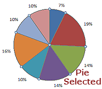
In the sample chart below, the sizes of the wedges give you a quick feel for the relative sizes - which pieces are biggest, which are smallest, which are about the same size, which parts make up the bulk of the whole. You get more exact numbers when you include the values or the percentages as part of the data label.
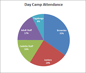
Sample Pie Chart
| |
Step-by-Step: Format Pie Chart |
|
| What you will learn: | to format chart title to explode a pie chart to explode one wedge of a pie chart to format data points |
Start with: ![]() trips13-Lastname-Firstname.xlsx (saved in previous lesson)
trips13-Lastname-Firstname.xlsx (saved in previous lesson)
Format Chart: Title
In the previous lesson Basics: Chart, you created a pie chart for the number of tickets sold for each week that World Travel Inc. had their special offers. Now you will learn how to make changes to the formatting.
Remember that the colors and borders are somewhat different between versions of Excel. Do not let that confuse you!
-
 Open trips13-Lastname-Firstname.xlsx from your Class disk in the excel project3 folder, if it is not
still open.
Open trips13-Lastname-Firstname.xlsx from your Class disk in the excel project3 folder, if it is not
still open.
-
 Save
As trips14-Lastname-Firstname.xlsx in the excel project3 folder on your Class disk.
Save
As trips14-Lastname-Firstname.xlsx in the excel project3 folder on your Class disk.
- Select the sheet named Pie Chart-People.
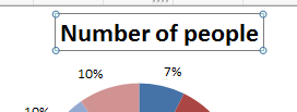
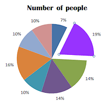
- Click on the chart's title to select it. When you changed the column label from # to Number, the chart was updated automatically. Cool feature!
-
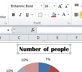 Use the Home ribbon tab to format the title as:
Font = Britannic Bold
Font Size = 16
not Bold
- Save.
[trips14-Lastname-Firstname.xlsx]
Format Chart: Explode Whole Pie or Part
-
 Click on the pie to select it but do not release the mouse button.
Be sure that there are sizing handles around the edges of the pie.
The pointer changes to the Move shape
-
Drag away from the center of the chart and release the mouse button.
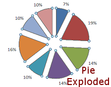
You have exploded the whole pie! Problem:
Only one wedge moves
Problem:
Only one wedge moves
You selected just one wedge by releasing the mouse button when trying to select the whole pie.
Solution: Click out of the chart and then click on the pie again but do not release the mouse button until after you drag. - Repeat your click and drag but drag back to the
center.
Your pie is glued back together.
- Click the pie to select it and then click on one of the wedges.
You should see handles ONLY on the corners of the wedge. - Drag out away from the pie center. Release the mouse.
That wedge slides out, leaving the other wedges snuggled up next to each other. You've "exploded" a single piece of the pie. This is a handy way to emphasize a special part of a pie chart. -
 Experiment: Explode and restore the pie and single wedges
Practice exploding the pie and a single wedge and restoring it until you can do both smoothly.
-
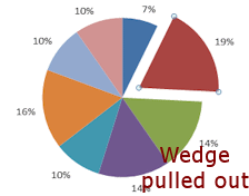 Click on the wedge labeled 19% to select it.
This is wedge with the largest percentage. - Drag the selected wedge up and to the right a little.
- Save.
[trips14-Lastname-Firstname.xlsx]
Format Chart: Data Point
Each value in the sheet that is a wedge in the pie is called a data point. A data point only looks like a point on a Line chart. You can change the formatting for all of the data points or for just selected ones.
![]() Printing in Gray Scale? Choose colors carefully!
Printing in Gray Scale? Choose colors carefully!
The color of gray that your printer produces may be the exact same for two very different colors. That can make your pie chart unreadable. For some reason, even if you have selected a printer that cannot do color, the print preview still shows color. You may have to experiment to get a good result. ![]()
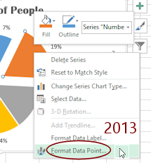 With the 19% wedge still selected, right click on the 19% wedge and choose Format Data Point... from the
context
menu.
With the 19% wedge still selected, right click on the 19% wedge and choose Format Data Point... from the
context
menu.

 Excel 2007, 2010: The Format Data Point dialog appears with several pages.
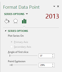

 Excel 2013, 2016: The Format Data Point pane appears with three pages, Fill and Line, Effects, and Series Options.
Choices made next apply only to what is selected - the data point.
-
Experiment: Formatting Data Point
Inspect all of the choices on all of the pages.Try out different colors and fill effects.
Live Preview shows what the choices in this dialog will do. If you open a second dialog, such as for Colors, Live Preview will not update until you are back in the Format Data Point dialog.Try some changes for Border Color and Border Styles.
When you are ready to continue, use Undo to return your pie to its original condition.
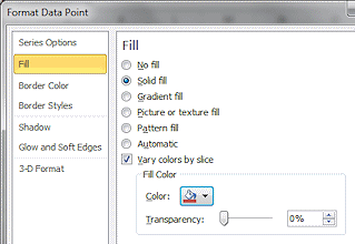
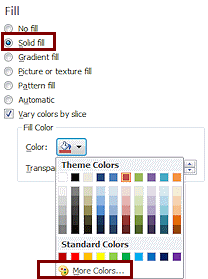 On
the Fill page of the dialog, click on Solid fill and then open the Fill Color
drop list for colors.
On
the Fill page of the dialog, click on Solid fill and then open the Fill Color
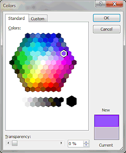
drop list for colors.- Click on More Colors...
The Colors dialog appears. - If necessary, click on the tab Standard Colors.
- Click on the purple hexagon on the 5th row, 2nd from the
right.
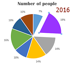
 Click on OK to close the Colors dialog and then on OK again to close the Format Data Point dialog.
Your wedge now is colored-
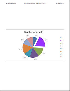
With the chart selected, open the Page Setup dialog to the Header/Footer tab.
There is nothing in the header even though you created one back in Project 2. The sheet header does not apply to just the chart. Surprise! -
Create a header like the one on the first sheet.
Your name and the date on the left, the workbook name and sheet name in the middle, and Excel Project 3 on the right.
-
 Open the Print Preview.
The chart is centered horizontally and vertically on the page.
-
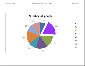 Change the page orientation to Landscape.
The chart is sized to fill the page because the chart was selected. Excel 2007: Click on the Page Setup button and select
Landscape on the Page tab. Click on OK to close the
Page Setup dialog.
Excel 2010, 2013, 2016: Click the Orientation button to the left of
the preview and then click on Landscape. -
Return to Normal view.
-
 Deselect the chart by clicking on a cell somewhere else on the sheet.
-
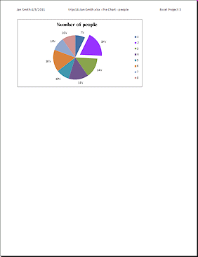
Open Print Preview again.
This time the chart covers only a part of the page. This page will print much faster and will use less ink!You need to edit the header at bit.
-
Open Page Setup to the Header/Footer tab.
Change the right side to 'Excel Project 3'.
This page should already have your name and the date on the left, the workbook name and sheet name in the middle. - Close Page Setup.
-
Save.
[trips14-Lastname-Firstname.xlsx]
-
 Print the chart sheet.
|
|
| © 1997-2017 Jan Smith All Rights Reserved |
Site Map What's New |
Privacy Policy Terms of Service Copyright Acknowledgements |
~~ 1 Cor. 10:31 ...whatever you do, do it all for the glory of God. ~~
Last updated: March 22, 2017