
Jan's Working with Presentations
Advanced: Tables & Charts: Chart Design
Once you have a chart on your slide, you have many options for managing exactly how the chart looks. There are two or three context tabs for charts, depending on the version of PowerPoint.
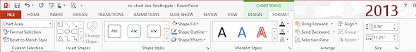
Chart Tools: Design
Formatting the chart as a whole - add parts, quick layouts, colors, styles, chart type. The chart styles are very different in PowerPoint 2013 and 2016.
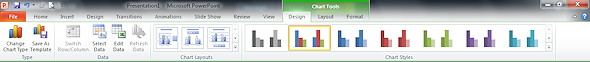
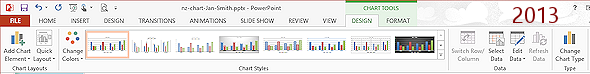
Chart Tools: Layout
Appears in PowerPoint 2007, 2010 but not 2013 and 2016. Add chart part or change part options.
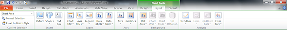
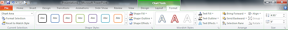
Chart Tools: Format
Change appearance of selected chart part - shape, fill, outline, WordArt, stacking order, alignment, grouping, rotation, size.
| |
Step-by-Step: Chart Design |
|
| What you will learn: | to change chart type to use Quick Chart Layouts to choose chart parts and their options to change chart style and colors to format the chart to select chart part to format chart parts separately to add a shape to format text on the chart to resize and reposition the chart on the slide |
Start with: ![]() , nz-chart-Lastname-Firstname.pptx
, nz-chart-Lastname-Firstname.pptx
You actually have a lot of control over how your chart looks. The Quick Chart Layout button provides pre-designed layouts that are commonly used. But you can change the fonts, color, background, and layout yourself, piece by piece.
Changes to the chart layout may make the plot area resize. The overall chart area remains the same size unless you resize it yourself.
![]() Save As to your Class
disk as nz-chartdesign-Lastname-Firstname.pptx in the powerpoint project3 folder on your
Class disk.
Save As to your Class
disk as nz-chartdesign-Lastname-Firstname.pptx in the powerpoint project3 folder on your
Class disk.
 Experiment:
Change Chart Type
Experiment:
Change Chart Type
You can change the chart type at any time.
![]() Always save
your work before experimenting... just in case you cannot
get all the way back with Undo!
Always save
your work before experimenting... just in case you cannot
get all the way back with Undo!
- If necessary, click the chart on the slide to select it.
The chart shows its resizing handles. -
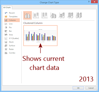
On the Chart Tools: Design ribbon tab, click the Change Chart Type button to open the dialog.


The dialog looks like the Insert Chart dialog. In PowerPoint 2013 the thumbnail uses the current data instead of sample data.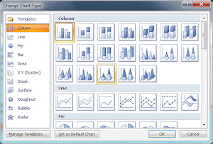
- Try out each of the types.
-
Return to the original type, Clustered Column.
 Evaluate: Which chart
types look useful for this data?
Evaluate: Which chart
types look useful for this data?
Experiment:
Quick Chart Layouts
-
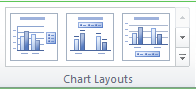
 With the chart still selected, on the Chart Tools:
Design ribbon tab, click the Quick Layout button or the More button for the gallery of Quick Layouts.
With the chart still selected, on the Chart Tools:
Design ribbon tab, click the Quick Layout button or the More button for the gallery of Quick Layouts.In PowerPoint 2007 and 2010, this control shrinks to a button when the window is small. But when the window is large enough, the ribbon shows a row of three thumbnails of layouts for the current chart type. In PowerPoint 2013 and 2016, this control is always a button.
-
 Which is the current layout? Unhappily, the current layout is not highlighted or marked in any way.
In PowerPoint 2007 and 2010, Live Preview does not work with this feature but it does for PowerPoint 2013 and 2016.
- Click on (2007, 2010) or hover over (2013, 2016) one of the Quick Chart Layouts.
Look carefully at what chart parts show up and which are hidden. - Repeat for each layout.
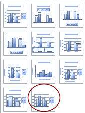
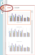
- Apply the last layout, Layout 11, which has a legend at the right and shows just a few grid lines. It does not put a title on the chart itself.
This was the original layout for PowerPoint 2007 and 2010, but was not for PowerPoint 2013 and 2016.  Save.
Save.
[nz-chartdesign-Lastname-Firstname.pptx]
![]() Evaluate: Are the Quick Layouts helpful?
Evaluate: Are the Quick Layouts helpful?
Do they add the parts that you would want to see on most charts?
Experiment: Add/Remove Chart Parts
Ribbon: Add Chart Element button
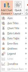 On the ribbon tab Chart Tools: Design, click the Add Chart Element button to open a list of potential parts for your chart.
- Hover over each of the items to see the further options.
- Try out some of the options. Some options do not apply to a column chart. Live Preview will show the effect in PowerPoint 2013 and 2016.
- When you are ready to continue, if necessary, reapply the Quick Layout 11.
![]()
![]() PowerPoint 2007, 2010:
PowerPoint 2007, 2010:
Layout
Ribbon: Buttons for chart parts
Buttons are grayed out for parts that do not apply to the current chart type. There are no buttons for selecting a data series (like the columns, pie wedges, or lines that show us the data values).
 Click on each of the buttons for chart parts to see what options are available.
- Try some of the options.
-
When you are ready to continue, if necessary,
reapply Quick Layout 11.
![]() Evaluate: How does this method compare to using the Add Chart Element list?
Do they do the same things? Do you prefer one method over the other?
Evaluate: How does this method compare to using the Add Chart Element list?
Do they do the same things? Do you prefer one method over the other?

 PowerPoint 2013, 2016: Add/Remove Parts Fly-out List
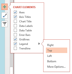 Click the Chart Elements button
  that appears at the right of the chart when the chart is selected. This button opens a fly-out list of possible chart parts. The list stays open after you make a choice!
- Check and uncheck elements and see the effect on your chart immediately.
- Hover over an item in the list and click on the arrow that appears at the right to see further options.
- Try out some of the options for various chart parts.
- Select More Options... to see if there are other interesting options.
-
When you are ready to continue, if necessary, reapply the Quick Layout 11.
![]() Evaluate: How does the fly-out list compare to the drop list from the Add Chart Elements button? Do they do the same things? Do you prefer one method over the other?
Evaluate: How does the fly-out list compare to the drop list from the Add Chart Elements button? Do they do the same things? Do you prefer one method over the other?
Experiment: Change Chart Style and Colors
The available styles are different in PowerPoint 2013 and 2016.
- With the chart still selected, on the Chart Tools:
Design ribbon tab, open the palette of Chart Styles.
Live Preview does not work for this feature in PowerPoint 2007 and 2010 but does for 2013.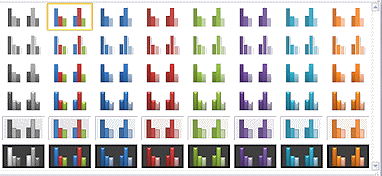

 PowerPoint 2007, 2010: Styles vary in colors and plot area background.
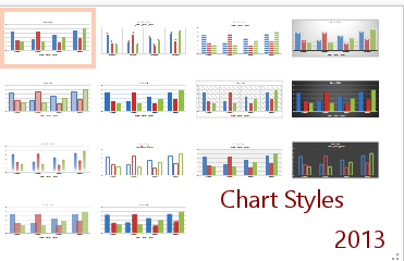 PowerPoint 2013, 2016: Styles vary in formatting of columns and plot area but are quite different from the styles available in PowerPoint 2007 and 2010.
-
Try out various styles.
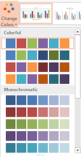 PowerPoint 2013, 2016: Try the various color schemes in the Change Colors button. Live Preview works for this palette.
 Alternate method: Use the Chart Style/Color button
  that appears at the right of a selected chart. It has two pages, STYLE and COLOR.
![]() Evaluate: Do you like using shades of one color for the chart columns or
multiple colors?
Evaluate: Do you like using shades of one color for the chart columns or
multiple colors?
Do you like flat columns or an effect?
Do you like
the plot area being shaded or not?
Format Chart
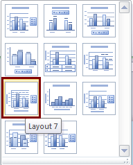 Change the chart to Quick Layout #7.
This adds two text boxes to use as a title for each axis.
This layout include more grid lines - major and minor horizontal lines.
- Delete the title text box for the horizontal axis with the method of your choice.
- Select the title text box for the vertical axis and replace the text with Days.
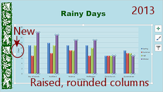
- Format Series Columns:
 PowerPoint 2007, 2010:
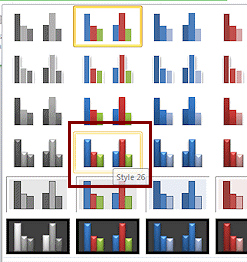
Apply Chart Style #26.
The columns get a raised and rounded look.
 PowerPoint 2013, 2016:
Does not have the same styles as previous versions.-
Click on one of the columns in the chart.
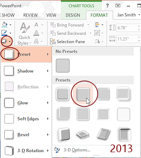
All of the columns in that series are selected and show handles. - On the Chart Tools: Format tab, in the Shape Styles tab group, open the Shape Effects palette.
- In the Presets section, click on the second effect.
The columns get a raised and rounded look. - Repeat for each of the other series.
-
Click on one of the columns in the chart.
-
Save.
[nz-chartdesign-Lastname-Firstname.pptx]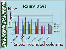
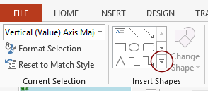
Experiment: Select Chart or Part of a
Chart
Before you can format a part of a chart, you have to select what you want to format. Clicking to select can be a bit frustrating until you understand how it works.
- Select by clicking:
Hover over areas in the chart to find the following and click to select...- whole chart, called the chart area
- legend
- grid lines
- plot area
- one series of columns
- one column only
(Select a series and then click on a single column) - horizontal (category) axis
- vertical (value) axis
-
Select from Ribbon:
- Switch to the Chart Tools:
Format tab.
-
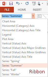
 At the far left in the Current Selection tab group, open the drop list of the parts of the current chart.
If you change the chart's type or layout, the drop list will change to match what is currently showing.
- Click one to see what it
selects on your chart.
Sadly, the list closes once you click on an item.
- Switch to the Chart Tools:
Format tab.
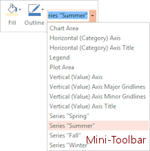 Select from Context Menu:
- Right click on the chart and open the drop list in the Mini-Toolbar.
This is the same list as you got from the ribbon button. - Click on an item to select a different chart part.
- Right click on the chart and open the drop list in the Mini-Toolbar.
- Use the method of your choice to select each item in the drop list.
The only part you cannot select with a drop list is a single data point, like a single column or pie wedge. Why would you want to? To format a special value differently, like a maximum or minimum.
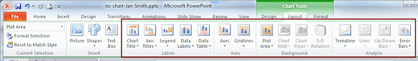
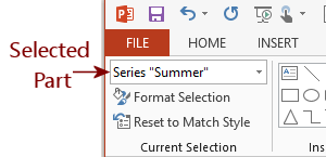
Format Chart with Chart Tools: Format
The ribbon tab for Chart Tools: Format has controls for changing the colors, borders, etc. for selected chart parts. If you insert an object yourself, you must use the context ribbon tab for that kind of object.
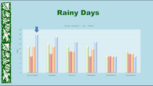
You are going to make a number of changes to the chart, including changing the columns to use pastel colors. Why? Because I think they look nice! And, because you need the practice with formatting the chart.
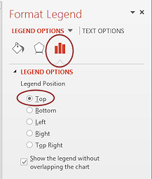
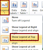
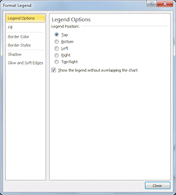 Select the Legend in the drop list of chart parts.
- On the Chart Tools: Format ribbon tab, click the Format Selection button.
The Format Legend dialog or pane appears. -
Change the Position to
Top.
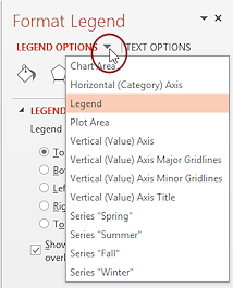 PowerPoint 2013, 2016: The Format pane also has a drop list of chart parts.
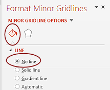 Select Vertical (Value) Axis - Minor Grid lines and format the grid lines to No Line.
This hides the minor grid lines
-
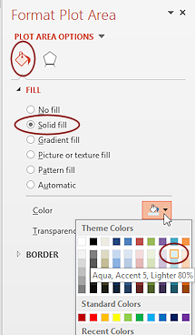 Format the Plot
Area-
Format the Plot
Area-
Shape Fill = Aqua, Accent 5, Lighter 80%.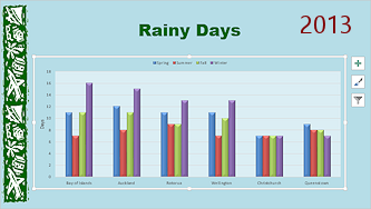
- Format the Series "Spring" (dark blue columns) -
Shape Fill = the theme color Olive Green, Accent 3, Lighter 60%.
- Format the Series "Summer" -
Shape Fill = Red, Accent 2, Lighter 40%.
- Format the Series "Fall" -
Shape Fill = Orange, Accent 6, Lighter 40%.
 Format the Series "Winter" -
Shape Fill = Blue, Accent 1, Lighter 60%.-
Save.
[nz-chartdesign-Lastname-Firstname.pptx]
Add Shape
You can add your own text boxes, pictures, or AutoShapes to the chart or slide. Actually, the chart won't react to anything you add. The new objects will not be on the same layer as the chart.
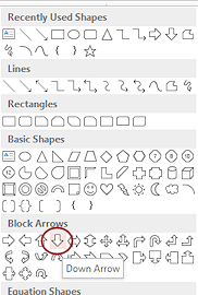
 On the Chart Tools: Format ribbon tab, click the More button for the Shapes palette.
- Click on the Down Arrow.
The mouse pointer changes to the Precision Shape.
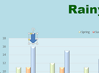 Drag on the slide above the tallest column to create a small arrow.
The tallest column shows that the area Bay of Islands has the most rainy days of the year and that this happens in winter.
-
Save.
[nz-chartdesign-Lastname-Firstname.pptx]
Evaluate and Edit
-
 View the slide full screen. If you can, project the slide onto a screen.Evaluate: How
easy is it to read? Is there too much data? Could you accomplish the same
purpose with fewer columns or by using multiple charts?
View the slide full screen. If you can, project the slide onto a screen.Evaluate: How
easy is it to read? Is there too much data? Could you accomplish the same
purpose with fewer columns or by using multiple charts?
Do you like the color scheme for the columns? Does it go well with the slide background?
Do the softer colors make the chart hard to read? What would you do differently?The text for the legend, axis title, and horizontal axis are probably too small. The chart could be a bit larger to fit better on the slide.
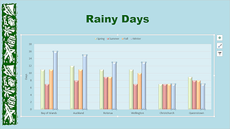
- Select the Legend.
- On the Home ribbon tab, change the Font Size to 18.
- Select the vertical Axis label, Days, and change the Font Size to 18.
- Select the horizontal axis labels (the place names) and change the Font Size to 20.
- Resize the chart larger to leave less empty space and to make the chart text easier to read.
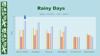
Chart enlarged on slide; text on chart enlarged
- If necessary, reposition the arrow over the tallest column.
- Save.
[nz-chartdesign-Lastname-Firstname.pptx]
|
|
| © 1997-2017 Jan Smith All Rights Reserved |
Site Map What's New |
Privacy Policy Terms of Service Copyright Acknowledgements |
~~ 1 Cor. 10:31 ...whatever you do, do it all for the glory of God. ~~
Last updated: March 22, 2017
What you get when you _____ a chart part:
This is how you can select one bar in a series or one legend item instead of the whole legend area.