
Jan's Working with Presentations
Advanced: Tables & Charts: Table Design
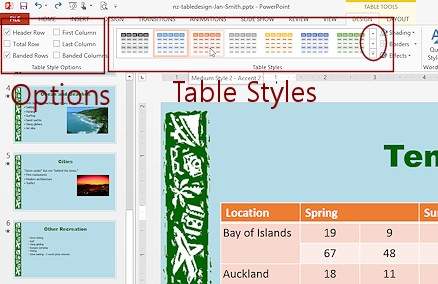
The Table Tools: Design ribbon tab offers some helpful shortcuts to formatting for a table.
Ribbon: Table Tools: Design
![]()
The Table Tools: Design ribbon tab is mostly about how a table is formatted, either with a table style or manually by formatting the backgrounds and borders. The check boxes at the left end do not add new rows or columns but do trigger formatting changes in some of the table styles.
You can also manually change the background shading, borders, and effects for the table.
This ribbon tab includes the Draw Table button which was described in the previous lesson and the Eraser button, which lets you erase selected borders.
Table Style
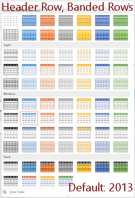
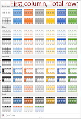
A table style can include formatting for cell background, borders, and even some text styling like Bold. The thumbnails in the Table Styles gallery may change, depending on which check boxes are checked in the Table Style Options tab group. For example, if the Header Row option is checked, most table styles (but not all!) apply a different color to the first row of the table than what the rest of the table uses.
Examples:
| |
Step-by-Step: Table Design |
|
| What you will learn: | to apply a table style to add a column to insert a symbol (for degree) to distribute columns equally to align cell contents to insert and format text to format table |
Start with: ![]() , nz-table-Lastname-Firstname.pptx from previous lesson
, nz-table-Lastname-Firstname.pptx from previous lesson
Apply Table Style
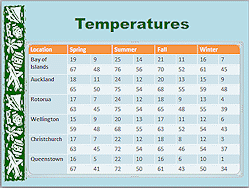
The default table design uses a blue color for the background and white text in the first row. There are other design choices. Lots of them!! They are in the gallery of Table Styles.
 If necessary, open nz-table-Lastname-Firstname.pptx from your Class disk in the powerpoint project3 folder.
- Save
As nz-tabledesign-Lastname-Firstname.pptx to the same folder.
-
 Experiment: Table Styles
- Click in the table to be sure it is selected.
On the Table Tools: Design ribbon tab, hover over various Table Styles.
Live Preview changes the table to match and a ScreenTip shows the name of the style.
 Problem: Table Styles
palette hides the slide so I cannot see Live Preview
Problem: Table Styles
palette hides the slide so I cannot see Live Preview
Solution 1: Maximize the PowerPoint window and reduce the Zoom for the slide until you can see enough of the slide for Live Preview.
Solution 2: Instead of expanding the whole gallery of styles, use the gallery on the ribbon and rotate to a different row with the arrow buttons at the right end of the gallery.
- Change the choices in the Table Style Options tab group.
The palette changes! Most styles do something different for the options choices, even if it is just adding Bold.
When you are ready to continue...
-
 On the Table
Tools: Design ribbon tab in the Table Style
Options tab group, check the box for First Column.
On the Table
Tools: Design ribbon tab in the Table Style
Options tab group, check the box for First Column.
Header Row and Banded Rows were already checked.The table changes immediately when you check or uncheck a box if the current table style includes formatting for the new option.
Select Table Style:Dark Style 2 - Accent 5/Accent 6

Problem: Missing this table style
If you do not have a table style with this name, you did not apply the Color theme named Office 2007 - 2010.
Solution: On the Design ribbon tab, click the More button for Variations and then open the Colors menu. Click on Office 2007 - 2010. No custom table styles: You can change all of the formatting of the table manually, but you cannot save your changes as a table style. So sad!
 Work-around 1: Theme
Change the theme or create a custom theme for the whole presentation. Then the colors in the table would be based on the new theme colors. The new theme will apply to ALL slides, so you must be careful with your choices.Work-around 2: Slide Master
From a presentation with the theme colors that you want, copy its Slide Master and paste to the current Master. Apply the appropriate layout to the slide with the table. Now the slide and Table Styles will use the colors from the new Slide Master.
- Save.
[nz-tabledesign-Lastname-Firstname.pptx]
Add Column After Formatting
It is still not clear on the slide what those numbers are supposed to mean. You need more labels. It will be a tight squeeze, but it can be done!
-
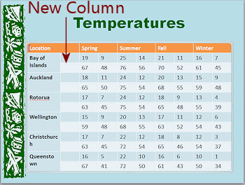 Click in the first cell under Spring, with the number 19 in it.
-
On the Table Tools: Layout ribbon tab, click on the button Insert Left
 .
.The new column inherits the formatting of the column to the right.
The Location column may not be wide enough... again!
- Merge the Location cell with the new cell in the top row.
- Save.
[[nz-tabledesign-Lastname-Firstname.pptx]
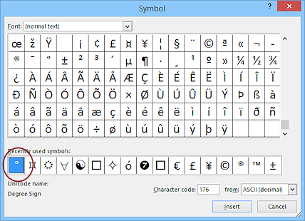
Insert Symbol
You need to add Co and Fo to label the rows of temperatures.
The symbol for degrees, a raised circle like º, is not on the normal English keyboard. You could use a superscript zero or a lower case letter o. But this time you will insert the actual symbol using the Symbol dialog.
-
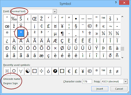 In the 2nd cell of the new column, first type a capital C .
 - On the Insert ribbon tab, click on the Symbol button
 .
.
- If necessary, change the Font to (normal text), which is the first item in the list of fonts.
- Click on the small raised circle in the middle of the
palette of characters. The name of the symbol appears at the bottom left of
the dialog when you select it.
Your dialog window may be a different size, which will make the characters fall on different rows.
- Click the Insert button in the dialog.
Nothing seems to happen except that the new character appears in the row of "Recently used symbols". That is a feature, not a problem!
The dialog remains open in case you want to insert more characters.
-
 Click the Close button in the dialog. Now you can see the degree symbol next
to your C.
Click the Close button in the dialog. Now you can see the degree symbol next
to your C.
-
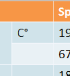
 In the next cell down type F .
- Open the Symbol dialog again and, in the row of Recently used symbols, click on the degree sign to select it.
- Click on Insert and then on Close.
-
 Drag to select the two cells you just typed in.
-
On the Home ribbon tab, click the Copy button
 .
. Alternate method: Use the key combo CTRL + C.
-
Click in the next blank cell in the column, beside "Auckland", and click the Paste button.
The data you copied is pasted into the next two cells. Alternate method: Use the key combo CTRL + V.
-
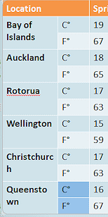 Repeat to paste your Cº and Fº into the remaining blank cells in the column.
Now your temperature data is clearly labeled but the wrapping issues are back!
- Save.
[[nz-tabledesign-Lastname-Firstname.pptx]
Distribute Columns Equally
You may need to adjust and readjust the table size and column widths to get the data into good order and the temperature columns equal in width. Such an aggravation! Fixing one problem creates other problems. That's life with tables!
 If necessary, drag the boundary between Columns 1 and 2 to the right until the Locations are
on one line, except for Bay of Islands.
If necessary, drag the boundary between Columns 1 and 2 to the right until the Locations are
on one line, except for Bay of Islands.
Be sure that Cº and Fº on one line.- Just to be sure, select the other data cells in a row and use the
Distribute Columns button again.
-
Save.
[[nz-tabledesign-Lastname-Firstname.pptx]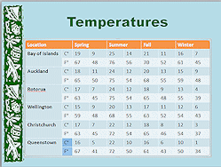
![]() Missing
Special Character when you show presentation: If
you insert a special character like the degree sign and the computer that is running your
presentation does not have the font that you used, you may see a
completely different character or nothing at all.
Missing
Special Character when you show presentation: If
you insert a special character like the degree sign and the computer that is running your
presentation does not have the font that you used, you may see a
completely different character or nothing at all.
Not all fonts include all of the
characters that other fonts have. This is a good reason to use common fonts in
your presentations.
Insert and Format Text
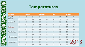
This slide still does not tell the viewer that these temperatures are maximums and minimums. There's no more room in the table! You can put this information in the Title, but you will have to format carefully to make it all fit. If AutoFit is turned on, PowerPoint will resize the text to make it fit the placeholder.
-
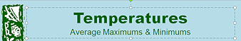
 Click in the Title at the end of the word Temperatures and press the ENTER key.

 PowerPoint 2007, 2010: The font size of the title drops one size to 40. A new line appears that will
use the same formatting. Too tall for a subtitle!
PowerPoint 2007, 2010: The font size of the title drops one size to 40. A new line appears that will
use the same formatting. Too tall for a subtitle!
 PowerPoint 2013, 2016: The original title remains the same.
The AutoFit icon
 will appear at the left of the Title placeholder IF AutoFit made a change.
 - With no text selected, change the font size to 24.
This size applies to new text since no text is selected.
The AutoFit icon vanished when you made changes.
- Change the font to Arial.
This font applies only to new text.
-
 Watch the placeholder
carefully as you start to type the new subtitle Average Maximums &
Minimums
Watch the placeholder
carefully as you start to type the new subtitle Average Maximums &
Minimums If AutoFit resized the text before (which it does in PowerPoint 2007 and 2010), the size of the main title changed back as soon as you started to type! Sweet!
- Save.
[[nz-tabledesign-Lastname-Firstname.pptx]
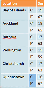
Format Table
Depending on exactly how you insert rows and columns and what errors you made along the way, you may have some cell borders that are formatted like the outside table borders. You can reset all of the borders easily.
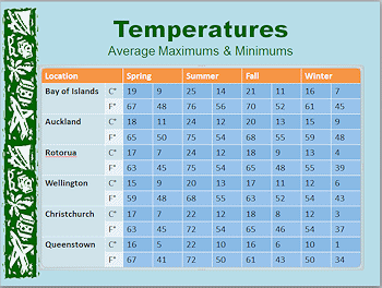
All those numbers would be easier to read if they were aligned to the right. It's the way we expect numbers to be written.
 If necessary, with
the cursor in the table somewhere, reapply the Table
Style, Dark 2 - Accent 5/Accent 6.
If necessary, with
the cursor in the table somewhere, reapply the Table
Style, Dark 2 - Accent 5/Accent 6.
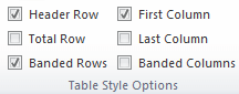
Be sure that the same choices are checked in the Table Style Options tab group: First row, First column, Banded rows.
- Select all of the temperature cells (those with numbers).
- On the Home ribbon tab, click on
the Align Right button
 .
.
All of the temperatures line up on the right side of the cell. Better!
-
Click out of the table.
- Save.
[[nz-tabledesign-Lastname-Firstname.pptx]
Evaluate
- Click on the Slide Show button in the Views bar.
- Click once to make the table appear.
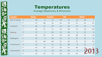
These lessons walked you through decisions in a way that is quite similar to what happens when you create your own table. You find that you need more or fewer rows or columns. You tinker with the alignment and the widths and heights. It is easy to lose sight of the goal - Clear communication.
![]() Evaluate: What do you think of
this table? Is it in a good spot on the slide? Is it easy to read? Would a different table style work
better? Could you accomplish your purpose
with less data? How about separate slides for Celsius and Fahrenheit
temperatures? Would a chart be better? Would more borders help? How about an entirely different approach using a color-coded map? Too much trouble or not?
Evaluate: What do you think of
this table? Is it in a good spot on the slide? Is it easy to read? Would a different table style work
better? Could you accomplish your purpose
with less data? How about separate slides for Celsius and Fahrenheit
temperatures? Would a chart be better? Would more borders help? How about an entirely different approach using a color-coded map? Too much trouble or not?
In the next lesson you will add a chart to a slide. Will it be easier? Better?
|
|
| © 1997-2017 Jan Smith All Rights Reserved |
Site Map What's New |
Privacy Policy Terms of Service Copyright Acknowledgements |
~~ 1 Cor. 10:31 ...whatever you do, do it all for the glory of God. ~~
Last updated: March 22, 2017
PowerPoint has a Design ribbon tab that is about the slides. Table Tools has a Design tab that is about table styles and Chart Tools has a tab about chart styles. Be sure you are on the correct 'Design' tab.