HTML Basics:
Page Format Guidelines

español![]()
Did you want IE9+, Chrome, Firefox; Notepad? ![]()
HTML Basics:
|
|
|||||
Choosing ColorsNaturally you want your page to be attractive. You will want to use colors and images that look pretty together. People can have quite different opinions about that! You must think like an artist while remembering that what your viewers actually see depends on their hardware and software. How colors appear on the screen will depend on:
|
|
Project 2: HTML Basics |
|||||||||||||||||||||||
Colors: Text vs. Background
The colors for your page background and text make an amazing difference in the look and feel of your web page. Choose wisely. It is easy to get carried away with bold color schemes. Don't make the text hard to read! Dark vs. Light
Contrast
Colors: Links
Consider carefully before assigning different colors. People now expect that underlined blue words are links and that underlined purple words are visited links. If you change the colors, pick colors that have the same kind of relationship to each other:
Careful choices help your viewers recognize which links are which. Of course, all of the colors should be easy to read against your background. Underlines:
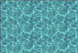
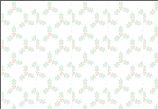
Use italics or bold or colors for emphasis. Underlining for emphasis was OK in the olden days of typewriters, which could not do bold or italics. Be modern! Background ImagesYou can use an image as the background for a page instead of using a solid color. Normally the browser will tile the image, repeating it across the page and then down the page until the whole window is filled. The smaller the image, the faster the page will display. A texture is a background that creates an overall effect on the page. Realistic textures look like sand, grass, water, brick, wood, etc. Some people call all small background images textures. A bit confusing. A watermark is a background which does not scroll when you scroll the page. The name comes from the world of paper. High quality stationary has a faint design in the paper called a watermark. You can see the design when you hold the sheet of paper up to the light. Types of background images:
Unless the border is very narrow, you must design your page carefully to keep the text off of the side border. One common method is to put your text in a table with an empty column over the border. Problem: Side border repeats across page If the side border image is not as wide as the window, it will be used more than once across the page. To avoid such repeats you must be sure that the image is wider than the window you expect your viewers will be using. Large monitors are getting cheaper all the time, so more and more people will be able to use the higher resolutions and large window sizes. A width of 1300 is probably needed these days. Experiment with Page Formatting
Your resource files include some background images that you can use in the Color Picker. |
|||||||||||||||||||||||||
~~ 1 Cor. 10:31 ...whatever you do, do it all for the glory of God. ~~ |
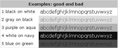 Your
page may be printed or viewed in gray scale. Quite a difference!
Your
page may be printed or viewed in gray scale. Quite a difference!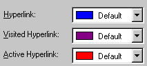 Your
browser assigns a default color for each of the three states that a
hyperlink can be in - unvisited,
visited, active.
Your
browser assigns a default color for each of the three states that a
hyperlink can be in - unvisited,
visited, active.


 Problem:
Text falls on top of side border
Problem:
Text falls on top of side border