
Jan's Working with Words
Brochure: Character Spacing
The Font dialog has a tab that you've not dealt with yet - Character Spacing (Word 2007) or Advanced (Word 2010, 2013, 2016). Sometimes it is useful to adjust the look of a font rather than find a whole new font.
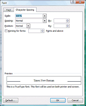
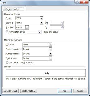
The Font dialog in Word 2007 and Word 2010, 2013, 2016
Character spacing options
Character Spacing Effects
|
|
Normal character
spacing
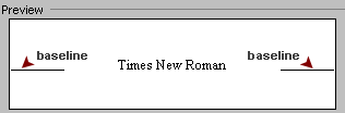
The baseline is the line that the letters normally sit on. |
|
|
|
|
|
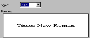
Scaling: You can adjust the width of a font as a percentage. This changes the shapes but not the heights of the characters. Example: Size of characters scaled to 200% of normal |
|
|
|
|
|
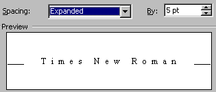
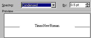
Spacing: You can expand the
spacing so
that the characters are further apart, or condense the spacing so that characters are
closer together. Letters remain the same size and shape.
Example: Character spacing expanded by 5 points. |
|
|
Example: Character spacing condensed by half a point |
|
|
|
|
|
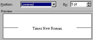
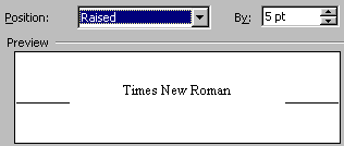
Position: The position of a word relative to the text's baseline can be set to Normal, Raised, or Lowered. In the preview, the base line is shown by the lines on either side of the preview text. It is the line the letters sit on. Example: Position lowered by 5 points |
|
|
Example: Position raised by 5 points |
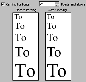 Kerning: While Spacing makes the same adjustment
to all characters, kerning adjusts the spacing
between certain pairs of letters, for example, a capital T next to a lower case
letter o. Without kerning the T will be too far away to look right in some
fonts and at large font sizes. In the sample at the right, look carefully at the space between the T and the o.
Kerning: While Spacing makes the same adjustment
to all characters, kerning adjusts the spacing
between certain pairs of letters, for example, a capital T next to a lower case
letter o. Without kerning the T will be too far away to look right in some
fonts and at large font sizes. In the sample at the right, look carefully at the space between the T and the o.
The first line has a font size of 18. It's not kerned because the
setting at the top says to start kerning at 24 points and
above. The other lines have font sizes of 24, 28, 36, and 48. The difference becomes more noticeable as the font size increases.
| |
Step-by-Step: Character Spacing |
|
| What you will learn: | to scale text to expand and condense text to raise and lower text to kern text |
Start with: ![]()
![]() , a blank
document
, a blank
document
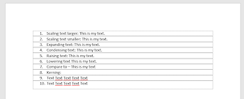
- In a blank document, type the following:
1. Scaling text larger: This is my text.
2. Scaling text smaller: This is my text.
3. Expanding text: This is my text.
4. Condensing text: This is my text.
5. Raising text: This is my text.
6. Lowering text: This is my text.
7. Compare to - This is my text
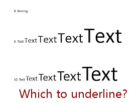
8. Kerning:
9. Text Text Text Text Text
10. Text Text Text Text Text
 Since you set Word to show text boundaries, there are a lot of dotted rectangles when the marks are showing.
 -
 Save as
characterspacing-Lastname-Firstname.docx in the word project3 folder of your Class disk.
- In line 1, select the part This is my
text.
- Open the Font dialog using the Dialog Launcher on the ribbon.
- Click on the
 Character Spacing or

 Advanced tab, if necessary.
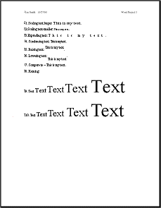
- Change scaling to 150%.
- Click on OK to close
the Font dialog.
 Continue with each line, applying the changes to the
phrase This is my text. -
Continue with each line, applying the changes to the
phrase This is my text. -
- line 2: scaling 80%
- line 3: expand by 10 pts.
- line 4: condense by 0.8 pts
- line 5: raise by 8 pts.
- line 6: lower by 12 pts.
- Compare each change
with the unchanged text in line 7.
- In lines 9 and 10 change the font size of the words to match the following sizes: 12 , 24, 36, 48, 72 pt
- Select the text in line 10 and open the Font dialog.
- Check the Kerning for fonts box and set the font size
at 1 pt.
When you click on the OK button to close the dialog, watch how the selected text moves.
- Create a header with your name and the date at the left and Word
Project 3 at the right.
- Preview.
- Save.
[characterspacing-Lastname-Firstname.docx]
 Print.
- Compare lines 9 and 10 carefully.
For which font sizes does kerning make a noticeable difference?
Underline them.
|
|
| © 1997-2017 Jan Smith All Rights Reserved |
Site Map What's New |
Privacy Policy Terms of Service Copyright Acknowledgements |
~~ 1 Cor. 10:31 ...whatever you do, do it all for the glory of God. ~~
Last updated: March 22, 2017